Create an interactive website where a flock of birds follows the user’s mouse in Japanese ink-painting style. Add options to switch them to koi fish or migrating animals across a safari landscape.
I kept pushing the Dynamic branding experiment a little further.
Started with a logo, ended up building a whole identity around it: minimal bar graphics, a custom halftone effect, and pretty much everything can move.
Would love to build something this expressive for a real brand!
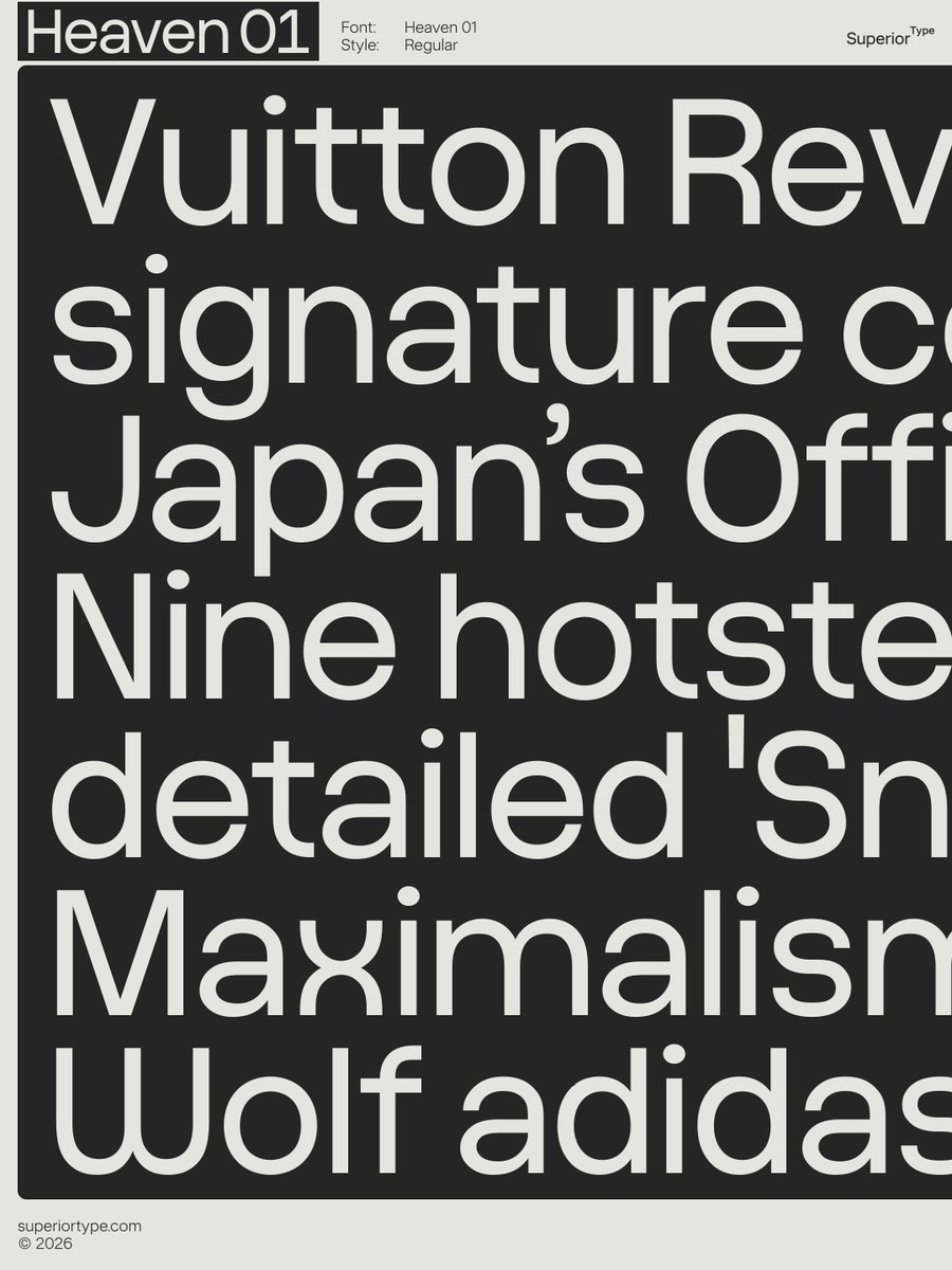
Heaven, a grotesque typeface from Superior Type, goes from soft to boxy on one variable axis.
Type designer Petr Kučera began with Heaven 03 and compares its curves to “a blown-up balloon fitted inside a box that is a bit smaller than the balloon.” If the balloon is blown up “bigger and bigger until it fills those corners,” he adds, “it becomes Heaven 09.”
I have a soft spot for printed ephemera like this.
Bold geometry, playful symmetry, wonderful colour combinations and characterful typography. A little graphic-design jackpot.
Vintage lottery tickets
Bulgaria, 1970s–1990s.
Pentagram has done the London Design Festival identity since 2007 and this year it's just a red frame cutting through the name. So simple, and it works everywhere from posters to the festival book.
https://t.co/7baNuAnJn7