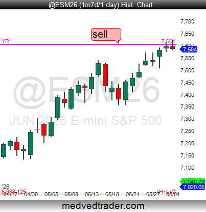
⚠️🚨My $ES_F $SPX $SPY charts are ALL flashing "WARNING" here at the Yearly R1 #pivotpoint(YR1)! ⚠️🚨
The BIGGEST reversals happen at the Yearly #pivotpoints! 😉
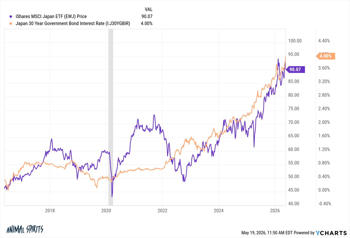
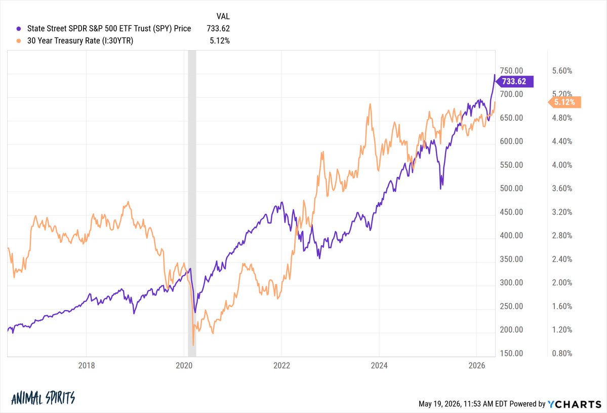
Everyone is freaking out about rising government bond yields...except for the stock market
Rising yields on 30 year govt bonds and rising stock prices in both Japan and the US
What if bond yields are just normalizing for a higher growth/inflation world?
This is a great example of sideways thinking. Many chartists look for indicators that show a topping or bottoming condition. This is an indicator which REFUTES the premise of a topping condition. That can be a valuable thing.
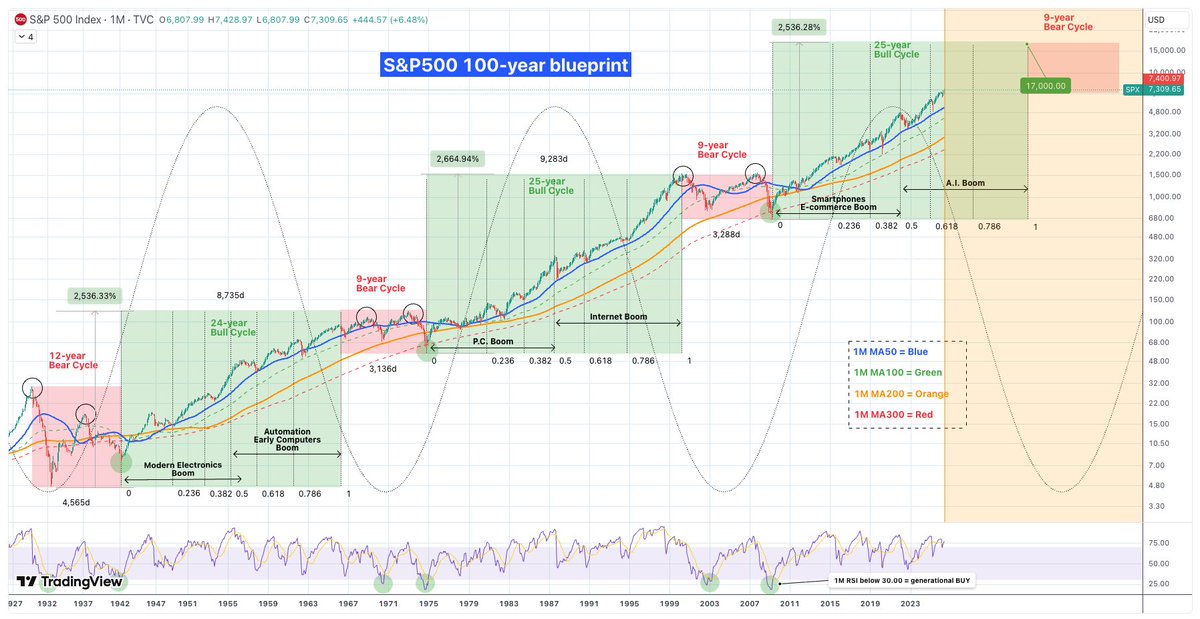
Der 100-Jahre-Plan für den Aktienmarkt
Wenn du dir die letzten 100 Jahre anschaust, siehst du ein klares Muster: Der Markt wiederholt immer wieder die gleichen Zyklen. Seit der Großen Depression 1930 gab es drei große Abwärtsphasen und drei Aufwärtsphasen .
Wir stecken gerade mitten im dritten großen Bullenmarkt.
Die schlechten Zeiten (Bärenmärkte)
Diese Phasen dauerten meistens etwa 9 Jahre (die Weltwirtschaftskrise von 1930 war mit 12 Jahren eine Ausnahme). Ein typisches Zeichen war, dass der Markt zweimal oben und zweimal unten „anklopfte“, bevor es wieder aufwärts ging. Oft krachte der Kurs bis zu einer bestimmten langfristigen Linie (dem 300er-Schnitt im Monatschart) und startete von dort aus neu durch.
Die guten Zeiten (Bullenmärkte)
Die ersten beiden großen Aufwärtsphasen dauerten jeweils 24 und 25 Jahre. Das Spannende: Sobald der Markt einmal Fahrt aufgenommen hatte, fiel er fast nie unter eine bestimmte grüne Linie (den 100er-Schnitt). Die blaue Linie (50er-Schnitt) war dabei immer die beste Chance, um günstig nachzukaufen, wenn es mal zwischendurch ruckelte.
Warum steigt der Markt so extrem?
Hinter jedem Bullenmarkt steckt eine neue Technologie:
Früher waren es industrielle Durchbrüche.
Dann kam der Internet-Boom.
Heute erleben wir den E-Commerce- und Social-Media-Boom.
Klar, irgendwann platzen diese Blasen immer, weil die Leute übertreiben. Aber die Technik bleibt! Das Internet ist nicht verschwunden, nur weil die Kurse im Jahr 2000 abgestürzt sind – es wurde zum Fundament für alles, was wir heute nutzen.
Der KI-Boom
Wir sind jetzt im zweiten Teil des aktuellen Aufschwungs, und der wird von der Künstlichen Intelligenz getrieben. Wahrscheinlich wird diese Blase um das Jahr 2034 platzen. Das wird wehtun, aber danach wird KI das feste Rückgrat unserer gesamten Wirtschaft sein.
Im Grunde sind die letzten 100 Jahre eine Kette von Erfindungen, die die Kurse immer höher treiben. Die Abstürze zwischendurch sind nur dazu da, die heiße Luft rauszulassen und Platz für neues Geld und die nächste Technologie zu machen.
Was bedeutet das für dich heute?
Wenn dieser Zyklus so läuft wie die letzten beiden, könnte der S&P 500 bis auf 17.000 Punkte steigen.
Es wird zwischendurch immer wieder Korrekturen geben. Der Zoll-Crash Anfang 2025 war so ein Moment, hat aber die wichtige blaue Linie nicht ganz berührt.
Schau auf den RSI-Anzeiger. Wenn der unter 30 fällt, ist das eine Chance des Jahrzehnts. Das ist in 100 Jahren erst sechsmal passiert – und jedes Mal war es der perfekte Zeitpunkt zum Kaufen.
Liken, Folgen, Speichern, Kommentieren, Teilen.
Danke für den Support 🫶😊🫶
@mwebster1971@IBD_JNielsen By the way, I don’t use MarketSurge because I haven’t seen that it is as good as thinkorswim on mobile. If MarketSurge ever gets really good on mobile, that would be great!
@mwebster1971@IBD_JNielsen I hope someone else will see this and do a study. I would like to see a series of follow through days using volume compared to days that would qualify as follow through days, except the volume was too low, and the comparison of which of those turned into power trends.
@mwebster1971@IBD_JNielsen I’m a big believer. I don’t let perfect. Be the enemy of good. And it is possible that applies to this situation. It is possible that it does not apply as well. Cheers. Thank you for your work and sharing your knowledge with us
@mwebster1971@IBD_JNielsen I totally believe you that volume is faulty.I am not convinced that it is completely useless, though. Really, the only thing that would convince me that it was useless would be for someone to study enough instances that show that even the faulty data do not give a decent signal.
@mwebster1971 Whether it’s dirty volume or some kind of voodoo, a study will mean more to people than the why. Just contrast the volume shown to the actual results. If it works, it works if it doesn’t, it doesn’t. @IBD_JNielsen
@mwebster1971 I watch most of your YouTubes and follow you on IBD Live as well. I appreciate all of the knowledge you impart to us. I watched most of your volume series. I think you should consider doing a study on either a daily or a weekly basis using volume and showing outcomes.
@alphatrends@mwebster1971 Loved the interview! Brian, I’ve been watching your videos since I believe 2008.
It was great hearing your story. I have only known your work, but not your story.
The S&P 500 triggered a rare technical event today, gapping above both its 50D and 200D moving averages simultaneously.
This looked weird to me, so I did some digging.
Since 1950, this specific signal has occurred only four times. In every instance, the index faced significant pullbacks shortly after. The average three month drawdown following the signal is -9.51%, with the worst three month drawdown reaching -12.92% during 2018.
Historically this has always been an exhaustion gap rather than a sustainable rally.
Maybe this time is different.
@al_xdpg For months,I did close stop loss tries.I didn’t want to be left behind if it broke https://t.co/aX68ZXQ9Uu, my days are more relaxing.I don’t short,so waiting for a decent sign of reversal before I try anything. As always, thank you for your posts. $👑