@YIMBYLAND Have to agree. Malls were an 80s fetish that killed the downtowns of so many cities and larger, once great American towns. They just paved the way for further private equity slop.
It’s personally very painful watching what happened to where I was born and then where I grew up.
Utahns, I’m seeing way too many of you having a freakout about Salt Lake City upzoning itself and allowing a tiny bit more density. People are saying it’s going to become California.
My bad news for you is that California is the way it is precisely because its cities have NOT voluntarily done what Salt Lake City is doing. If they had, more of us would’ve been able to afford to remain in California instead of swamping YOUR state.
Allowing greater density in already developed areas with high demand is a critical pressure relief valve for affordability.
@usgraphics A great recent example is the ship graphics in Alien: Covenant. Ridley wanted practical and the the effects team rigged physical controls to TouchDesigner where custom graphics were then fed back real-time to screens while shooting. Just a different feeling than post.
@usgraphics Apple continues to insult our intelligence with these Srouji stages even though everyone realized they were fake by 2021. Also appears to be the same Italian blue sandstone used in Apple stores (and HQ) - no way they are putting industrial equipment on that.
The Shield Born from Invisible Waves.
In the mid-20th century, Louis Christiaan Kalff, Philips’ long-serving industrial designer, created one of the most enduring logos in corporate history.
Inspired by the idea of sound waves traveling through the ether, Kalff combined twinkling stars and flowing wavy lines inside a protective shield. The stars suggested light and energy; the waves represented radio signals and invisible power bringing sound and illumination to the world. Enclosed in a circular form that evoked global reach, the design felt both scientific and poetic.
The resulting red-and-white shield distinguished Philips from competitors and became a symbol of technical innovation and human progress. Decades later, its core elements still resonate.
One elegant emblem. A lasting tribute to the invisible forces that connect us.
#logodecks
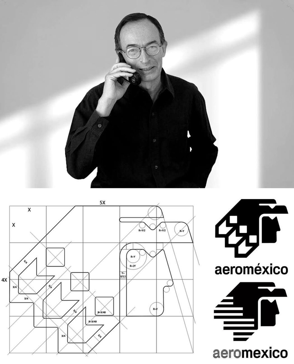
The Eagle Warrior Who Ruled the Skies for 26 Years.
In 1981, Mexican artist Raúl Pérez-Duarte Viesca created Aeroméxico’s iconic “Caballero Águila”, a sleek, geometric eagle warrior that fused Aztec heritage with modern elegance.
His minimalist design, first in bold orange and white, captured the strength and pride of Mexico’s flagship airline. In 1988 it gained dynamic striped feathers and a deeper blue palette. By 1997, smoother lines refined it further, keeping the symbol timeless and sophisticated.
For more than a quarter-century, Pérez-Duarte Viesca’s eagle defined Aeroméxico’s identity across the skies. Even after its 2024 replacement, the original remains a benchmark in aviation branding, elegant, cultural, and unforgettable.
One warrior. Decades of Mexican pride in flight.
#logodecks