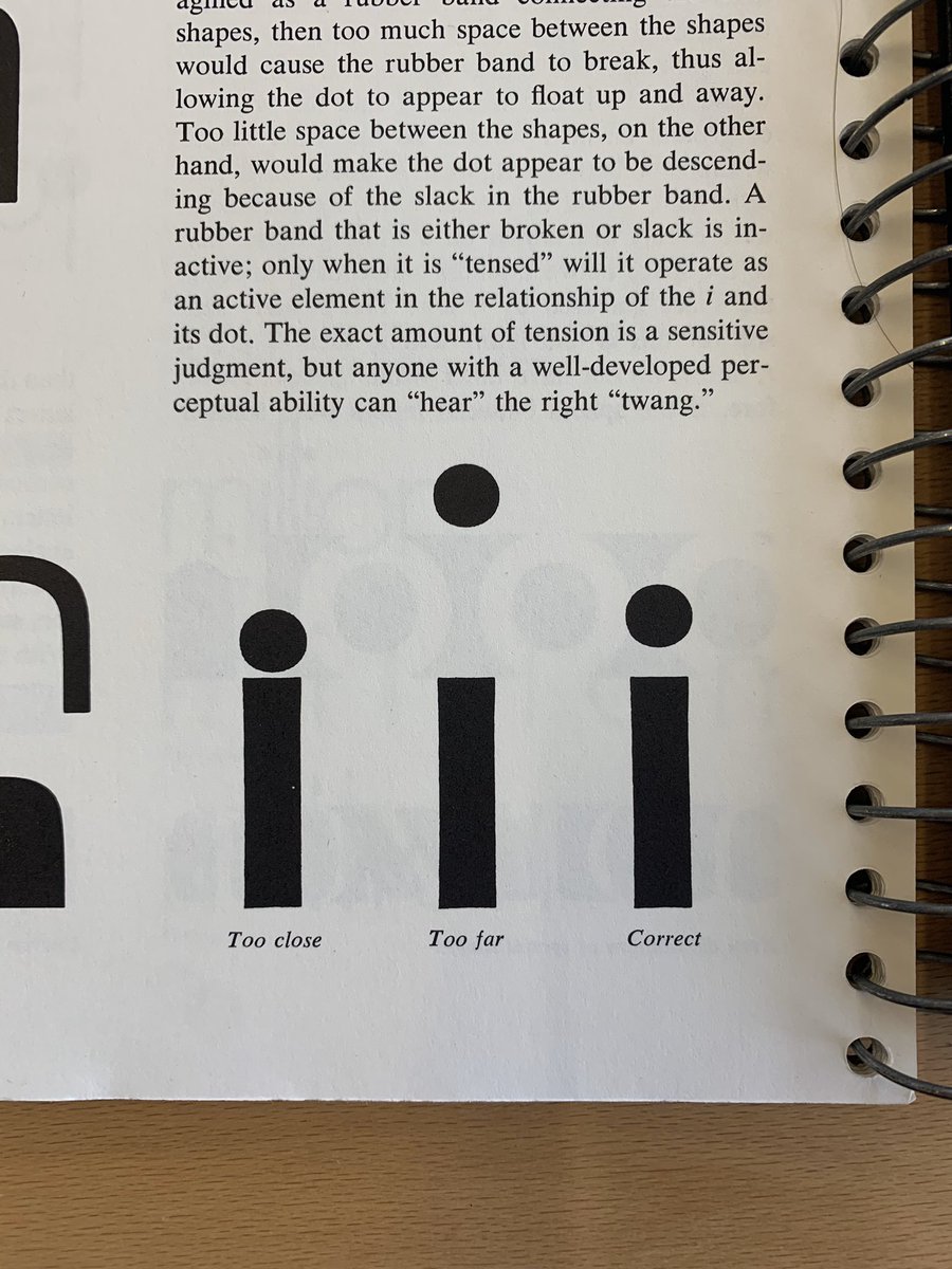
We republished an article originally written for @eyemagazine examining the notions of originality in type design and the boundaries between interpretation and plagiarism.
https://t.co/cfyhezhvsW
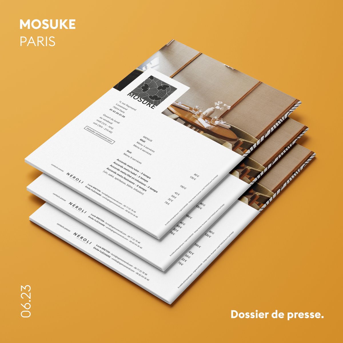
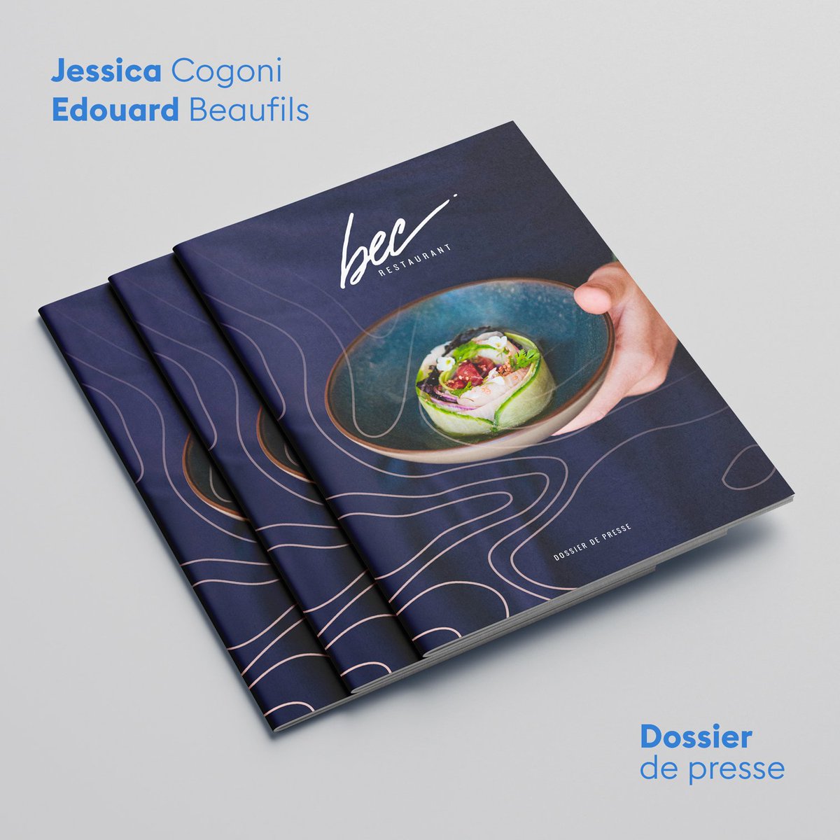
Boostez votre communication avec le Graphic Pack !
Vous êtes un dirigeant d'entreprise ou un directeur de communication et de marketing, et vous cherchez à améliorer la visibilité de votre entreprise grâce à une communication visu…https://t.co/Zmu0mZlIOP https://t.co/gIsl2MAqpr
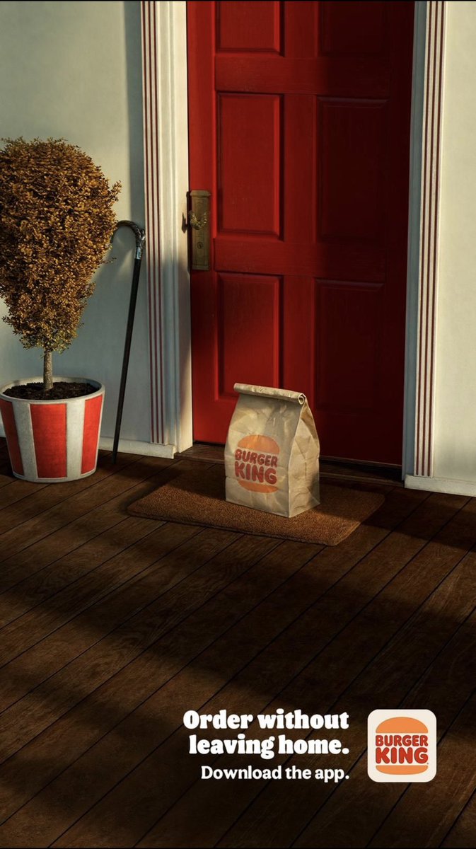
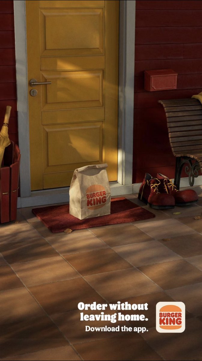
I am no fan of fast food advertising. “See? We made these red gloves with yellow fingers look like French fries!” Dear God, stop.
And then I saw these new, simple ads for Burger King. And they were both lighthearted and pointed. Even low-key. Well-played, BK.
Quand nous avons pensé Capitaine Train, nous avions un principe d'interface que nous pensions très puissant. Puisque https://t.co/q0bIoUtu6v était un affreux formulaire plein de pubs, nous voulions débarquer avec un design qui devait démontrer notre simplicité d'un coup d'œil.
La covid a emporté mon papa. D'habitude discret sur ma vie privée, j'ai souhaité en parler pour sensibiliser les sceptiques et ceux qui vivent le confinement comme une injustice. En effet ... 1/10
Happy birthday to A.M. Cassandre (1901–1968), born 120 years ago today! #LfABirthday Image: Bifur specimen (typeface designed by A.M. Cassandre), Deberny et Peignot, France, 1929. See the full booklet, as well as the French version, in the Online Archive. https://t.co/8Jn4deB9gG