@AvvocatoAtomico - alb. se idea buona, non serve forma specifica per convincere; qua si fa propaganda, facendo leva sul noi-loro, e secondo me questo non porta a risultati duraturi. Se sbaglio, che la pagina continui, ma mi informerò altrove.
- luiza forma e contenuto non scorrelati
- koore -_-"
@AvvocatoAtomico Mi dispiace, ma tolgo il follow: penso che i toni che usate non siano degni dei contenuti che volete trasmettere e inefficaci nel far cambiare idea, oltre a peggiorare il mio umore :) spero che cambino e continuerò a leggervi altrimenti. Buon lavoro!
@AvvocatoAtomico io vi seguo perché vi ritengo esperti e portatori di un punto di vista importante... Ma che modo di dialogare è quello che usate, andando a insultare chi scrive opinioni contrarie? Mi sembra indegno dei vostri contenuti, oltre che poco efficace.
@theneilrichards@CedScherer It's not "wrong", but I'd say that no insight is revealed by plotting the chart this way (trends or clusters). It looks like they had to make a bubble chart and just made an axis up; why not plotting only imports vs. % from Russia, a simple to interpret scatter plot?
Maybe not everyone had the possibility of visualizing a pandemic spreading (in this case, on a network) and playing with that. Also, it can help getting a better grasp of vaccinations act. https://t.co/X1hSMxDxqt
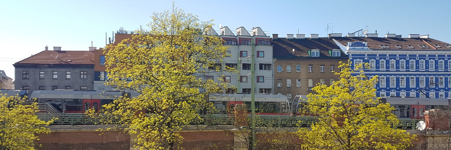
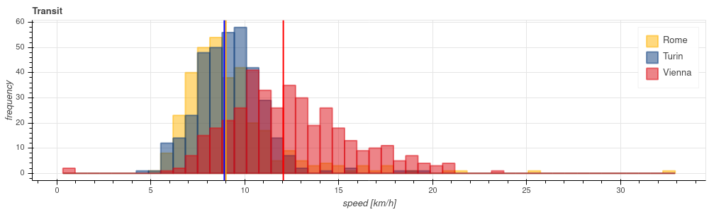
🚌 🏙️ How much is the public transport service gap between "good" and "bad" cities? How can we quantify it? Here is a proposal for a first step, using poor man tools.
https://t.co/rRczQGgraS
(see the full work at https://t.co/896QmqsHRZ)
#Torino#Roma#Vienna#publictransport
@VisualCap Not only some names seem a bit "tweaked" to look more appealing, but there are errors: for instance, Belarus is translated as "white Ruthenia" (Wikipedia), and "white Russia" is a common error.


![GabrieleLabanca's tweet photo. [gablog] New article about interactive #DataVisualization for spatial #traffic data: https://t.co/AF07LsvLZD https://t.co/oWSot2rPcC](https://pbs.twimg.com/media/Ekb7tp7WMAEBDbt.png)


