Nearly ten years in, there’s a lot about $FIRO I wish more people knew.
With $ZEC bringing fresh attention to privacy, I wanted to share our story: the research, what we’ve built, and the people who kept us going.
Here’s why I’m still excited about Firo. https://t.co/TWmD7cRvp9
I've had an amazing year running @privacychronics and preaching the gospel of privacy and blockchain alongside my friends.
Along the way, we've spread the goodness @cakewallet brings to Nigeria through our podcast and IRL events, from hosting our own meetups to cross-chain collabs with other brands across various states.
I've honestly lost count of the people who still call me "The Privacy Guy" or ask for a bite of their cake whenever we cross paths. 😄
It's been a wholesome ride, to say the least.
Despite going quiet online these past few months, I've packed in lessons and wins behind the scenes. Here's a glimpse of what this past year has looked like; a milestone for me, for you, for all of us.
Cheers 🥂
Networking would be so smooth here.
Booths alone 😩
Main stage would be 🔥
Looking forward to what 𝗕𝗹𝗼𝗰𝗸𝗳𝗲𝘀𝘁 𝗔𝗳𝗿𝗶𝗰𝗮 𝟮𝟬𝟮𝟲 holds. @blockfestafrica@GISECGlobal
In dark mode brand systems, borders should be felt more than seen.
Use very low-contrast lines ( 4–10% lighter than the bg) so they define the layout well.
When the borders disappear at a bit but still hold the layout together, the identity feels refined instead of
outlined
Using pure white text in dark mode brand systems is almost always too bright.
Use a soft off-white or light gray(#E0E0E0 or #F0F0F0) so the type sits into the black instead of fighting it.
Pure white is one of the fastest ways to make a dark system look unpleasant.
Using pure white text in dark mode brand systems is almost always too bright.
Use a soft off-white or light gray(#E0E0E0 or #F0F0F0) so the type sits into the black instead of fighting it.
Pure white is one of the fastest ways to make a dark system look unpleasant.
In dark mode brand systems, shadows should almost never be used.
On dark bg, drop shadows either vanish or create muddy edges.
Instead, separate elements with slim shifts in surface levels (a slightly lighter black) so depth comes from the hierarchy itself.
Over $500K awarded to Nigerian projects on Stellar 🚀🇳🇬
The latest Stellar Community Fund round has once again shown what Nigerian builders are capable of.
Six Nigerian projects received funding in SCF #44, with over $500,000 awarded to support projects building their solutions across the ecosystem.
We’re incredibly proud to see more Nigerian founders and builders continuing to show up, getting the support they need to build boldly, and make their mark on the Stellar ecosystem.
Big congratulations to @callyolat , @choppaddi , @JumpaHQ , @useblinkapp , @useazza , and @paycashless_ ! 🥳
We can’t wait to see how these projects grow with this support.
Curious about what they’re building? Take some time to explore their projects and support their work.
It’s still day one!
In dark mode brand systems, shadows should almost never be used.
On dark bg, drop shadows either vanish or create muddy edges.
Instead, separate elements with slim shifts in surface levels (a slightly lighter black) so depth comes from the hierarchy itself.
I couldn’t resist cooking up my own version.
Like, I want y'all to actually spend your ZEC.
@ZecHub store with the recent redesign - 1st frame
Prepare your $ZEC
I'm happy to share the full concept on request.
[Heavy Type]
In dark mode brand systems, the type should feel heavy.
Slightly increase the weight or tracking so the letters hold their own against the dark bg without needing extra contrast or outlines.
Thin type that disappears is the most common dark-mode mistake.
[The single light in a dark room]
When designing a dark mode system the accent color should appear as rarely as a single light in a dark room.
Use it on the one elements that must be noticed.
It can be;
◇ A logo detail,
◇ A key word,
◇ A button.
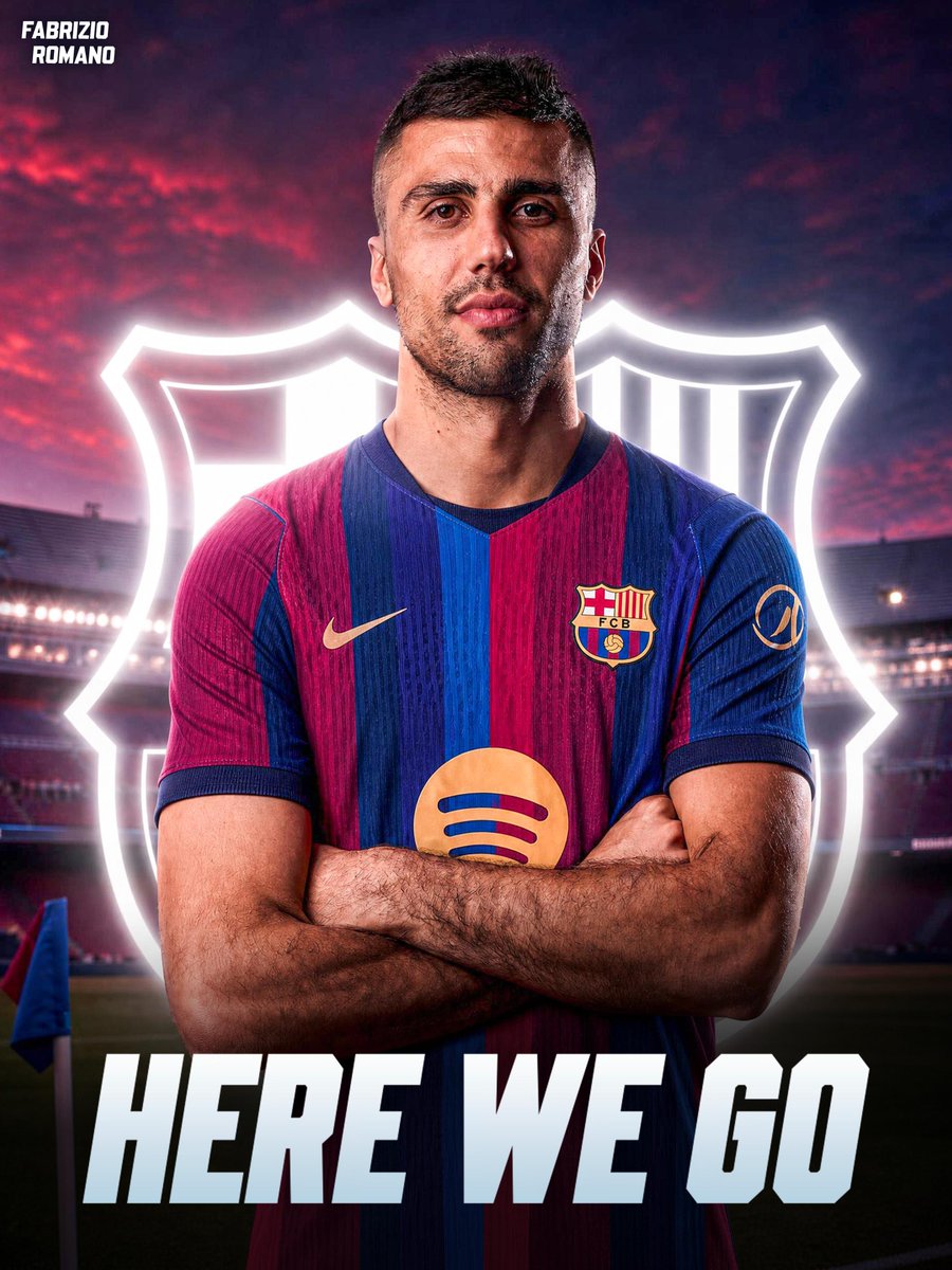
🚨🔵🔴 EXCLUSIVE: RODRI TO BARCELONA, HERE WE GO! 💥
Deal agreed for Spanish midfielder to join Barça from Man City, all done for the former Ballon d’Or.
Green light from Man City to last Barcelona bid.
More follows. 💣
A reduction in the opacity (70 - 85) can help soften the contrast.
That quiet tension is what separates intentional dark mode identity from generic “dark theme” work.
[almost invisible]
In dark mode brand systems, the logo should almost disappear into the black before it becomes visible.
If you can still see every edge clearly at a glance, the contrast is too high and it feels like it was pasted on.
⬇️
That’s why a pure black (#000000) background with careful contrast and one strong accent color outperforms any “darkened” palette.
Do this and every element suddenly feels intentional.
Most dark mode brand systems fail because they just invert light mode colors.
True dark-mode identity starts by treating the black as the main surface, not empty space... only then do the logo, type, and mockups work.