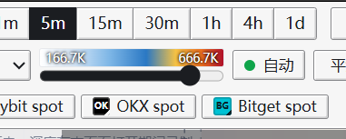
@karlbooklover Heatmap: it would be great if users could adjust the sensitivity themselves.
Large orders: could they be displayed directly above and below the candlesticks? Right now it's a bit tiring on the eyes to read them the way they are.
@karlbooklover Hi, just a couple of small suggestions:
It would be great if we could have two or more layouts.
For absorption, could it be displayed as semi-transparent circles? Right now, absorption sometimes looks just like candlesticks on the chart, which can be a bit visually misleading.