Branded Thumbnails >>> Good Thumbnails
The goal is to create familiarity because familiar thumbnails get processed faster/build trust over time
A few ways creators build thumbnail branding:
- Consistent fonts and text styling
- Repeating colour palettes
- Similar composition/layouts
- Recurring visual elements
One of the easiest ways to improve your thumbnails is by testing for clarity before you upload
Most viewers don’t see your thumbnail in full size. They see it small on the homepage or in the sidebar
So before finalizing the thumbnail, ask yourself
- Can I instantly tell what the thumbnail is about?
- Is every word easy to read at a glance?
- Do the main elements stand out clearly?
- Is there one obvious focal point?
- Would this still work if it was viewed very small?
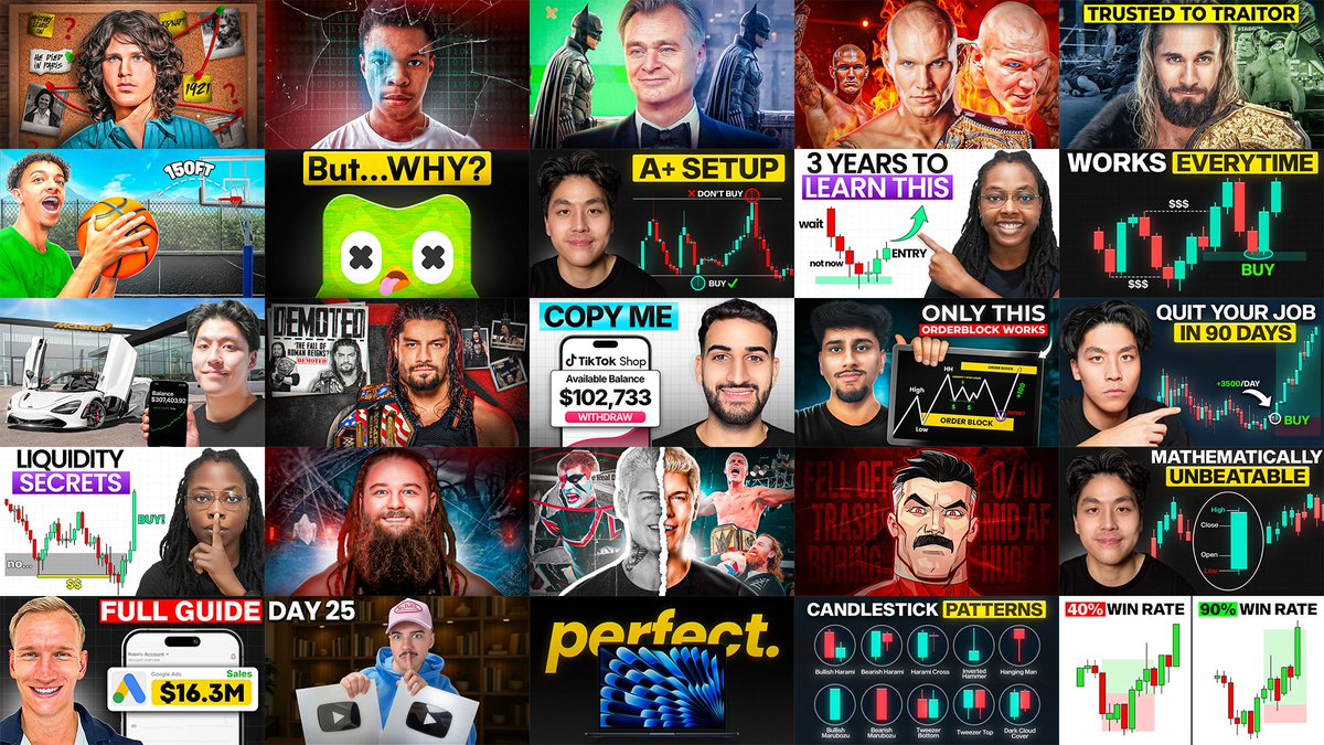
In the image below, notice how every thumbnail is still easy to understand even at sidebar size
- Easy to tell what the thumbnail is about
- Simple words and easy to read text
- Simple composition and elements stand out (good separation of elements through design techniques)
If the viewer has to stop and “figure out” what they’re looking at, they’ll usually just keep scrolling instead.
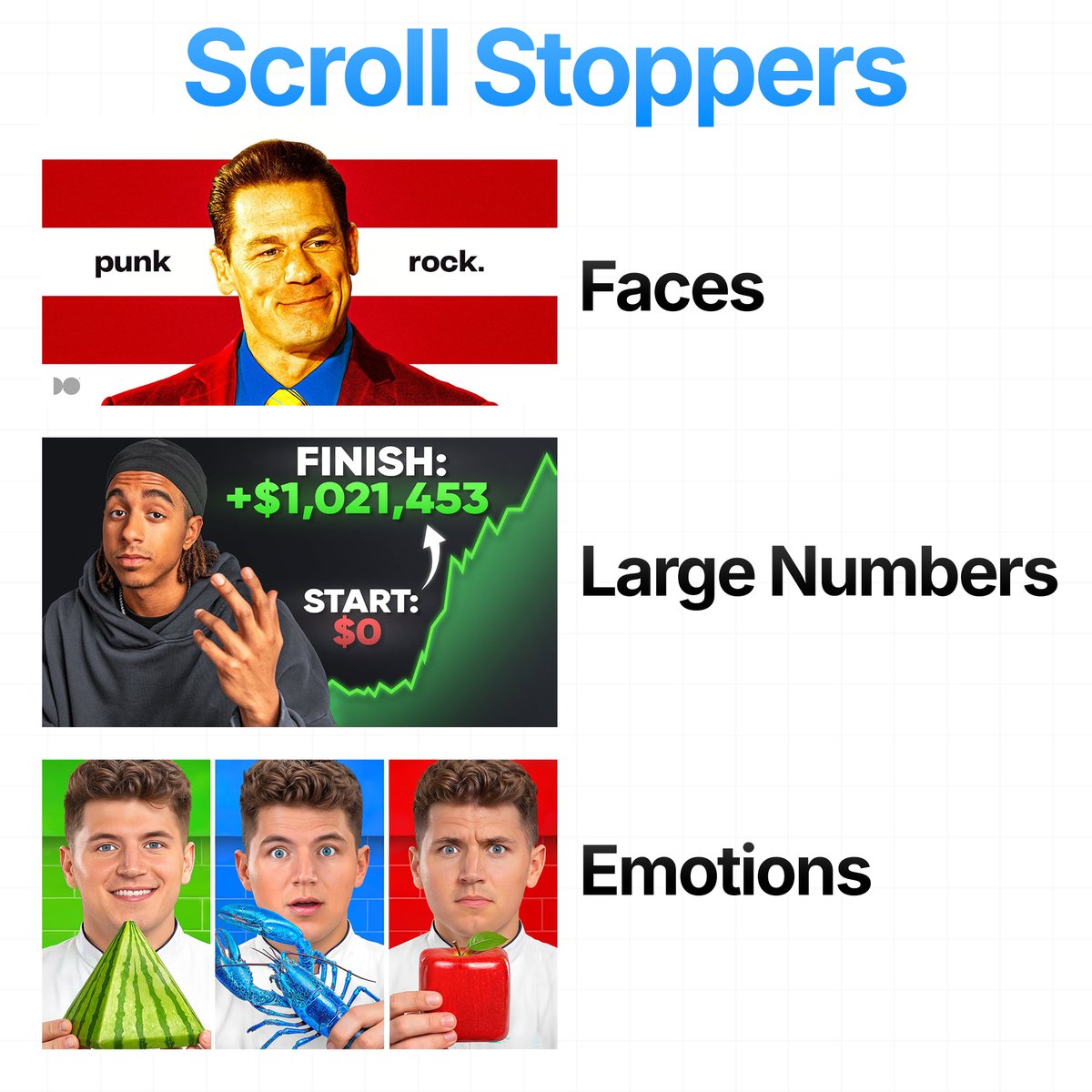
Every thumbnail NEEDS a scroll stopper.
The YouTube homepage has hundreds of videos fighting for attention at the same time. As viewers scroll, they’re only glancing at thumbnails for a split second
You need something in your thumbnail that instantly interrupts that scrolling behavior. Here are some you can use in your next thumbnails:
- Faces: Humans are naturally drawn to faces first. Especially when there’s eye contact, exaggerated expressions, tension/confusion. Faces give the viewer something human to instantly connect with
- Large Numbers: Create perceived value/results. The number itself grabs attention, while the other elements of the thumbnail and the video itself make it believable
- Emotions: Emotion is what creates curiosity. A thumbnail that makes the viewer FEEL something will almost always outperform one that only explains information
Some common emotions used:
- Surprise
- Fear
- Confusion
- Excitement
- Tension
Other common scroll stoppers creators use:
- Bright Colours
- Movement
- Aesthetically Pleasing thumbnail
Most thumbnails fail because there’s nothing strong enough psychologically to interrupt the scroll and make the viewer care
Throughout my thumbnail breakdowns, I’ve talked a lot about social hacking (the idea that our brains are naturally drawn to things and people we already recognize, trust, or feel familiar with), but mostly only on the surface level
So here are a few different ways creators use social hacking in thumbnails to instantly grab attention and make viewers stop scrolling:
- Celebrity Hacking: Using recognizable people/faces to borrow attention from mainstream media/pop culture
- Brand Hacking: Using familiar brands/products/logos viewers already have strong associations with
- Trend Hacking: Using viral moments/trends or culturally relevant topics people already care about
Use this technique strategically (don't force popular things into a thumbnail randomly) so the viewer’s brain processes your thumbnail faster
One of the biggest mistakes in thumbnail design is adding too many competing elements
The more things the viewer has to process, the more likely they are to scroll past.
These thumbnails work because they stay focused around 3 main elements max:
- A clear main subject
- A supporting element/context
- Short and easy to read text
You don’t need to show everything in the thumbnail. The goal is to simplify the idea down to 2–3 main elements max so the viewer can instantly process it and feel compelled enough to click
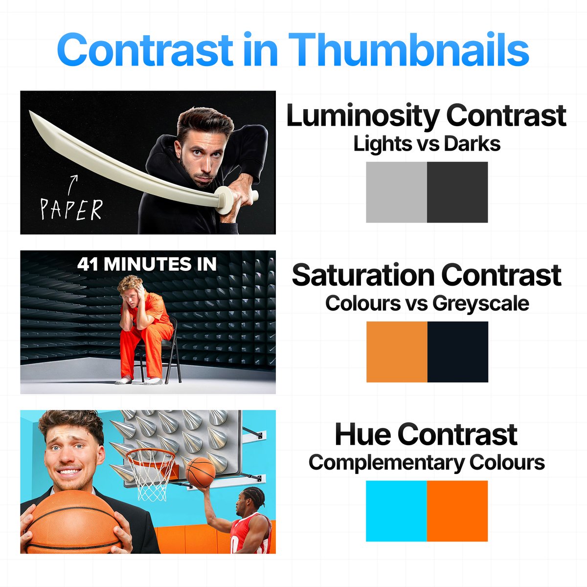
Thumbnails need contrast to guide the viewer’s eyes
3 types of Contrast:
Luminosity Contrast: Lights vs Darks
Saturation Contrast: Colours vs Greyscale
Hue Contrast: Complementary Colours
Most high CTR thumbnails have very obvious contrast separation
What makes this thumbnail so smart is that it doesn’t LOOK like a motion design video at all
Most people in this niche would’ve done the obvious thing:
- Giant After Effects logo
- Crazy motion graphics screenshots everywhere
- Glowing text (usually purple or yellow)
- Timeline screenshots
The problem is your brain instantly categorizes that as:
“tutorial content”, which, of course, usually means time, effort, learning and probably something you can watch later
Instead this creator went in the complete opposite direction. Instead, he used a recognizable face (Trump) at a podium with the American flag behind him. The second you see that face, your brain already reacts before you even think. It doesn’t even matter if you like him or not, he’s one of the most recognizable people on earth (especially more now), so naturally your eyes go there.
This is social hacking (Our brains are naturally drawn to what we are familiar with, specifically to who/what we know, like, or trust). They used attention from politics/media to their advantage and put it into a video's thumbnail that is about motion design, which helped the thumbnail stand out from the usual styles in this niche that audiences have probably become numb to over time (not only social hacking)
The main idea I want you to takeaway from all of this is that the best thumbnails often borrow from outside the niche itself because audiences eventually become blind to the same repeated concepts over time
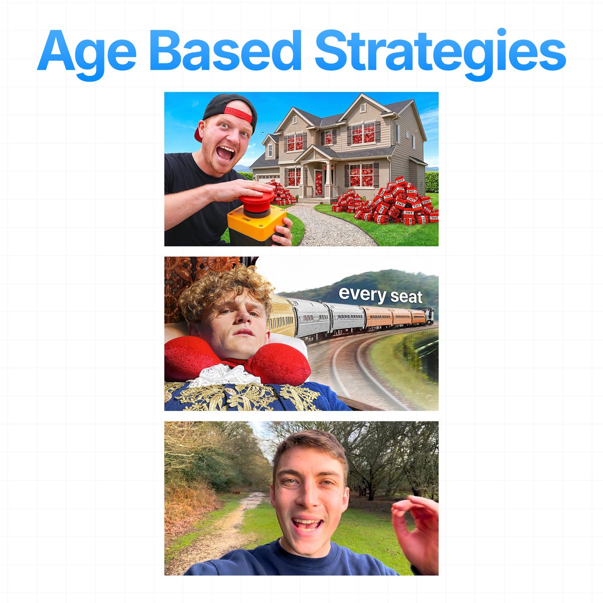
There is no one single/universal thumbnail style
There’s only the thumbnail style that best matches the audience you’re trying to attract
A thumbnail that performs well for a 13 year old audience would probably fail with a 30 year old audience. To figure out what style works best, study your target audience, research your niche and analyze what type of packaging consistently gets clicks from that demographic
The best creators design thumbnails for the audience viewing them
A 13 year old and a 30 year old don’t respond to the same packaging
Follow the thread where I explain more 🧵👇