Caca de fesse, si t’as pas un offre en béton armé un marché en béton un produit puissant as fuck des créa en béton de fou lance même pas tes pub.
Faut que quand tu pense à ce que tu vas faire tu sente une flamme sinon c’est ps le bon truc.
Tout mes amis d’enfance n’ont plus rien à voir avec moi et ne sons plus en adéquation avec mes valeurs.
Wallah je vais faire une Dremo personne sert à rien ici.
Ya des gens en souffrance psk ils ont un sale entourage ils le savent mais ils restent quand même.
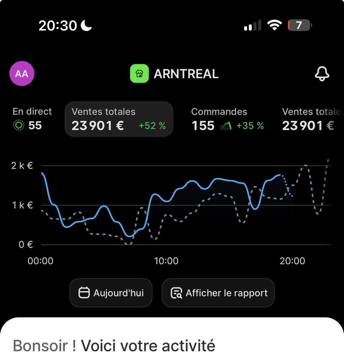
bon c’est 20h30 on est quasi à 24k€
peut être on fais le 30k day ce soir je sais pas
mais @Sacharbd_ veut augmenter le budget donc on passe la cbo 5k day de spend
on va voir si ca prend
jvous tiens au jusss
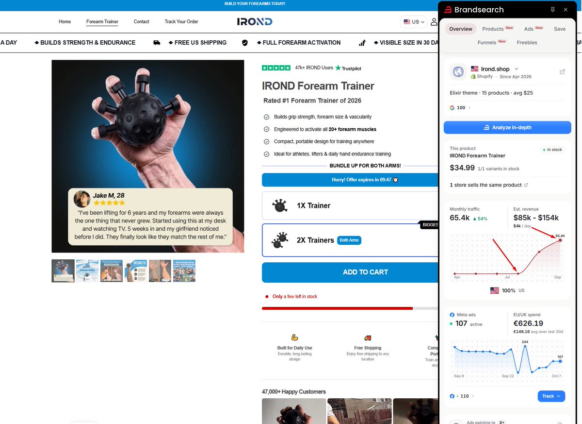
💪Damarlı kollar herkesin hayali değil mi ? 🙃
Bu ürün de sana bunu sunuyor.
Markanın büyüme grafiğini görüyorsunuz.
Reklam Kreatiflerin çoğu ise ai ile yapılmış.
Most buy boxes look like a math test.
12 options. Confusing bundles. Overwhelming choices.
So the buyer does what's easiest: they leave.
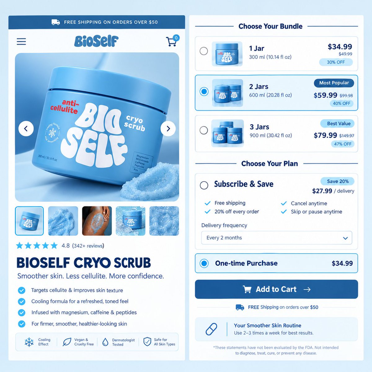
Look at another version of BioSelf buy box I just built. I broke a complex purchase into two simple decisions:
1️⃣ "Choose Your Bundle"
→ Radio buttons make the choice tactile
→ "Most Popular" and "Best Value" badges do the selling for you
→ Clear price anchoring ($59.99 vs. $99.98) makes the middle option a no-brainer
2️⃣ "Choose Your Plan"
→ Subscribe & Save vs. One-time purchase
→ Clear savings (20% off) and clear friction removal ("Cancel anytime," "Skip or pause anytime")
→ "Your Smoother Skin Routine" tells them exactly how to use it, removing post-purchase anxiety
This isn't just design. It's Choice Architecture.
When you reduce decision fatigue and make the best option obvious, conversion goes up. Simple.
If your buy box is overwhelming your buyers.
DM me, and I'll show you how to simplify it into sales.
Or reach out directly: https://t.co/z4A4oUCegz
Portfolio: https://t.co/pQsEF0S8H2
#ConversionRateOptimization #LandingPageDesign #UXUI #MobileFirstDesign #EcommerceTips #DTCMarketing #ShopifyExperts #Replo
Stop looking for the one thing that will fix your conversion rate.
There isn't one. Growth comes from testing consistently.
The brand that tests faster wins. Execution > overthinking.
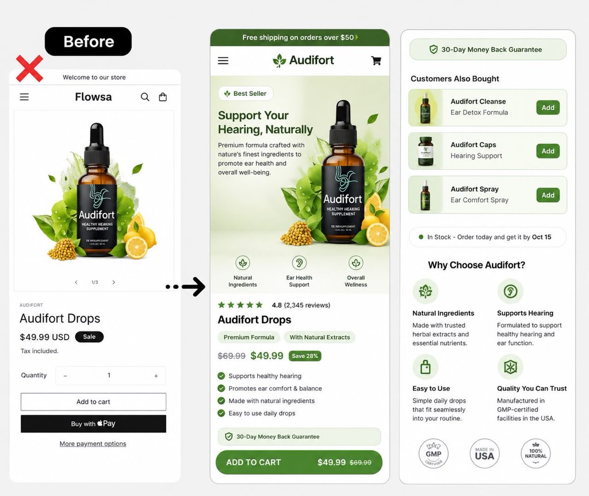
The “before” PDP wasn’t broken. It was just making the shopper do all the work.
I redesigned this Audifort mobile PDP around one simple question:
“What does the shopper need to know before they hit Add to Cart?”
The redesign focuses on:
→ Stronger first-screen value proposition
→ Product benefits made instantly scannable
→ Reviews moved closer to the buying decision
→ Price + savings made more obvious
→ Guarantee placed directly above the CTA
→ Cross-sells separated from the main decision
→ “Why choose us?” used to build confidence
→ Cleaner visual hierarchy
→ Much stronger mobile CTA
Before: product → price → Add to Cart.
After: value → proof → offer → reassurance → Add to Cart.
That’s the difference between putting a product on a page and designing the page around the buying decision.
#CRO #DTC #Ecommerce #MobileUX #PDPDesign #ProductPageDesign #Shopify #Replo #ConversionRateOptimization #UXDesign #EcommerceDesign #ShopifyDesign
The hardest part of selling a $14.95 moisturizer isn't the price.
It's getting the buyer to stop overthinking.
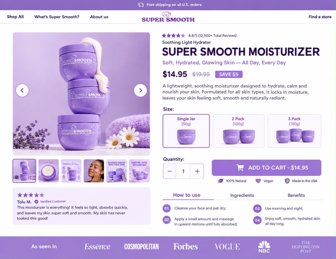
A client sent me this Super Smooth product to build a page for.
Here's how I removed every ounce of friction:
→ "SAVE $5" badge - makes the discount feel instant and real
→ Size selector (Single / 2 Pack / 3 Pack) - upsells without pressure
→ "100% Natural / Vegan / Made in USA" - kills the ingredient anxiety
→ 4-step "How to Use" - removes the "will this actually work for me?" doubt
→ 12,500+ reviews - makes the decision feel safe
The goal isn't to convince them to buy.
The goal is to make buying feel like the easiest choice they'll make all day.
Got a product that people hesitate on?
DM me, and I'll show you exactly where your page is creating friction.
Or reach out directly: https://t.co/z4A4oUCegz
#ConversionRateOptimization #LandingPageDesign #EcommerceTips #DTCMarketing #CopywritingTips #ShopifyExperts #FrictionRemoval #FreelanceDesigner #NigeriaTech
Traffic brings people to your store.
But your product page is where the sale happens.
If the page is slow, cluttered or unclear, visitors will leave before they understand the value.
A clear and well-structured product page helps people trust faster, decide faster
A beautiful PDP can still lose sales if the buying decision feels complicated.
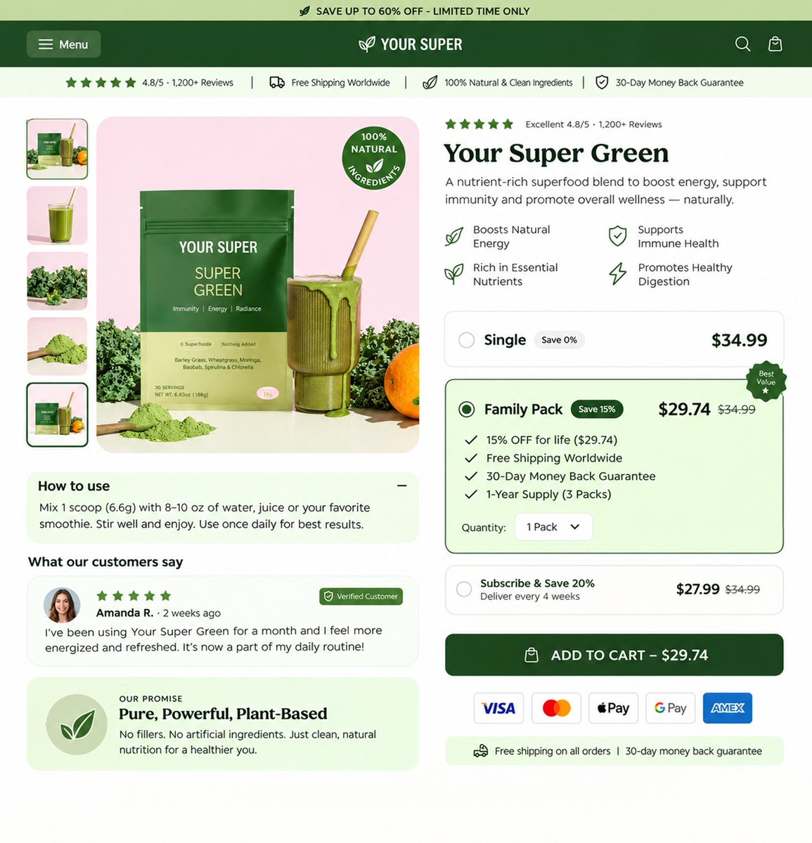
For this Lunavera product page redesign, I focused on making the offer easier to understand at a glance:
→ Stronger product presentation above the fold
→ Clearer product positioning
→ Reviews placed where shoppers can see them early
→ Subscription vs. one-time purchase made obvious
→ Bundle options structured for easy comparison
→ “Most Popular” highlighted without overwhelming the page
→ Savings shown next to each option
→ Free-shipping reassurance placed close to the purchase decision
→ Stronger CTA hierarchy
→ Cleaner mobile-friendly information flow
The goal wasn’t to add more content.
It was to remove friction between “I’m interested” and “I know what to choose.”
That’s what good PDP design should do: make the next decision obvious.
If your product page gets traffic but shoppers still hesitate, DM me. I’ll show you where the buying experience may be leaking conversions.
#CRO #DTC #Ecommerce #Shopify #Replo #ProductPageDesign #ConversionRateOptimization #UXDesign #EcommerceDesign #ShopifyDesign #PDPDesign
Most beauty brands copy supplement page tactics.
Countdown timers. "Only 3 left!" Flash sales. Scarcity everywhere.
But cosmetics buyers aren't solving an emergency. They're buying a feeling. Urgency feels wrong on a beauty page it cheapens the brand.
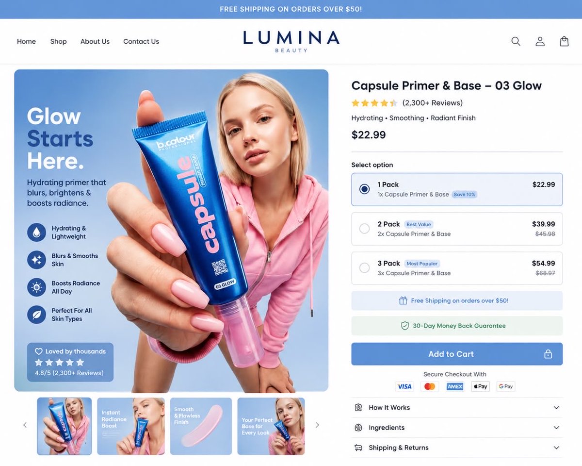
Just designed a primer page for Lumina Beauty around restraint instead.
Here's the structure that works for cosmetics DTC:
→ Clean trust bar (one signal)
→ Outcome headline ("Glow Starts Here")
→ One-line promise + 4 benefit icons
→ Social proof box on the hero
→ Reviews above the fold
→ Clean 3-tier bundle stack
→ Trust signals below the bundle
→ Full trust footer + payment icons
No countdown. No "only X left." No fake urgency. Just clarity.
If your beauty page is using supplement urgency tactics, you're leaking brand equity and conversions.
DM "AUDIT" for a free teardown.