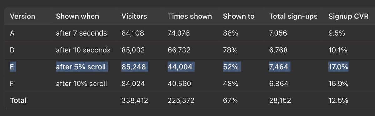
5% scroll-depth also winning for us
fewer people see the email pop-up, so you annoy fewer people who were never going to sign up anyway and you still get more sign-ups
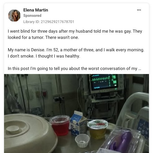
"I went blind for three days after my husband told me he was gay." is crazy work. Selling a vibrator btw.
Native ads are definitely the most entertaining thing to happen to Ecommerce in the last 12 months.
It's ironic that the one thing AI is STILL terrible at is copywriting, especially when you consider the fact that language is the foundation of these models.
Coding, images, and videos are pretty much solved. But... if you want GOOD copy you gotta massage tf out of it.
@Jake_Langley@Armon_Sho@aftersell Try it out with Claude Chrome. A bit slow and more token hungry than it being a native tool in the MCP but it gets the job done.
Shopify’s Post-Purchase Extension API is almost 6 years old.
It's still in beta... 😅
The customization given to developers here?
Very limited.
You can’t build whatever you want.
“Shopify doesn’t support it” has never been a good enough answer for us.
At @Aftersell, our philosophy on PPU is simple:
Boost RPV by pushing Shopify’s post-purchase experience as far as it can go.
That’s how we’ve found creative ways to add:
Progress bars.
Badges.
Reviews.
Better text styling.
...and other features that aren't straightforward.
They might seem small.
But we’ve seen them substantially lift RPV.
Our latest:
VSLs (video) in post-purchase upsells.
It’s a v1.
And lot more improvements are coming.
Run an A/B test and let me know what it does for your RPV.
@Mr_Rbd_ New UI looks great guys, phenomenal job.
BUT, you're severely lacking on a common feature nowadays for spy tools: MCP / CLI integration for agents.
Also one of the biggest strengths of Minea compared to others was seeing the actual ad post with comments... Great for research.
This is officially the most battle tested DTC listicle layout.
Javvy has been running variations of this for YEARS now and it continues to be their top landing page based on the amount of ads pointing to it.
It's got a modern, branded feel. Each component is dense and conveys just enough information without boring the customer or forcing them to read a book.
They keep the copy pretty much the same with every iteration, only swapping out seasonal elements like the obvious ones in the announcement bar.
If you've been in the space for a while, you've probably seen it. Maybe you used the layout for one of your stores.
The best example of a brand re-using this layout successfully is Hollow Alpaca Socks.
@nicktheriot_ I knew that hook looked familiar.
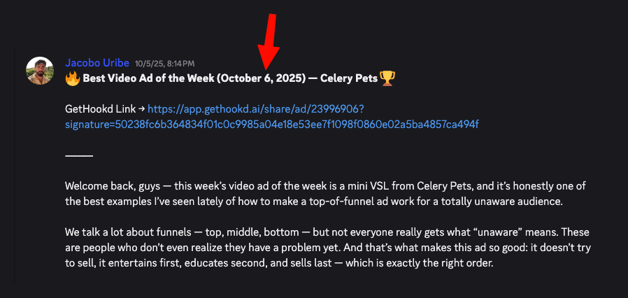
I reviewed this ad from Celery Pets last year talking about how masterful of an unaware ad it was.
Based on the launch date this came BEFORE Teazy's... So either they just ripped the entire concept or this was a rebrand.