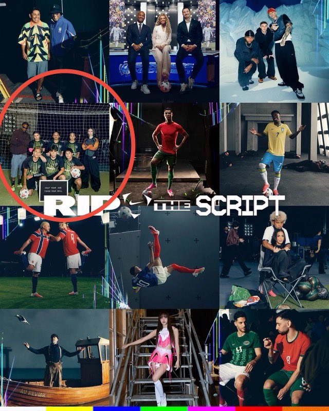
So much to like about #Nike's “RIP The Script”. Lots of boxes ticked. Fact remains that no other brand out there can match their freak during World Cups. And nobody can put their posse to work quite like they do!
But beyond all the celebrity names here, particularly pleased to see Nike's TOMA street football circuit being platformed in a prominent way. The young kid in his TOMA LA team jersey getting proper screen time, that too in the closing stretch of the film, says a lot.
Once again, underscoring just how central TOMA is to Nike’s football strategy. And given that this World Cup campaign is all about instinct and freedom, it makes total sense to spotlight someone from the very ecosystem where those qualities are first nurtured. Good on Nike for weaving that angle into the story in kind of an indirect but purposeful manner. Excited to catch the various offshoots from the film now.
#Marketing #Advertising #FIFA
New art by Hirohiko Araki. He designed a special kabuki stage curtain celebrating the name succession of actors Onoe Kikugoro VIII and Onoe Kikunosuke VI.
More info here: https://t.co/DdZTHwjJkr
Manabu Sakamoto, born March 9, 1968, is a Japanese graphic designer and visual communication expert who graduated from Tsukuba University's Special Arts Group with a major in Visual Transmission Design. He joined Sony in the early 1990s, working in the Creative Development Department at Sony Creative Center as a senior producer until 2011. There, he contributed to branding for products like VAIO and became renowned for conceptualizing the iconic PlayStation logo in 1994, ahead of the console's Japanese launch on December 3 that year.
The original PlayStation logomark features interlocking "P" and "S" letters in a dynamic, perspective-distorted form, evoking a 3D shadow illusion to symbolize the era's shift to immersive 3D gaming. Sakamoto developed about 20 prototypes, blending 70% concept ideation (inspired by keywords like "inspiration" and "logic") with 30% refined design. Colors, red for passion, yellow for happiness, green for excellence, and blue for patience, added emotional depth, targeting a youthful, diverse audience.
This simple yet bold emblem, with its custom clean typeface, has endured across generations, evolving subtly (e.g., desaturated for PS5) while retaining core unity. Sakamoto's work not only defined PlayStation's identity but also influenced Sony's global branding success, turning a gaming console into a cultural powerhouse.
#logodecks
Men don’t need therapy
They just need 2 hours of shuizshuizshuizshuizshuizshuizshuizshuizshuizshuizshuizshuizshuizshuizshuizshuizshuizshuizshuizshuizshuizshuizshuizshuizshuizshuizshuizshuizshuizshuizshuizshuizshuizshuizshuizshuizshuizshuizshuizshuizshuizshuizshuizshuizshuiz
Kashiwa Sato, born in Tokyo in 1965, is a renowned Japanese creative director and graphic designer. He graduated from Tama Art University’s Graphic Design program and worked for 11 years at Hakuhodo, a leading Japanese advertising agency, before founding his own studio, Samurai, in 2000. Known for his minimalist and iconic design approach, Sato draws inspiration from Japanese culture and traditions, emphasizing simplicity and clarity. His work spans branding, logo design, product development, and architecture, with notable clients including Uniqlo, Honda, and Seven Eleven.Sato designed Uniqlo’s current logo, introduced in 2006, to reflect the brand’s Japanese identity and global ambitions. The logo features the word "UNIQLO" in a custom typeface, stacked vertically, against a bright red square background, echoing the colors of the Japanese flag. A second version incorporates the Katakana script "ユニクロ" (yunikuro), creating a dual-language design intended to appeal to both Japanese and international audiences. This redesign debuted at Uniqlo’s flagship store in New York’s SoHo district and became the official logo in Japan by 2009. Sato’s intention was to make the logo simple, memorable, and evocative of Japanese pop culture, aligning with Uniqlo’s global branding strategy under CEO Tadashi Yanai. He has also overseen broader branding efforts, including store designs and the UT T-shirt line, reinforcing Uniqlo’s identity as a functional yet culturally rooted fashion brand.
#logodecks