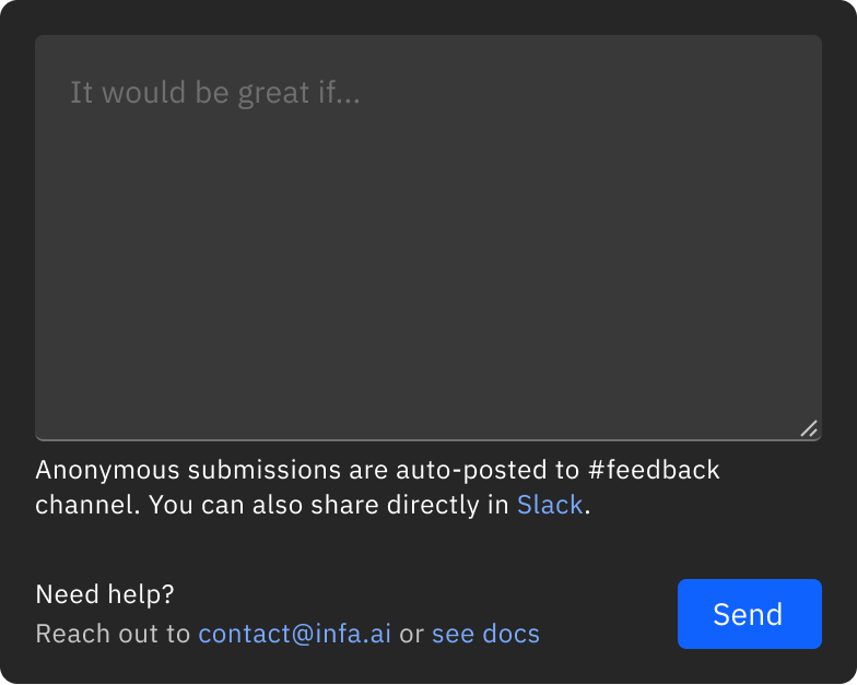
This is actually big! ‼️ Why waste time writing tickets? The fastest way to iterate is to make changes directly in your product right from your browser.
With the new Evolve feature in the Infa AI Chrome Extension, you can capture elements, give instructions, and send them straight to your code editor. No friction. No handoff. And it’s completely free!
Coming soon: you’ll even be able to leave comments that trigger @cursor_ai Background Agents to make changes automatically no local setup required 🤩
I’ve got a bunch of free Pro coupons (1 month) for early testers. Want one? Drop a comment, and I’ll share access!
#Design #Cursor #DesignSystems #DevTools
We are currently experiencing outage. It's related to one of our providers @supabase
Please check https://t.co/9tAanmNGb9 for the latest updates and we will update https://t.co/bPyt4gI77Q when supabase will be up and running
This is actually big! ‼️ @ShopifyEng Polaris #DesignSystem Inspect & Reflect!
I’m excited to team up with @danmall , Maya Hampton, Lucas Mosele, and @pattyrozmus to explore how Shopify is evolving its design system and integrating it into their products.
Register here: https://t.co/iNw2qio0Jh
This is the perfect opportunity to dive deeper and analyze how their components, tokens, and patterns are shaping up. We’ll take a hands-on approach, reviewing their documentation, tagging components, and discussing practical insights on scaling a design system.
What You’ll Get From This Session:
→ A closer look at how Shopify applies its design system across its products.
→ Insights into design system adoption, consistency, and future-proofing.
→ A collaborative discussion with experts sharing real-world strategies.
Our goal? Learn, explore, and collaborate, not critique. If you’re into modern frontend ecosystems, design tokens, and how design systems scale in fast-moving companies like Shopify, this is for you!
Join us for an interactive co-creation session, it’s going to be insightful and fun!
#DesignSystems #Component
A big thank you to everyone who joined us for our Inspect & Reflect session on Wise's #DesignSystem! Special thanks to our speakers—@JonDelman1, Raquel Pereira, @ASundiev, and Jane Wolf, for sharing their expertise.
Missed something? Watch the full recording here
https://t.co/VDCEVxCDPC
What’s Inside
In this episode, we explore https://t.co/GhUt0t6Sic's Design System implementation through the expert eyes of industry professionals:
→ In-depth analysis of Wise's documentation practices and #accessibility considerations
→ Examination of empty states, patterns, and table #components across the platform
→ Insights into component navigation strategies and user experience optimization
→ Discussion of type hierarchy and design system governance techniques
→ Practical takeaways for implementing design systems in fintech and international products
Explore Wise Design System
Check out the community board we created for this event to see how Wise implements their design system across their global platform:
https://t.co/74kF305M64
Don’t miss upcoming J.P.Morgan Salt Design System Inspect & Reflect
https://t.co/6ZI6ApC4iP
Thanks again for being part of this incredible session. I look forward to seeing you at our next event! ❤️
Does Your SMB Need a #DesignSystem? Look at @vercel's Geist Approach
During our Inspect & Reflect, Jon Delman shared an interesting observation about Geist's documentation approach. Key Takeaways:
→ Geist focuses primarily on components rather than patterns or detailed usage guidelines
→ They provide code examples but minimal prescriptive guidance on when to use specific variants
→ Even with buttons that have semantic variants (error, warning), the examples show practical usage (upload) rather than explaining the semantic meaning
→ This suggests a deliberate choice to let developers consume the code directly rather than reading extensive guidelines
My Thoughts:
This could be a perfect example of how small-to-medium businesses (SMBs) can approach design systems without overwhelming documentation. Interestingly, Vercel doesn't use Storybook—they keep everything in one place using Nextra (their own documentation framework built on Next.js) to render markdown files.
Why This Works:
1️⃣ Self-Explanatory Code > Documentation
→ Clean implementations with minimal but well-named props
→ Focus on solving real use cases rather than documenting every possibility
→ Faster learning curve for developers who prefer reading code over docs
2️⃣ Unified Documentation Architecture
→ Single technology stack (Nextra/Next.js) instead of separate tools
→ Markdown-driven workflow that's easy to maintain
→ Version control that treats documentation and code as a unified system
3️⃣ Right-Sized for SMBs
→ Scales with your team instead of requiring dedicated documentation resources
→ Prioritizes speed and implementation over comprehensiveness
→ Fits teams where designers and developers collaborate closely
What's your take? Could this minimalist approach work for your team?
📢 Join us for the upcoming Inspect & Reflect: https://t.co/LT9k2ZLUvE's Vibe Design System! Check my profile for details.
#DesignOps
In our recent Inspect and Reflect session, we explored the Gestalt #DesignSystem and discussed the Accordion component. Steve Dodier-Lazaro highlighted the importance of using the new HTML <details> element instead of custom solutions
🧵
Design systems are well-documented, but as @danmall rightly points out, context is key. With https://t.co/S7ijTipeCB, you can highlight components directly in the browser 🔎👀
@aidenybai This is incredible work, @aidenybai! I’ve created something similar—a Chrome extension that lets you tag components visually on any web page without needing access to the code
Would love to connect and explore ways to collaborate—amazing work!


