Alhamdulillah! I’m really excited to announce that I got awarded the ‘Ben and Beatrice Edward Biology Scholarship’ from the department of Biology at @unevadareno (UNR) based on the academic records, research expertise and influencer as a TA.
#UNR#Scholarship#biology#GTA
This is my first paper from my PhD journey, which began with receiving the Nevada INBRE Scientific Core Service Awards in 2023. It's been published in the BMC Genomics journal (IF-3.7). #genomics#bioinformatics#alhamdulillah#UNR
https://t.co/olhyinIYrY
Comparative genomic analyses shed light on the introduction routes of rice-pathogenic Burkholderia gladioli strains into Bangladesh https://t.co/SwBT30Ggnk #biorxiv_genomic
Our @williamandmary Data Science department is recruiting 1 tenure-track and 1 teaching assistant professor! Welcome to apply and be my colleague 😊
- Tenure-track: https://t.co/TwJc0OD0jt
- Teaching: https://t.co/IPuRM70Axh
(please reshare) I'm recruiting multiple PhD students and Postdocs @uwcse@uwnlp
(https://t.co/I5wQsFnCLL). Focus areas incl. psychosocial AI simulation and safety, Human-AI collaboration.
PhD: https://t.co/ku40wCrpYh
Postdocs: https://t.co/K9HUIPJ5h6
Literature Reviews are like chess - without a strategy, you can't succeed.
With new AI tools, your leverage is 10x bigger if you use them right.
Here is the strategy & the tools I found after 3 years of experiments in the brand new AI Lit Review Course:
👇
We have an open PhD position, 4 y. with 2/3 of E 13 TV-L salary, assigned broadly to the design and synthesis of coordination compds for the activation of small molecules (https://t.co/6ZhI5vF4oF...). Pls apply directly to [email protected]. Pls retweet!
📣 Applications are now OPEN for the John Innes Foundation Rotation PhD Programme
This 4-year #PhD programme trains graduate students in Plant & Microbial Sciences @JohnInnesCentre@TheSainsburyLab & @EarlhamInst
🗓️ Apply before 13 Nov '25 ➡️https://t.co/KhLHJijixf
Top 7 most important statistical analysis concepts that have helped me as a Data Scientist.
This is a complete 7-step beginner ROADMAP for learning stats for data science. Let's go:
Bayesian logistic regression is a powerful method for predicting binary outcomes (such as yes/no decisions). It differs from traditional logistic regression by incorporating prior beliefs and quantifying uncertainty using posterior distributions. This makes Bayesian logistic regression ideal for situations where you want to explicitly account for uncertainty or include prior knowledge.
Here’s a breakdown of the four key graphs that provide insights into a Bayesian logistic regression model:
✔️ Posterior Distribution Plot: This plot displays the posterior distributions of the coefficients for predictor1 and predictor2. The shaded area shows the range of probable values (credible intervals), while the vertical line marks the median estimate of each coefficient. Unlike frequentist approaches that provide single point estimates, Bayesian logistic regression gives a distribution of possible values, which allows for a clearer understanding of uncertainty in the model parameters.
✔️ Trace Plot: This shows the trace of the MCMC (Markov Chain Monte Carlo) sampling process over 4000 iterations for predictor1 and predictor2. The traces should ideally look "fuzzy" and well-mixed, moving around the full parameter space without getting stuck. This indicates that the chains have converged and that the model’s parameter estimates are reliable. A poorly mixing chain (one that looks like a straight line or is stuck) would indicate convergence issues.
✔️ Posterior Predictive Check: This plot helps to evaluate the model's predictive performance by comparing the predicted outcomes (y_rep, light blue) with the observed data (y, dark blue). The closer the predicted values align with the observed data, the better the model captures the underlying structure. In this case, the predicted values align well with the observed data, indicating a good fit. This check is crucial for assessing whether the model generates realistic predictions.
✔️ Posterior Interval Plot: This plot visualizes the credible intervals for the model coefficients, including the intercept. The wider the credible interval, the more uncertainty there is in that coefficient estimate. Both 50% (inner) and 95% (outer) credible intervals are shown, providing a range of probable values for each coefficient. If a credible interval includes zero, it means the predictor may not have a strong effect on the target variable.
This grid of graphs allows for a comprehensive understanding of your Bayesian model, showing how well the model fits the data and how much uncertainty there is in the parameter estimates. Bayesian logistic regression provides a richer interpretation than traditional methods by quantifying uncertainty and incorporating prior knowledge into the analysis.
Want more insights on data science? Subscribe to my free email newsletter! Take a look here for more details: https://t.co/X93SeCe0rb
#datastructure #DataAnalytics #DataScience #datavis #Statistics #RStats
Congratulations to my supervisor, Dr. David Alvarez-Ponce, for his groundbreaking research revealing that organismal complexity is driven by the number of protein families, not just gene count.
https://t.co/1RgqmFYQL1
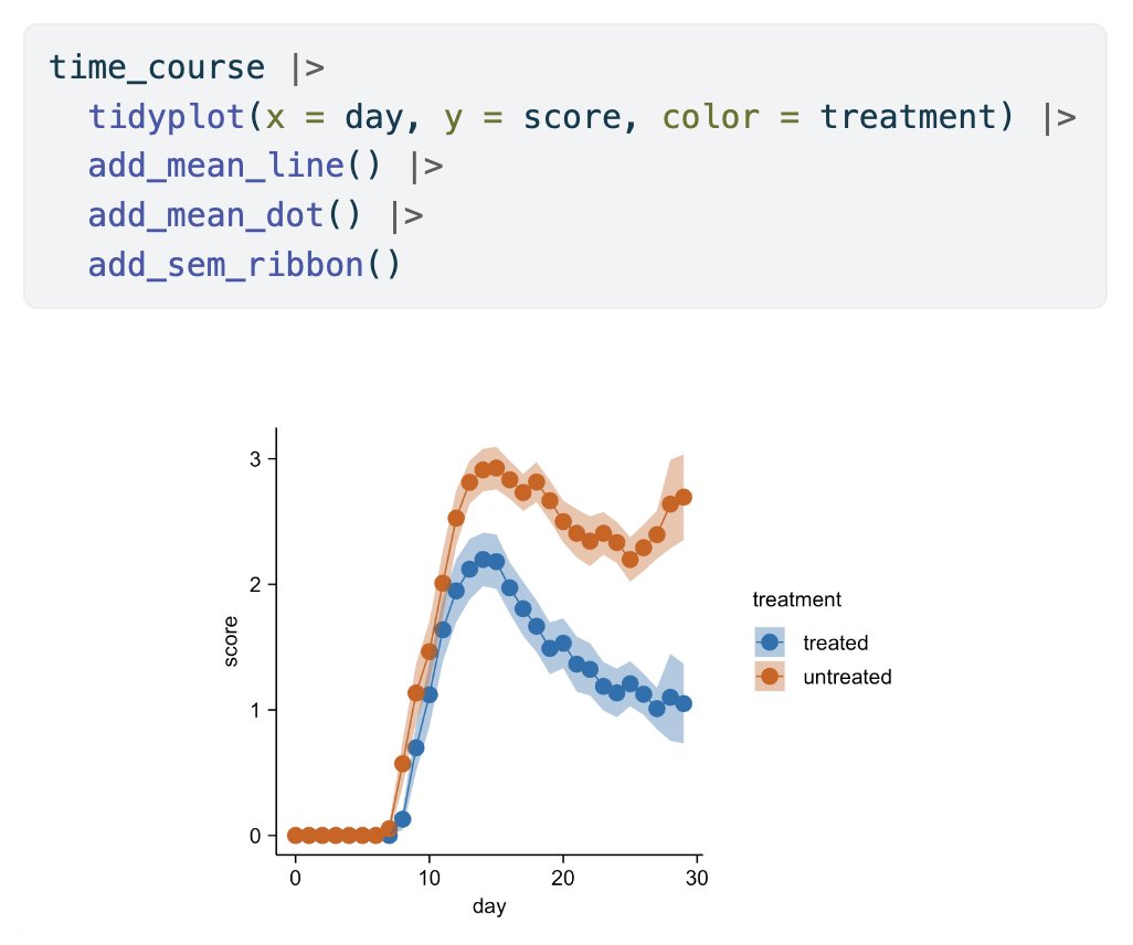
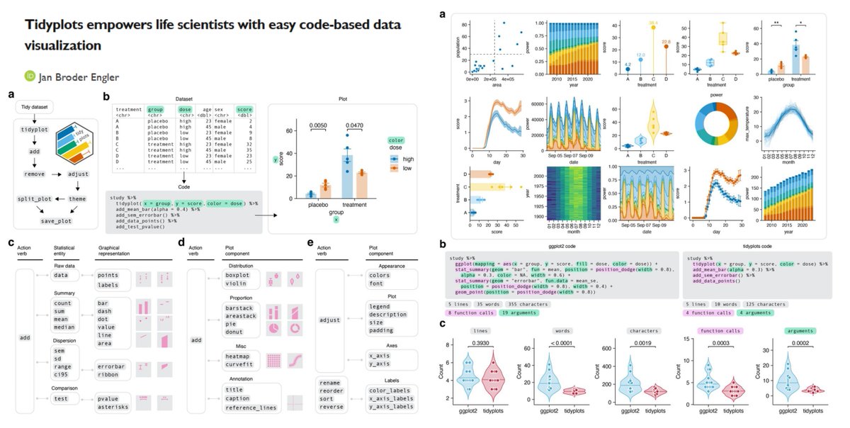
tidyplots
Time to say goodbye to ggplot2?🫡
"a significant reduction of code complexity" vs ggplot2
https://t.co/6wKFnRrjMn
@JanBroderEngler bioRxiv 2024
https://t.co/rqvyMsj5JK
New Publication (IF-0.9)! It focuses on the pathogen Xanthomonas citri, the causal agent of citrus canker, contributing to understanding plant-pathogen interactions and plant pathology. https://t.co/4Q6TRPSpif #xanthomonas#citrus#canker#xcc#bacteriology#plant#plantpathology