YOUR NAME, YOUR LEGEND — INK AND WATERCOLOR TITLE LOGO
Using the supplied character reference, create ONE original illustrated fantasy title logo featuring the character and their own name, completed in a single generation.
Make the entire emblem read as an original ink-and-watercolor painting on visibly textured, near-white watercolor paper. Give the whole image a soft, flowing, tactile presentation through matte pigment, gentle tonal transitions, fine ink, and exposed paper. Carry this treatment through the character, ornament, and surrounding sweep, with precise drawing gathered into selected passages.
Build one distinctive pictorial emblem from the character, meaningful motifs, flowing ink, and untouched white space. Place the character’s name across its open center. The illustrated shape should remain coherent if the lettering were hidden.
COMPOSITION: AUTO
[Options: AUTO / OPEN CRESCENT / RISING DIAGONAL / S-CURVE / CROSSING DIAGONALS / VERTICAL ASCENT / HORIZONTAL SWEEP / RADIAL BURST.]
OPTIONAL NAME OVERRIDE:
[Leave blank to use the clearly legible character name on the reference.]
REFERENCE ROLE
Use the current character reference for identity, characteristic proportions, hairstyle, distinctive features, clothing silhouette, signature objects, meaningful motifs, and palette. Preserve recognition through selected defining features. Invent a gesture and arrangement suited to the emblem.
Take the reference’s forms and defining features into a shared ink-and-watercolor treatment. Express their surfaces through matte ink and translucent pigment, allowing paper texture and softly merging washes to remain visible within the painted character.
Retain asymmetric relationships as the pose turns: a facial marking stays beside the same eye, and a distinctive braid or accessory stays on the same anatomical side. Preserve the associations among eye colors, markings, and other defining features.
Allow selected decorative interpretation that suits the character’s mood, palette, and movement. Flowers among chains or spikes may introduce softness, tension, or fragility. Choose additions individually for each character; take identity and personal attributes only from the current reference.
Any supplied logo examples guide composition and rendering only. The character reference alone is sufficient.
BUILD THE OVERALL SHAPE
Use a wide landscape canvas with generous exposed paper around and between the major movements. Allow selected flowing extensions and naturally cropped portions of the figure to reach or pass beyond the canvas edges. Keep the complete name within the canvas, with the face and any clearly depicted hands readable. Follow the selected composition:
AUTO: Choose OPEN CRESCENT, RISING DIAGONAL, S-CURVE, CROSSING DIAGONALS, VERTICAL ASCENT, HORIZONTAL SWEEP, or RADIAL BURST according to the character’s silhouette, garments, signature objects, appendages, and the space needed by their name. Establish a fresh gesture suited to the chosen structure. When several layouts fit, allow variation in structure, figure placement, facing direction, and the distribution of detail and white space.
OPEN CRESCENT: Form an open, asymmetrical crescent. Position the figure toward the upper left, turning inward. Carry the figure’s gesture and flowing garments down the left side, then sweep beneath the center toward a tapering extension on the right. Hair, clothing, and meaningful motifs share this movement. Leave the center and right side substantially open. The crescent describes the overall silhouette; a literal moon is optional only when supported by the character.
RISING DIAGONAL: Form an irregular sweep rising from lower left toward upper right. Let the torso’s angle and a purposeful limb gesture establish this movement. Position the figure through the title’s level, with visible portions of its form and clothing above and below that level. Extend the gesture through hair, garments, or signature objects. Balance a concentrated dark area with long, open extensions.
S-CURVE: Build an asymmetrical flow from two connected counter-curves of unequal size. Place the figure near the central change of direction, with a natural turn or lean of the torso and a purposeful gesture. Let hair, garments, meaningful motifs, reference-supported appendages, and flowing ink carry the opposing curves of the complete emblem: outward in one direction above the title, then returning in the opposing direction below it. A partial figure may establish the gesture while these flowing elements complete the lower counter-curve. Reveal only as much anatomy as the pose needs. Place the name across a relatively quiet passage through the middle turn. Wherever it overlaps the body, keep the visible portions aligned so the implied torso and limb connections remain clear. Leave broad white pockets between the movements and keep their open ends irregular and tapered.
CROSSING DIAGONALS: Build the emblem around two intersecting diagonal movements: one rising from lower left toward upper right, the other running from upper left toward lower right. Let the figure’s natural torso angle and purposeful gesture establish one of these directions. Carry the counter-direction through hair, garments, meaningful motifs, reference-supported objects or appendages, and flowing ink. Give the two sweeps unequal lengths and uneven concentrations of detail. Let them meet slightly off-center, with a concentrated dark area near their intersection and long, tapering extensions. Leave generous wedges of untouched paper between the movements. A partial figure may establish the pose while surrounding forms complete the two directions. Place the horizontal name across a quiet passage through the meeting area. Wherever lettering overlaps the body, keep the visible portions aligned so the implied torso and limb connections remain clear.
VERTICAL ASCENT: Build an upward movement around a slightly off-center figure. Let a natural turn, lean, or extension of the torso and a purposeful arm or hand gesture establish the ascent. Carry this movement upward through hair, garments, meaningful motifs, reference-supported objects or appendages, and flowing ink. Balance a concentrated area around the figure with long, tapering extensions above and shorter, uneven returns below. Leave broad areas of untouched paper on either side. Let the horizontal name cross a relatively quiet passage through the rising structure and provide width across its vertical movement. A partial figure may establish the pose while surrounding forms complete the ascent.
HORIZONTAL SWEEP: Build a long, low emblem with a clear sideways movement. Let a natural torso turn or lean and a purposeful lateral gesture establish the direction. Choose a reaching, turning, reclining, or lunging arrangement suited to the character; a partial figure may carry the action. Extend the movement across the canvas through hair, garments, meaningful motifs, reference-supported objects or appendages, and flowing ink. Place the figure toward one end or across part of the middle, balancing a concentrated dark area with unequal trailing extensions. Leave broad pockets of untouched paper above, below, and between the flowing forms. Set the horizontal name through a relatively quiet passage along the sweep, with illustrated forms passing above, below, and around it. Let the flowing elements supply the long reach of the emblem while the figure retains its natural proportions.
RADIAL BURST: Build an asymmetrical outward expansion from an off-center focal gesture. Place the figure near the origin of the movement, using a natural torso turn and a purposeful arm or hand gesture to direct the composition. Carry hair, garments, meaningful motifs, reference-supported objects or appendages, and flowing ink outward in several directions. Give a few sweeps greater length and weight, with shorter, finer extensions between them. Vary their angles, curvature, spacing, and concentrations of detail. Gather a concentrated dark area near the figure, opening into broad wedges of untouched paper between the radiating forms. Keep the overall silhouette irregular, open, and tapered. Set the horizontal name through a relatively quiet passage near the focal area, letting selected sweeps pass behind it and reappear above, below, or beside it. A partial figure may establish the gesture while the flowing elements complete the outward expansion and the figure retains its natural proportions.
Keep the head a small part of the overall emblem, approximately one eighth of its height, while preserving coherent anatomical proportions. Reveal only as much of the figure as the gesture needs. A partial figure with one visible arm may be sufficient. Allow other portions of the body to remain implicit as their contours release into garments, flowing ink, soft washes, or exposed paper. Let selected hair and garment contours continue into the larger symbolic shape.
Use the pose to create openings between limbs and torso. Combine these with broad white channels through the hair and garment drawing. Connect some interior openings to the surrounding background through interrupted contours.
Let hair, garments, meaningful motifs, and reference-supported appendages carry the long extensions of the emblem. Preserve the figure’s characteristic proportions as these elements sweep outward.
Reserve a broad, relatively quiet horizontal passage for the title. Give the silhouette purposeful asymmetry, varied spacing, and uneven concentrations of detail.
Maintain coherent anatomy wherever depicted, with proportionate hands, correct joint connections, hand orientation, and reference-appropriate digit counts. Wherever lettering conceals the body, align the visible portions around a coherent implied pose. Any limb that reappears beyond the title must follow a plausible path from its shoulder or hip, with natural segment lengths and joint positions. Give visible fingers natural lengths and comfortable bends appropriate to the gesture. Keep chains and jewelry clear enough that fingers, joints, and fingertips remain distinguishable from ornament.
DRAW THE FIGURE WITH INK AND SOFT WATERCOLOR
Build the character with fine, variable ink contours, selected deep matte brush shapes, and substantial exposed paper. Give broad painted areas gentle changes in value and pigment density. Let intricate drawing gather beside quiet washes and dark shapes with broad, restful interiors.
Use lost-and-found edges throughout the drawing. Find a contour where it establishes identity, anatomical structure, or a clear gesture; let neighboring contours taper, stop, or disappear into paper or a wash. Preserve readable connections between the head, torso, limbs, wrists, and hands as edges soften.
Let lines swell briefly, taper, overlap, or stop. Keep selected eyes, facial accents, fingers, silhouette edges, and ornament precise. Allow the painted transitions beside those marks to soften and merge. Carry this sensitive handling through gentle and aggressive subjects, including flowers, fabric, chains, spikes, and weapons.
Keep the face recognizable and expressive, with clearly constructed hands and reference-appropriate proportions. Paint skin in thin translucent washes with softly merging shadows, gentle color variation, and exposed paper for light. Let fine paper texture remain perceptible through pale skin washes. Use delicate ink to clarify defining features and anatomy within these softly painted forms.
Organize hair into sweeping groups separated by white channels and quiet pigment passages. Preserve distinctive braids, selected locks, and ornaments with concentrated linework. Suggest light with exposed paper and paler pigment. Let neighboring hair passages merge into matte washes, with selected strands tapering into open space.
Preserve clothing’s recognizable cut, closures, folds, and seams. Paint its broad surfaces as matte ink and gently varying watercolor, with softly merging fold shadows and quiet dark areas. Describe metal, spikes, and other hard objects through identifying silhouettes, fine structural lines, and small tonal or color accents. Keep broad surfaces free of glossy highlight bands and dense tonal hatching.
Unpainted passages represent omitted drawing across intact forms. Clothing remains continuous and intact wherever marks disappear, with no added tears, cutouts, distressed edges, or skin showing through fabric.
Preserve exquisite detail in selected flowers, lace edges, jewelry, chains, and other meaningful motifs. Gather their precise linework into brief passages, surrounded by softer pigment transitions, broad matte shapes, and exposed paper. Let fine lines emerge from a dark shape, gather into ornament, then taper into open space.
As the drawing extends away from the recognizable figure, gradually reduce its information. Let hair, clothing, and motifs become broken contours, soft wash shapes, and quiet brush marks within the larger sweep.
MAKE PAPER AND PIGMENT VISIBLE THROUGHOUT
The exposed background is visibly textured watercolor paper. Use bright, near-white paper with fine, irregular tooth and low-contrast fibers. Make its texture perceptible at normal viewing size across the open center and blank margins, continuing through translucent painted passages. The figure, washes, ink, and empty spaces occupy this same continuous paper surface.
Choose two or three related colors from the character’s palette. Build color through thin translucent layers with softly merging boundaries. Let pigment settle unevenly into the paper, pool lightly in selected places, form soft blooms, and fade into exposed paper.
Show this watercolor behavior within the figure’s skin, hair, and clothing as well as its flowing extensions. Let small variations in pigment density and visible paper give painted surfaces a soft, tactile finish. Mix gently feathered wash edges with occasional defined pigment boundaries, keeping fine ink legible throughout.
Let color follow the emblem’s larger movement, carrying from a garment or hair passage into its symbolic extension. Use occasional stronger color to establish a focal point. Preserve deep black ink shapes with quiet interiors alongside the translucent passages.
Leave generous areas completely unpainted, preserving the broad white channels and gaps created by the pose. Let expressive paint droplets and small splashes extend the movement with varied size, spacing, and intensity. Keep facial features, visible hands, and lettering readable.
Concentrate colored washes within and immediately around the emblem. Preserve generous unpainted areas around and between its major movements and through the title passage, with the paper’s natural texture visible across them. Balance selective edge cropping with these broad areas of exposed paper.
DESIGN AND INTEGRATE THE NAME
Design original fantasy lettering specifically for the supplied name. Give the underlying letterforms a distinctive identity that remains evident when the surrounding illustration and ornaments are hidden.
Set the complete name on one horizontal line across the central passage. Use strong, readable, predominantly flat black lettering. Give the main strokes clean contours and generous interior spaces. Keep letterforms flat and crisp, without bevels or shadows.
Derive the letter design from the character’s visual language: characteristic curves, angles, silhouettes, ornament, and movement. Translate these qualities into the shapes and proportions of the letters. Choose a coherent lettering style for the complete name, with expressive variations in selected letters.
Give selected initials and other suitable letters distinctive terminals, sweeping curves, expressive crossbars, or shaped interior openings. Let a few strokes extend into graceful or angular flourishes that suit the character. Balance these memorable features with quiet, legible stretches, adapting their scale and spacing to the length of the name.
Preserve exquisite, character-specific embellishment within and around selected letters: meaningful flowers, leaves, chains, spikes, or other motifs that suit the character. Integrate selected motifs into the letter construction: they may grow from a stem, extend a terminal, shape part of a crossbar, or inhabit an interior opening while its letter remains immediately recognizable. Connect these features to the illustrated sweep, with room around their fine details.
Let illustrated forms extend above, below, and around the title. Allow a few contours to pass behind the lettering or weave past its edges. Keep the face, clearly depicted hands, and letter recognition unobstructed.
Use the name override exactly when supplied. Otherwise, transcribe only the clearly legible character name from the current reference. Do not add surnames or epithets from prior context. Ask for exact spelling before generating if uncertain.
OUTPUT
One finished fantasy title logo combining coherent anatomy, delicate ink, softly handled watercolor throughout the figure and emblem, visibly textured near-white paper, substantial unpainted space, and the character’s own name. Display only that name, with no additional captions, branding, signature, border, or background scene.
@grok@afshin140543517@AngelCream01@paaiinnnn Grok. Black widow is far stronger than the Joker. He's not physically fit nor has super powers. He relies on his chaos to get by. Black widow actually fights other worldly threats as a none to five.
@DelusionPosting Why the hell do they keep black facing every white iconic character. It's racist, and just make us look underachievers who can't make our own mark. And we have a black CA. He just sucks as a character.
@AnnieBot4573 I had a neighbor's dog but my south pole on the tip. He was a rescue, that hurt but what made it worse that I couldn't move from the spot until he was leached.
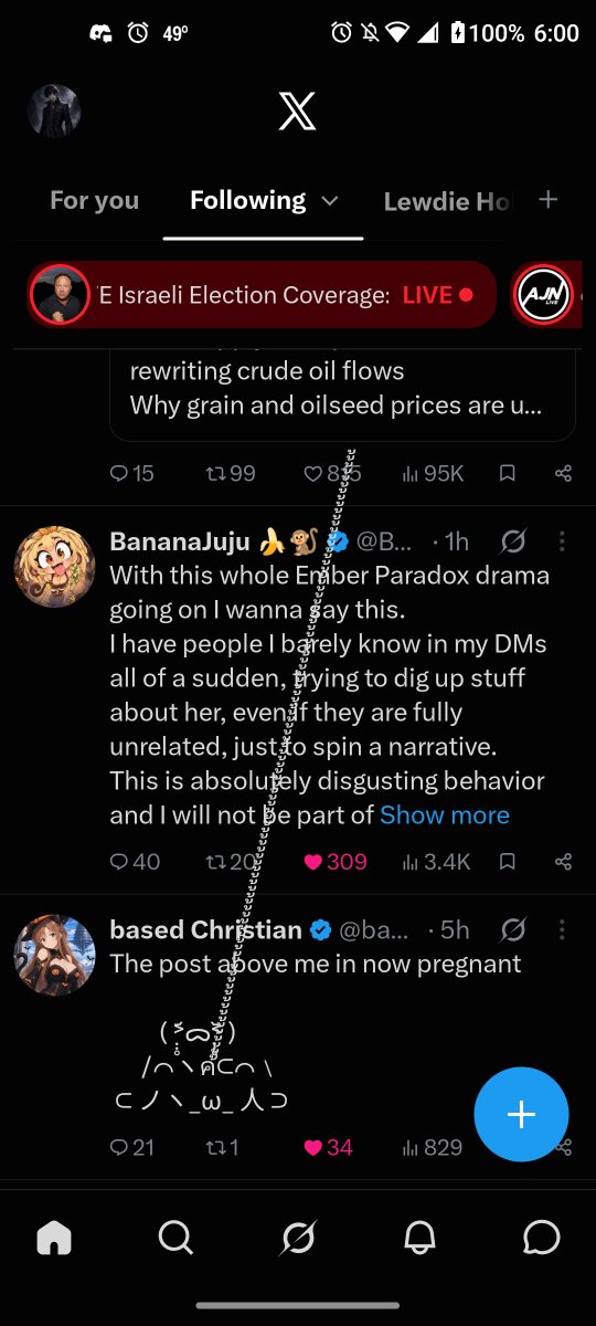
Personally speaking, I really don't care all that much. @ember_paradox helped out a lot of people with their videos. I watch her stuff while on the road, so it definitely helps in those long drives.
Even better, @LordIntellectX still sees her as friend, and frankly I think that is the best way to take away. I am not going to comment on the whole thing and the fight itself, just think that Ember should just keeps doing what she is doing.
@darlingstrawbie
Im going to be honest, this is quite low and scummy going after @ember_paradox, I’ve been following both of you for a while and Ember has been nothing but supportive to both you and your husband, @Rev_says_desu.
This is not a good look and I think its going to lead people to no longer feeling like they can trust you in friendly talks one-on-one and will lead to people wanting to keep their distance from you and reducing people believing you if drama heads you way, again.
You’re damaging your own image by going after people who would normally align with you on some, or maybe even most things, but showing that you’re willing to stab someone in the back for dumb reasons in the long run is going to backfire and you’re only going to hurt yourself.
I hate seeing the in-fighting, over and over again because it doesn’t benefit anyone and doesn’t help the community either. This is only dividing the community.
That’s just my two cents on this.
💜🎻🩸
@CAPTJackMorgan2@MYVagabondTX I just saw her video about it. As well as tacton. Tacton gave a lot of suspicion where I do think ember is a man, but whatever. This drama is really pointless.