Shine animations in CSS are actually simple to make.
.shine-container {
position: relative;
overflow: hidden;
}
.shine-container::after {
content: "";
position: absolute;
inset: 0;
transform: translateX(-100%);
background: linear-gradient(
90deg,
transparent,
rgba(255, 255, 255, 0.25),
transparent
);
animation: shine 1.5s infinite;
}
@keyframes shine {
100% { transform: translateX(100%); }
}
Now you have a reusable shine effect, that you can reuse in any container!
If you found this useful, follow for more. ❤️
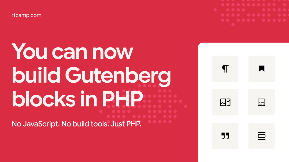
WordPress 7.0 is coming soon, and it brings something developers have wanted for a while. You can now register Gutenberg blocks in pure PHP, without needing JavaScript, a build pipeline, or npm.
Building custom blocks is set to become easier now.
【Ken Yokoyama】
昨年末に、テレビ東京『超音波「横山健スペシャル」』で放送された
Ken Yokoyama「The Golden Age Of Punk Rock Tour」ファイナルの模様をオフィシャルYouTubeで1曲ずつ2夜連続公開中ですが
https://t.co/w0idqawkeK
本日は【Stickin In My Eye】
是非ご覧ください!
https://t.co/ih0q3YDhrK


