The best thing about Spider-Noir is that because it needed to work in Black and White it was lit properly. So everything didn't look like a murky un-contrasty mush.
.@OutbreakFest Presents: Count Your Blessings | Repented
played in full, for the first time ever [manchester 10th july 2026] + other bangers.
UK, pre-order the album before tues 3pm bst for early access tickets.
https://t.co/qEFZT7e85W
Sketchbook. For the work and tests that don't quite go anywhere or went somewhere but for no one.
Will be adding more pieces periodically.
https://t.co/z9Z8CcrNT5
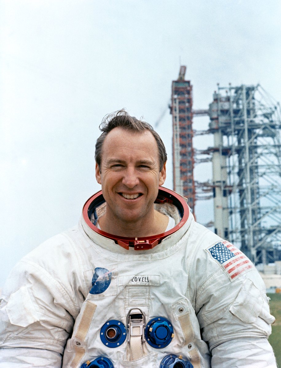
We are saddened by the passing of Jim Lovell, commander of Apollo 13 and a four-time spaceflight veteran.
Lovell's life and work inspired millions. His courage under pressure helped forge our path to the Moon and beyond—a journey that continues today. https://t.co/AjT8qmxsZI
I'm surprised there haven't been any legibiltiy/ readability concerns raised in QA with using the mono font throughout Marathon. It looks like on a 4K TV it would be very small and quite difficult to read. #UI#marathonthegame#design@Marathon


![bmthofficial's tweet photo. .@OutbreakFest Presents: Count Your Blessings | Repented
played in full, for the first time ever [manchester 10th july 2026] + other bangers.
UK, pre-order the album before tues 3pm bst for early access tickets.
https://t.co/qEFZT7e85W https://t.co/9zkwRt41qr](https://pbs.twimg.com/media/HFxjY3tXsAAlvKE.jpg)