FBI Director Kash Patel Under Oath:
“There’s no credible information that Jeffrey Epstein trafficked minors”
40 minors gave sworn testimonies that they’d been trafficked by Jeffrey Epstein.
This is treason.
This one’s a perfect example of how removing friction, not adding features can lead to major gains.
🧪 CRO Case Study
The Test:
Removing the secondary “Buy Now” (Shop Pay) CTA and adding payment icons beneath the primary “Add to Cart” button.
The Goal: To simplify the decision-making process and boost conversions by reducing checkout confusion.
The Why:
Having multiple CTAs within the cart was creating decision fatigue. Users were pausing to choose between checkout methods instead of confidently clicking the main button. We hypothesized that by focusing on a single, primary “Add to Cart” CTA and displaying payment icons below for reassurance, we could streamline the experience and increase completion rates.
The What:
1. Removed the secondary “Buy Now” Shop Pay button.
2. Kept one clear primary CTA (“Add to Cart”).
3. Displayed accepted payment icons directly below for trust and reassurance.
The Results:
$44,562 per month
$534,744 per year (forecasted)
Higher Add to Cart rate and overall CVR
Give me a follow @oliverkenyon for more case studies.
Cheers.
If your hook rate is low → Your ad is dead.
If your hold rate is bad → Your story is boring.
If your CTR is weak → Your offer is unclear.
Here’s the simplest step-by-step guide to fix each issue:
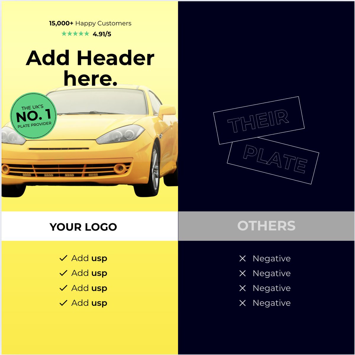
My checklist for “Us vs Them” ads that avoid lawsuits:
1. Only compare factual attributes
2. Never insult competitors
3. No emotional claims
4. Hide logos unless facts are proven
5. Use measurable specs
6. Highlight product differences
7. Keep copy objective
8. Avoid medical claims without proof
9. Use simple visuals
10. Always stay inside FTC guidelines
Safe comparisons still sell like crazy.
Text-based ads always crush during promo periods. Idk why, but they are crushing for us in Q4.
Here are 4 formats we took inspiration from:
- Apology Letter (Nuuds)
- Apple Notes (Warmies)
- Announcement Style (HeyShape)
- Big Text Offer (Sculpd)
You don't need a designer. You can literally create these yourself in 10 minutes.
Good luck everyone!!!
Photo ads are the most slept-on creative in Meta Ads right now.
But when you do them right, they beat video every time.
Here’s the step-by-step framework we use to scale them to $10K/day
(Spoiler: You won’t regret reading this) 🧵
13 next-gen static templates that are crushing it in EU
Like, Comment, RT = you're a real one
Make a copy to edit them in Canva
1x1: https://t.co/ZkqQtr8uEF
9x16: https://t.co/JacHLA12o3
Most brands plateau because they use the same hooks for every audience.
But different awareness stages need different psychological triggers.
Master all 5 stages and your audience pool becomes unlimited. (BOOKMARK THIS)
> Upload your ad comments into ChatGPT
> Rank objections by most popular
> Get Claude to write a Facebook ad script addressing the objection
> Make a comment response ad out of it and thank me later
We've made 4 of these so far and 3 have worked
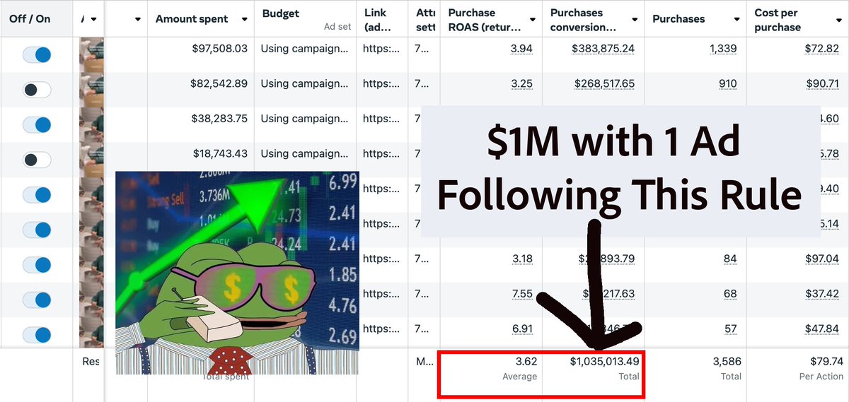
If you want to make ads that generate $1M (not $10k)
Master the Rule of 1:
1 Avatar
1 Desire
80% of Ecom brands mess this up, then wonder why competitors with trash products lap them while they stay stuck burning cash on "more creatives"
Stop trying to target multiple things in a single ad or LP
Everyone keeps trying to make ads appeal to everyone
Even when you "niche down" it's way too general
The more stuff you cram into an ad and landing page, the more you confuse people.
One avatar. One desire. One message.
Your whole user journey from seeing the ad to converting at checkout needs to be congruent
The more specific you can be to that one person's wants, the more it resonates with them
Which generates belief, and the stronger the belief, the higher the likelihood they CONVERT
Everyone knows about targeting specific groups - that's beginner stuff.
Level 5 thinking is understanding your customers better than they understand themselves
Most people think these are avatars:
People with back pain ❌
Office workers ❌
Busy moms ❌
These are demographics, not avatars
What's their age, their job, their day-to-day struggles, what does their day look like, etc
Real avatars look like this:
"42-year-old marketing director Lisa who sits in Zoom calls for 8 hours, gets shooting pain when she stands up, and is scared she'll need surgery like her sister did."
She believes she's "too busy" to fix this properly and that all quick solutions are scams.
She wants to be seen as someone who has her life together - the executive who can handle anything.
She's tried yoga apps, ergonomic chairs, and physical therapy but nothing stuck because she couldn't commit the time.
Her daily struggle? Hiding her pain during video calls and popping ibuprofen like candy while pretending everything's fine.
This avatar knows her fears, her failed attempts, her self-image, and her daily reality.
When she sees an ad that speaks directly to "marketing executives who are one meeting away from needing surgery", she will stop scrolling.
That's the level of depth we're talking about.
The same thing applies to Desires:
"Be more confident" ❌
"Look better" ❌
"Feel healthier" ❌
These are wants, not desires. Go deeper.
Keep asking why to find the real desire:
Look better" > "Feel confident" > "Turn heads at reunion" > "Make ex realize what he lost" > "Feel desired and wanted again" (Deep desire) > To be loved (Mass Desire)
Now you've got something that converts.
You can have identical products but make 10x different revenue
Two supplement brands selling the exact same thing:
Brand A targets: "Busy moms who want energy"
Brand B targets: "38-year-old Michelle who used to run half-marathons but now falls asleep putting her kids to bed and wants to feel like herself again, etc etc"
Brand B wins every time.
They own that customer. Brand A fights with 1000 other "energy" brands for scraps.
These are the things that separates $100k months from $1M months
On top of that, your landing page needs to match your ad exactly.
Kills conversions:
Ad says "look sexy for your husband" → Landing page talks about "general confidence"
Prints money:
Ad says "make him unable to keep his hands off you" → Landing page continues that exact story
This way the whole user journey is optimised for ONE particular person and their specific desire
This is how you get killer ROAS/CPAs
The customer journey is just so believable and feels tailor-made just for them.
Not like the brand/product was made for other people, but for them.
Don't tell me you've niched down until you've done this level of work.
And if you planned these variables out before you started writing the ad, the overall outcome will be much better since you already know who and what you want to target
It also makes learnings on the ads much easier since the variables are stated beforehand
It is a simple rule
You can keep throwing sh*t on the wall and hope something sticks
Or have more intent behind your ads, mastering the rule of 1
And creating Chad ads that scale
Tis the way of the chad scaler
Been in marketing 16+ years…but I never knew this!! 🤯
🧠 According to science, “placebo buttons” (buttons that give a sense of control over an experience, but may not actually be necessary…like the “close door” button on an elevator) can drastically increase customer satisfaction.
This works because it gives people a sense of agency over their choices, which reduces frustration, improves trust, and boosts conversions.
Examples:
The X button on pop ups.
The “add to cart” button.
Progress bars on checkout pages.
Steal these 7 placebo-powered UX tweaks to boost trust and conversions👇
1. A “Hide This Product” Button – Let users remove stuff they don’t want to see, even if nothing changes behind the scenes.
2. “Show Me Something Else” Button – Offer an alternate choice instead of a hard “no”, it feels more respectful.
3. Minimal vs. Detailed View – Let people toggle info density so they feel in control of how they shop.
4. Remind Me Later – Give users the power to snooze popups, trials, or offers. They’re more likely to return.
5. “Show Fewer Like This” Reviews – Filter or collapse irrelevant reviews so the experience feels tailored.
6. Smart Unsubscribes – Replace “unsubscribe” with “pause,” “send less,” or “only send X.” Retain trust, reduce churn.
7. Mute a Feature – Let people hide benefits they don’t care about. It’s segmentation disguised as empathy.
Source: https://t.co/lTJ4VgLkyX
Building a business just got 10x easier in the last 7 days.
I used GPT3 to scale my SaaS business
Now custom GPTs have rigged the whole game!
Here are 15 golden GPTs to accelerate your next startup 🧵