this ad from happy mammoth has been running for months now with crazy engagement
and it's an ugly ad
so how does something like this pull numbers like that
it's because it's new to the human eye
when you see something weird, something you haven't seen before, your brain stops to figure out what it's looking at
that hand drawn style does exactly that
it almost gives this nostalgia of how a kid would draw their mom
and that hits different than another polished product shot
then "spare tire" instantly tells you we're talking about belly fat
no explaining needed, the customer already knows what it means
and instead of making it hard to understand, the copy is dead simple
it complements the before and after visual perfectly
easy to read, easy to get, paired with an art style you just don't see in ads
the messaging is creative but it doesn't sound like an ad
the visual doesn't look like an ad either
simple message, hand drawn, trust badges sitting quietly at the bottom
nothing about it screams "i'm selling you something"
and that's exactly why it sells
one thing i notice with statics is when the copy has too many pauses
imagine reading something, then a sudden pause, then another one
it breaks your flow and makes it annoying to read
when i build statics i minimize the pauses
that way the reader can digest the copy peacefully without thinking too hard
they absorb it quickly and keep moving
smooth copy feels easy to read
and easy to read means easy to believe
how to spot a good static vs a bad one
good ones you understand at first glance
you know who it’s for, what it’s selling, and what you’re supposed to feel
all in one look
it’s super specific on who it’s targeting too. selling to anyone is selling to no one
bad statics? the design and copy are disconnected, saying two different things
everything looks too perfect, too polished, completely unrealistic
and you can tell there was zero research behind it
don’t underestimate statics
the good ones look simple
but simple is the hardest thing to get right
trying to challenge someone's belief head on is a losing battle
they'll just scroll past or argue in the comments
the smarter move is to go to reddit first
read what they've tried, what failed, what they're frustrated about, what questions they're still asking
because somewhere in that research is the exact belief that's blocking the sale
and once you know what it is you don't fight it
you meet them where they are
the visual does that job before the copy even loads
if the design looks like every other ad they've already ignored, they're gone before they read a single word
design something that feels categorically different
so by the time they hit the headline
the belief is already starting to crack
and the copy just walks them the rest of the way
guys don’t expect too much if you’re just copy pasting statics from other brands and feeding them to claude without knowing the fundamentals
without knowing who your static is made for, who you’re trying to sell, what they actually feel
without even reading breakthrough advertising (Non-negotiable)
i promise you it’s not gonna scale
and if it did, congrats you won the lottery
most people making statics are just copying formats they saw work for someone else
without knowing why it worked in the first place
so the concept doesn't match the copy, the copy doesn't match the visual, and the whole thing just falls apart
the whole point of a static is to hit an emotion with the image and confirm it with the copy
if they're pulling in different directions the reader feels nothing
and people who feel nothing keep scrolling
A lot of brands treat statics like a video, where the visual is saying everything but the copy is still repeating the same thing
it's like telling a joke and then explaining what the joke means 💀
if your ad makes the customer feel stupid for having the problem
they leave
people don't buy from ads that make them feel bad about themselves
they buy from ads that take the blame off them
name the real enemy
the system, the misinformation, the hidden mechanism
shift it from "why can't I fix this"
to "now I know what's been keeping me stuck"
that's when the product becomes the weapon
not the lecture
the visual in your ad is like the body of a car
nobody buys the body
they buy what the car does to their life
same thing with design
nobody stops scrolling because your ad looks expensive
they stop because something in those first 0.3 seconds
felt true to them
a beautiful car body with no engine
just sits there looking good
people walk past it, say "nice"
and keep moving
that's most ecom ads right now
gorgeous. well-designed. completely still.
the body is the design
the engine is the copy
and you can't drive a body
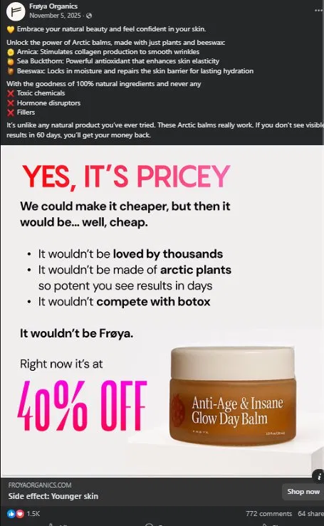
772 comments on a skincare ad
and the headline is just: YES, IT'S PRICEY
most brands spend the whole ad apologizing for the price
this one made the price the argument
because there's a shortcut in your brain that never turns off
expensive = quality. cheap = corners cut somewhere.
so when Frøya admitted it upfront
they didn't lose trust
they built it
then they named what cheap actually means
toxic chemicals. hormone disruptors. fillers.
they didn't list competitors
they made cheapness itself the villain
then one line: "competes with botox"
botox is $500 a session
now the math in your head completely changed
40% off landed after all of that
and it didn't need to do any heavy lifting
the sequence is the strategy
price admission → villain → anchor → offer
flip that order and the whole thing falls apart
cold traffic doesn't care how your product works
they're not there yet
they're still deciding if they have the problem
most brands show up explaining the mechanism like a professor
to someone who hasn't even enrolled
MOF is where mechanism earns its keep
that's when buyers are comparing, researching, asking "but why is yours different"
give them the why there
BOF? just tell them why today. that's it.
wrong message at the wrong stage isn't a creative problem
it's a timing problem
and timing problems look like bad ads
Nobody talks about this but the sub-headline is doing 50% of the work in your static
most brands waste it
they repeat the headline in different words
or describe the product features
or stuff in another claim
the sub-headline has one job
take the avatar from the hook to the click
three ways it does that:
1. deepens the mechanism (why does this actually work)
2. names the enemy (what's making the problem worse)
3. shows the after (what life looks like when it's fixed)
pick one. commit to it. the rest is filler
if your sub-headline could be removed and the ad still makes sense
it wasn't doing its job in the first place
been thinking about this a lot lately
most ads die because they're trying to teach the avatar something new
but the avatar's brain hates being corrected mid-scroll
they don't wanna learn, they wanna feel understood
if your ad says "you've been doing it wrong"
they scroll past instantly
ego protection kicks in
but if your ad says "you've been doing the right thing, here's the missing piece"
now they're listening
stop fighting the beliefs they already have
build on top of them
that's the whole shift
quick test for any static you make
cover the headline. does the visual still tell the story?
cover the visual. does the headline still make sense?
if both pass, the ad is locked
if one fails, the ad is broken even if both elements are good
most ads have a sync problem
the avatar feels the disconnect but can't name it
they just scroll past