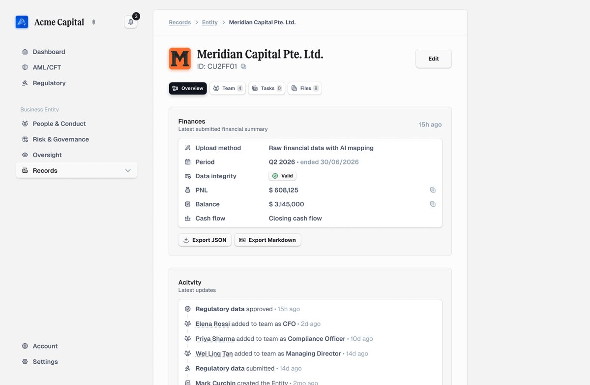
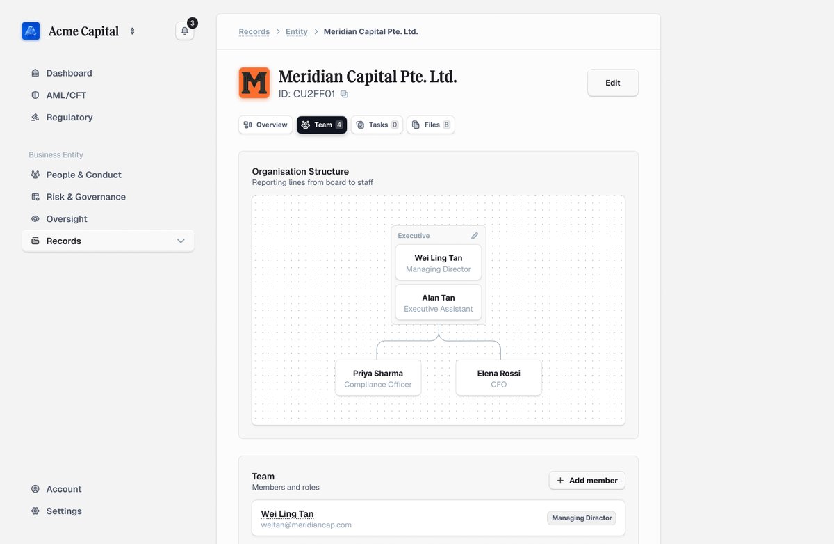
When our client runs many projects in parallel, the hard part is seeing the right information at a glance and having a clear log of what collaborators changed.
What was previously scattered across different pages, we successfully combined it on a single page with the right priorities: financials and activity up front, related records one click away.
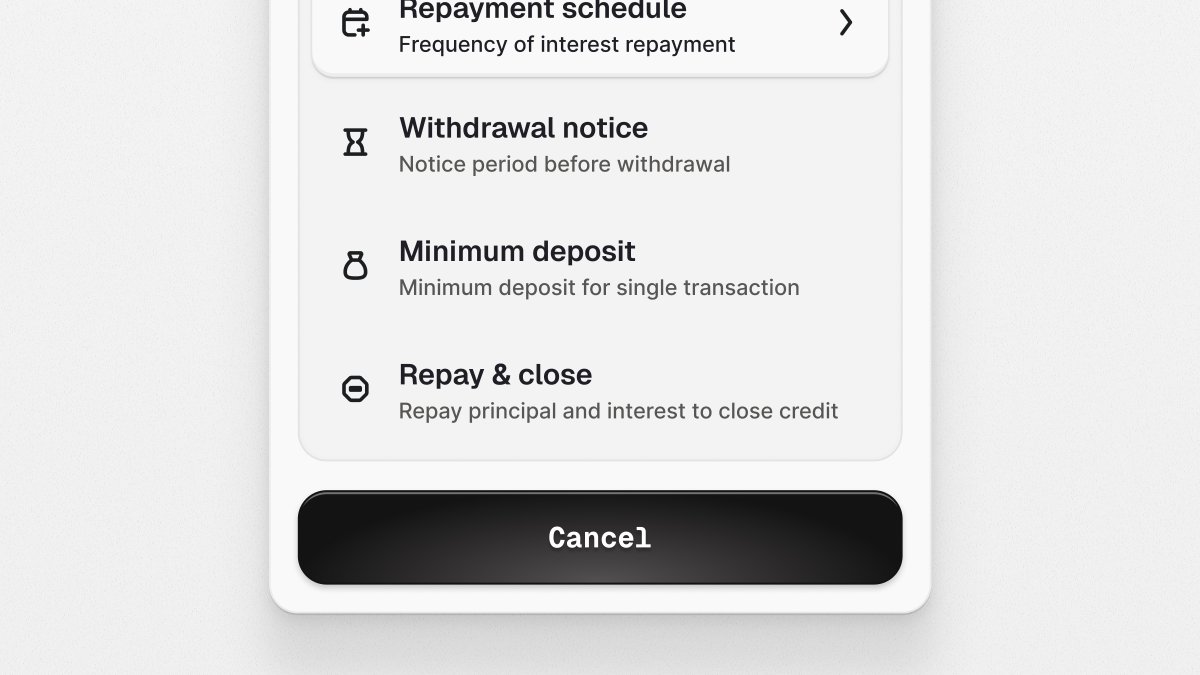
Explored two versions of UX for this pop-up. This one had the most confusing execution in the client's app. What used to be a split screen job to match the values from a spreadsheet is now a few clicks away.
We chose the first version, where the user performs less clicks, has less friction and more things at a glance. Which one do you prefer?
Explored two versions of UX for this pop-up. This one had the most confusing execution in the client's app. What used to be a split screen job to match the values from a spreadsheet is now a few clicks away.
We chose the first version, where the user performs less clicks, has less friction and more things at a glance. Which one do you prefer?
Client came with an emergency. We redesign the whole app in two days, and it went live two days later.
Looks simple on purpose. Once the guidelines were agreed, we spent the rest of it on the UX they were struggling on, not polishing the buttons.
Most people would’ve spent those four days nailing shadows. We just fixed what users didn’t understand.
Client came with an emergency. We redesign the whole app in two days, and it went live two days later.
Looks simple on purpose. Once the guidelines were agreed, we spent the rest of it on the UX they were struggling on, not polishing the buttons.
Most people would’ve spent those four days nailing shadows. We just fixed what users didn’t understand.
More and more often we receive requests from clients to redesign or rebuild their vibe-coded application. The story usually goes around "our intern built it for us or we built this with a dev house and it doesn't work further".
Not saying you can't build solid apps or sites with AI, it's the 20% remaining after vibe-coding that requires a great eye and knowledge to polish it.
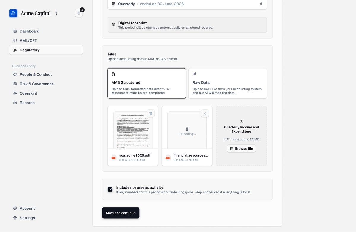
The single screen you see here used to be 5 steps inside client app. Which means more click, more friction, more context for the user to keep in their head. We grouped related information together and arranged it intentionally making it possible to fit on a single screen without the mental overload.
More and more often we receive requests from clients to redesign or rebuild their vibe-coded application. The story usually goes around "our intern built it for us or we built this with a dev house and it doesn't work further".
Not saying you can't build solid apps or sites with AI, it's the 20% remaining after vibe-coding that requires a great eye and knowledge to polish it.
The single screen you see here used to be 5 steps inside client app. Which means more click, more friction, more context for the user to keep in their head. We grouped related information together and arranged it intentionally making it possible to fit on a single screen without the mental overload.
Meet the founders. A feature, previously available for premium calendars now available for free with AI. Book meetings with multiple people simultaneously. It takes care of each other's availability as it should with a simple UX.
It took our engineering team three days to deliver it.
- Connects with Google Workspace or even external Google Calendar accounts.
- Build custom booking links with selected people
- Set custom duration and breaks between meetings
- Collect analytics
- One-time-booking links
Statement has some truth in it. Seniors indeed produce more and faster due to bigger past experience. Brain is also more flexible, adapting previous UI/UX to new requirements.
All works with one caveat: AI can produce even more variations but all slop in wrong hands. Don't always use speed and volume as criteria.
@mds I've encountered multiple occasions where the replies I got from Claude, Gemini or ChatGPT contained typos. So I wouldn't call it a human trademark.