Executive Producer: Leslie Uy
Senior Producer: Alex Predusel
Design Director: Martin Ehrlich
Lead Brand Designer: Jared Granger
Brand Designer: Mubeen Qassim
Lead Motion Designer: Martin Egrt
Motion Designer: Dominik Budimir
3D Motion: Kryštof Ježek
Lead Web Designer: Vítor Cardoso
Web Designer: Gilles Tossoukpé
Web Designer: Charlie I.
Illustrator: Marek Ehrenberger
Case Study Narrative: Valgeir Valdimarsson
Brand Strategy: Motto®
Web Development: Evil Martians
With Aptos, the ambition was to transform the entire brand ecosystem — breaking decisively away from typical crypto visuals.
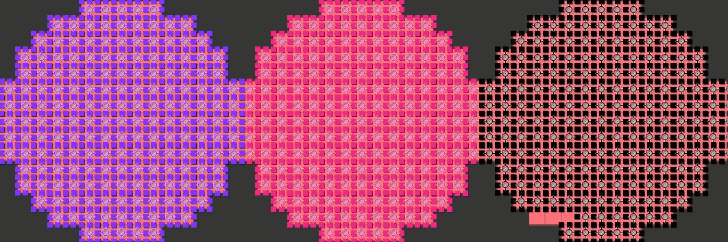
Therefore creating a brand centered around movement with @ashfallstudio required rethinking every touchpoint. Kinetic typography, animated patterns, and dynamic visual systems became core principles rather than decorative layers — forming a cohesive system built on flow, precision, and controlled momentum.
The typeface Season by Displaay supported this transformation with its variable serif–sans axis, allowing smooth typographic transitions that reinforce the idea of continuous motion and evolution.
New case study: @Aptos Brand Identity 🔥
Our most ambitious project to date.
Transforming @Aptos, one of the leading blockchain platforms serving millions of users, leaving behind the conventions of Web3 to position them as a category of one.
Take a look, link in comments 👇🏻
Executive Producer: Leslie Uy
Senior Producer: Alex Predusel
Design Director: Martin Ehrlich
Lead Brand Designer: Jared Granger
Brand Designer: Mubeen Qassim
Lead Motion Designer: Martin Egrt
Motion Designer: Dominik Budimir
Lead Web Designer: Vítor Cardoso
Web Designer: Gilles Tossoukpé
Web Designer: Charlie I.
Illustrator: Marek Ehrenberger
Case Study Narrative: Valgeir Valdimarsson
Brand Strategy: Motto®
Web Development: Evil Martians
Charmed to work on the rebrand of one of the prominent Web3 players, Aptos — with @ashfallstudio repositioning them as a trusted institutional partner for builders.
A wave-like movement was embedded not only into the logo, but carried throughout the entire identity — resembling the flow of data. Smooth, there-and-back transitions create a sense of continuity, stability, and precision.
The typeface Season by Displaay added another layer to the system. With its variable axis shifting from serif to sans serif, we were able to mirror that same fluid transformation within the typography — creating seamless transitions in motion that echo the brand’s evolution from experimental to institutional.
In a world where everything blends, motion systems are becoming increasingly vital in shaping strong connections with audiences.
In collaboration with @ashfallstudio , @cavalry__app-made dynamic motion visuals for FifthRow — an AI platform helping corporations make smarter, ROI-driven innovation decisions.
_ _
Brand: Nicolas Garcia, Mubeen Quassim
2D Motion: Martin Egrt
3D Motion: Kryštof Ježek
New @AshfallStudio release: FifthRow🔥
A brand identity that departs from typical AI clichés and builds on a clean, systematic, responsive design language. Procedurally generated patterns, responsive 5x5 grid, and smooth motion design.
Case study link in comments 👇🏻
There’s another challenge keeping me busy this month. OFFF Festival is once again calling designers and artists to create visuals for the evening mappings during the festival. You can apply even if you don’t plan to attend!
https://t.co/b7zp02cIKs
It was a pleasure to help the skilled type designers at Displaay showcase their stellar work. Usually, they’re the ones shaping the core of so many design projects—this time, the spotlight was on them.
Even better: all of their fonts are variable, which makes them an absolute playground for motion designers.
The video opens with a look behind the scenes and work in progress, then flows into custom motion of the finished typefaces—highlighting unique features such as a uniwidth style (where every character keeps the same width, no matter the weight) or a typeface with a contrast variable slider. It all comes together with beautiful examples of their fonts in use by other designers.
Motion: Martin Egrt
Music: Oliver Torr & Apu Nanu
Sound design: Jiří Machů
Sharing a short snippet from another vibrant project we did at @WE3co with Sneha about two years ago.
Curio is a game and infrastructure company pioneering on-chain games with strong user-generated content. The identity is built around playfulness, with a strong web3-native vibe.
Brand identity: @snehasanks
Motion design: @MartinEgrt
See the full project → https://t.co/HDQiiUvVWC
Introducing Identity! 🏆
A brand new template pack for animating and showcasing your brand. Perfect for:
🧭 Design guidelines and handoff
🎨 Visual identity exploration
⚡️ Decks and marketing comms
Switch in your assets and bring your logos, colours, and typography to life easily with motion.
Get started now: https://t.co/zEctnWxQu8
For 24 hours, Amsterdam’s main train station became a space for motion, not advertising. During DEMO festival by @studiodumbar, motion work replaced commercial content across the station — and beyond NL into Europe.
What stayed with me most wasn’t my own piece, but the pause from visual noise and all designers coming together at the end.
More of this! Motion as art in public space.
Recently, we’ve started organizing small designers’ gatherings in Prague with @gradual_works. The focus is always on topics that feel crucial at the moment — this time, unsurprisingly, AI.
Ideas for future sessions are very welcome, especially if something’s been on your mind lately.
A short summary is shared to your inboxes via Substack for anyone curious – in Czech and English.
https://t.co/HTnNpQCwn6