Gave Arkiv’s hero a little refresh.
Updated the imagery to give the architecture a little more room to speak.
Same direction, new first impression. Preview link in the comments.
Hey @framer community! 👋
I just officially launched ARKIV, a Framer template crafted specifically for architectural practices, spatial designers, and interior studios.
Would love to hear your thoughts on the interactions and layout rhythm!
@BHAUSZGZ@framer Hi, really appreciate the love, of course I can do that. Do you want me to do for you guys? It will be better if you dm me to chat a bit more about that.
Gave Arkiv’s hero a little refresh.
Updated the imagery to give the architecture a little more room to speak.
Same direction, new first impression. Preview link in the comments.
Gave Arkiv’s hero a little refresh.
Updated the imagery to give the architecture a little more room to speak.
Same direction, new first impression. Preview link in the comments.
Hey @framer community! 👋
I just officially launched ARKIV, a Framer template crafted specifically for architectural practices, spatial designers, and interior studios.
Would love to hear your thoughts on the interactions and layout rhythm!
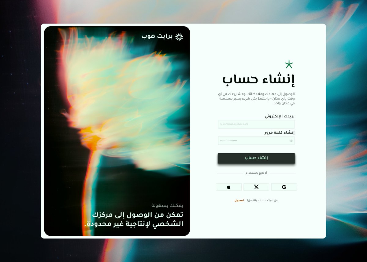
Same UI. Different mood.
Explored two visual directions for a productivity app sign-in page:
🌿Calm & focused
✦ Bold & expressive
Which direction works better?
Your studio’s About section shouldn’t feel like an afterthought.
It should tell people who you are, what you do, and what makes your work different.
Built for studios that want their work to speak first.
Preview link in the comments👇