Yeah, that makes sense!
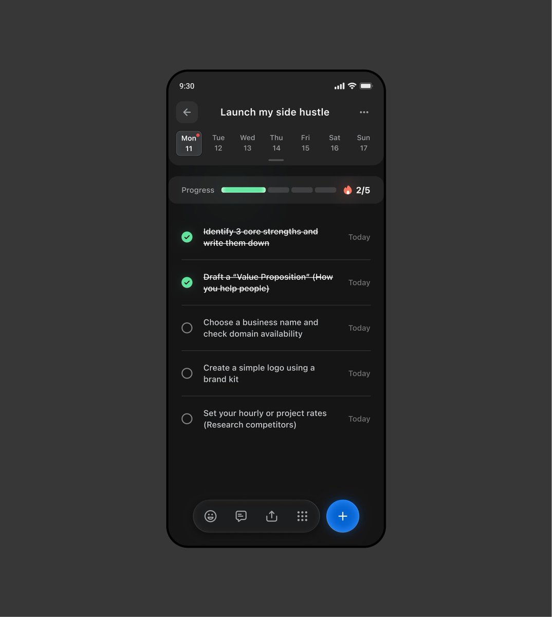
My initial idea was to hide completed tasks under the progress bar with a cool animation and make that section expandable. But that would cause the layout to shift, which isn’t great for UX either
Basically, I just wanted to give the user a sense of reward by highlighting those completed tasks
Celebrating small wins is hardwired into "Achieve," our goal-tracking sample app.
We wanted the simple act of checking off a task to feel like a celebration. Instead of the standard #Material ripple, we used Styles to drop in a custom, high-contrast completion animation—specifically, a brand-colored ring that expands and fades on tap, paired with a subtle pressed-state gradient.
It lets us focus entirely on polishing those custom, rewarding micro-interactions while Material handles the foundation.
#GoogleDesign #MaterialDesign #JetpackCompose #AndroidDev #UXDesign #InteractionDesign
Celebrating small wins is hardwired into "Achieve," our goal-tracking sample app.
We wanted the simple act of checking off a task to feel like a celebration. Instead of the standard #Material ripple, we used Styles to drop in a custom, high-contrast completion animation—specifically, a brand-colored ring that expands and fades on tap, paired with a subtle pressed-state gradient.
It lets us focus entirely on polishing those custom, rewarding micro-interactions while Material handles the foundation.
#GoogleDesign #MaterialDesign #JetpackCompose #AndroidDev #UXDesign #InteractionDesign