Most fintech + crypto landing pages don’t have a traffic problem…
They have a clarity problem.
Users don’t understand what you do in 5 seconds.
So they leave.
Here’s how I fixed that👇
@AnicryptDesigns I've seen the perfect course from @devanddesignhq but I was unable to pay for this their last edition
I'm working and praying towards getting locked in for the next edition
Most Nigerian students buy and sell on WhatsApp groups.
Listings get buried. Sellers get ghosted. Buyers get scammed.
I designed Agora — a campus marketplace built specifically for Nigerian university students.
I'll share my full design later.
There's a reason some people keep winning in crypto while you keep starting over.
And no, it's not because they're smarter,
It's not even about timing.
It's something most people in this space will never admit out loud🧵↓
#BLOKCapital
Giving away this content inspiration pack for designers.
It includes your fav designers content strategy and their top-performing posts so you will never run out of ideas (and something extra spicy if you retweet).
If you want it for FREE:
1. Comment
2. Follow me (so I can send you a message)
3. If you retweet, I'll include a secret Claude prompt (your own ghostwriter)
Do all that, and I'll send you the link to your DMs. :)
@TomHatcher03 We can definitely achieve whatever we put our mind into
Most wouldn't last for 117days before quiting
I'll us to partner for more coming updates and new projects
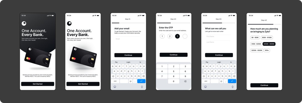
... experience the product from the very first interaction.
Good onboarding doesn’t try to impress. It helps users get started.
Founders building SaaS, AI, fintech, or crypto products, if users feel lost in your product, that’s a design problem. DM me. Let’s fix it.
Most fintech onboarding feels more like filling a form than starting an experience. Users open the app and immediately get asked for information they don’t understand yet, which creates hesitation or makes them leave early.
So I approached this flow differently
↓↓↓
The goal was to start with clarity, guide users step by step, and only ask for what matters at each stage. No extra steps, no confusion, just a clear path forward.
When onboarding is done right, users don’t feel lost. They feel progress. And that shift changes how they ...
3 things first timers check on any website before any interaction:
→ speed
→ layout clarity
→ clear call to action
If these are weak, nothing else matters.
@TomHatcher03 After Frameproof going life on App Store hope you have your plans on marketing + great design (app screenshots, landing pages) as they are the backbone of any good product