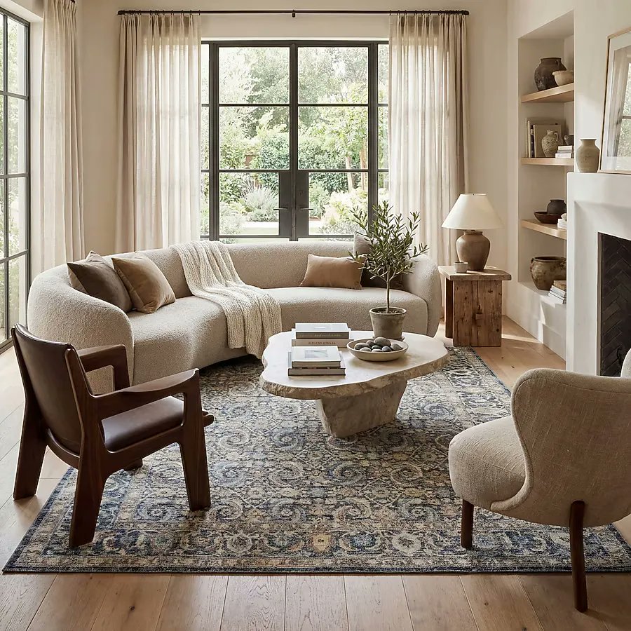
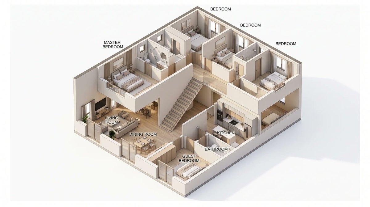
@SoraHikariii Mid-century reads calm because the plan is honest — low furniture, one long sight line, storage built to the wall so the floor stays open. Copy the palette without the planning and the same room feels like a showroom. It is geometry first, walnut second.
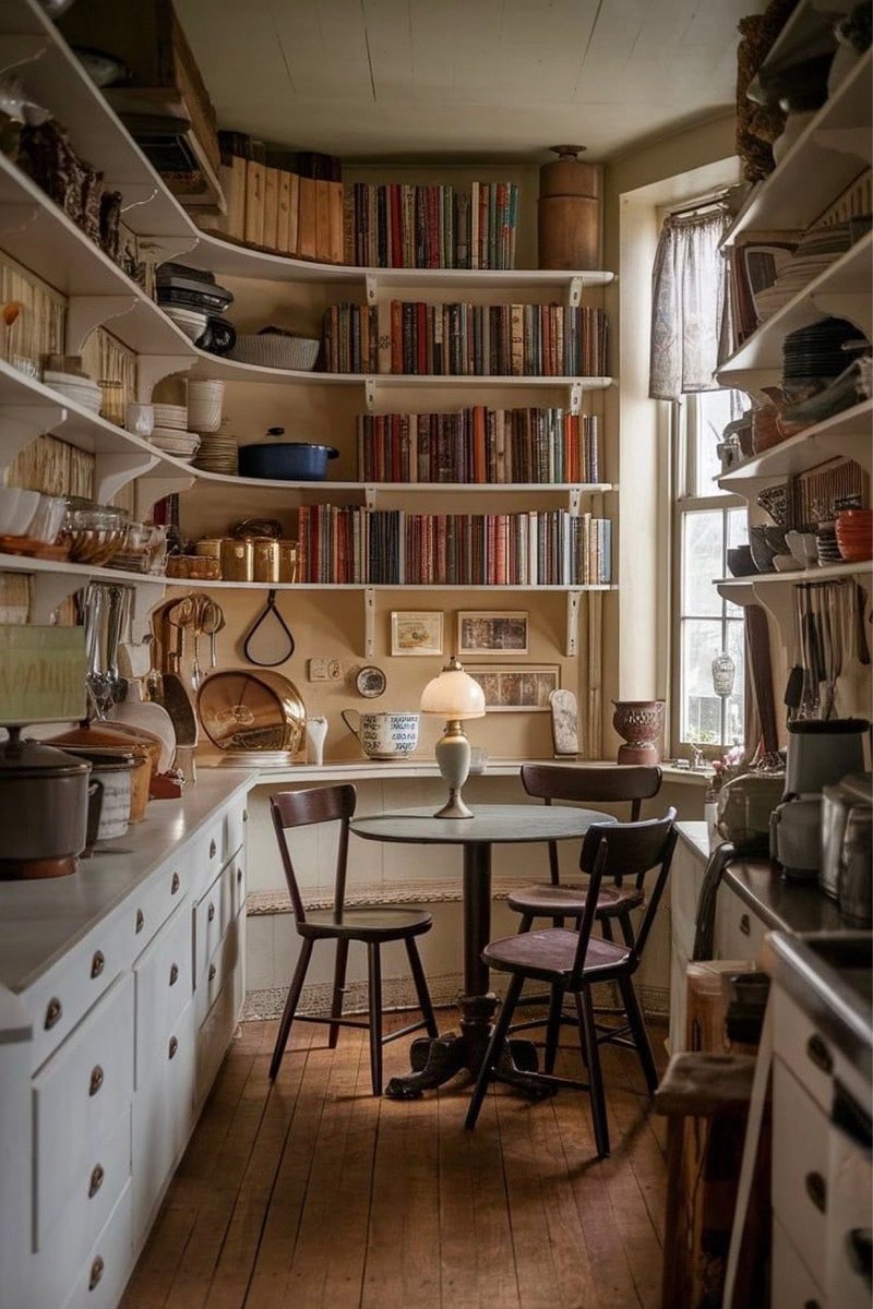
@aurearch A corner like this is really a room inside a room — depth, a low sill to sit on, light from one side only. That is what makes it restful: the plan gave it boundaries. Most unused corners are just leftover square footage nobody drew on purpose.
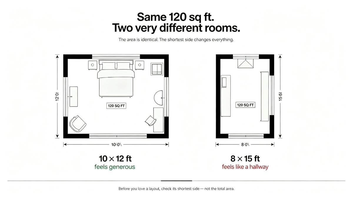
@sekarwangikuu What makes a bedroom feel calm is rarely the furniture — it is the shortest walking path. Keep it above 3 ft and even a small room reads generous. Squeeze it and no amount of styling fixes the pinch. Which one did you pick?
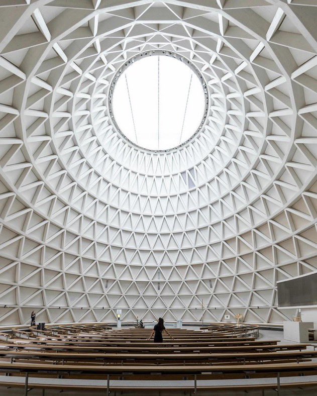
Purpose shows up in section, not in elevation. A church does its job the moment the ceiling lifts your eyes and the seating sits low enough to feel held. Same test for every plan I draw: what is this room for, and does the geometry say it out loud?
What is the “Purpose” of Architecture? This is the first and foremost question that must be answered. This is the primary goal of bring an architect, do design for the purpose…..for humanity. What did I think when I saw this Church? At first I thought…..this is good, well Interesting.
Then I thought of the “purpose”….a church. My eyes “distracted”, my attention wavered away from “God” and the purpose.
Sacred architecture, churches included, shape the experience of the human, focus them to the nature of the visit. This project does the opposite. I think the form forgot the function.
-St. Josef Church by Eberhard Wimmer in Holzkirchen, Germany
#architecture #art #sacred
@KJP Cedar does more than the shingles ever could — it changes the roof line itself, softens the whole massing, and reads as shadow instead of a hard grey edge. The mistake is picking the roof colour last. On a house like this it sets the palette for everything below.
@Watchman_motto The clock only works because the room lets it be old — green wall, gallery hang, checkerboard floor. Same clock in a white box reads as junk. Cheap antiques pay off only where the architecture agrees to age with them.
@Watchman_motto Exactly. In every floor plan I redraw, the bedroom is where the wasted square footage hides — a long empty walk to the closet, a bed floating in the middle of nothing. Take it down to 10 × 12 ft and the whole home plans better.
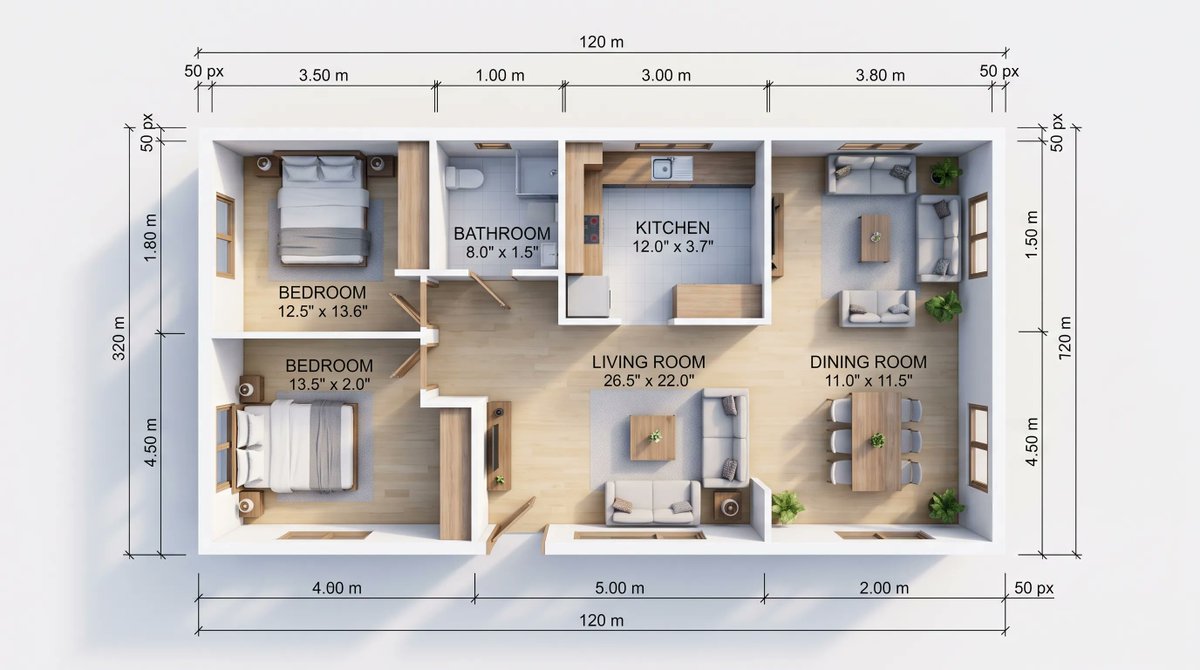
Hand-drawn sketches become clean floor plans in seconds.
Type the rooms you need — the generator handles layout, dimensions, and spacing. No CAD, no redraws.
#FloorPlan#HomeDesign#AI
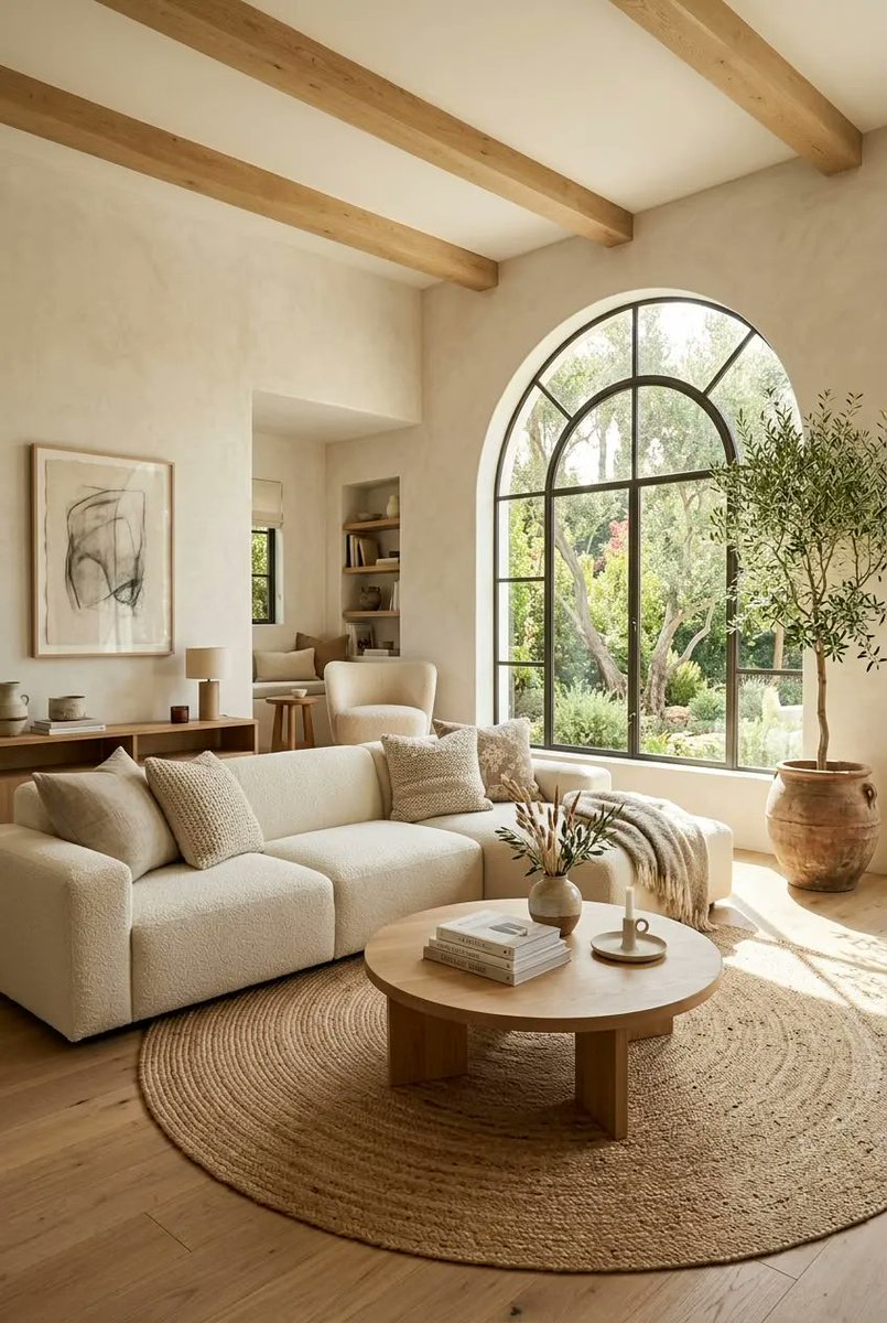
Earthy textures and soft light — that's a style, not luck. Four palettes that land the same feeling: warm minimal, japandi, earthy modern, classic. Same room, four moods. Which one would you live in? 👇 #InteriorDesign#HomeDesign
The breakthrough isn't the colour — it's the restraint. Green tile only reads expensive when three walls stay quiet and the light does the rest. Cover the whole room in it and the same tile looks cheap. #InteriorDesign#HomeDesign
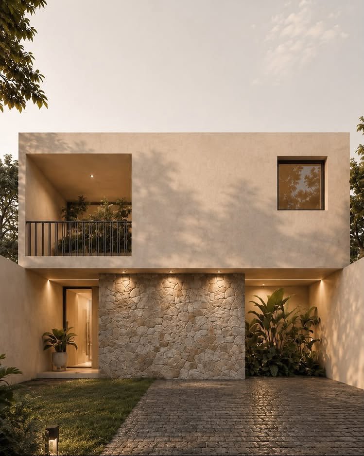
@ouchi_saikou1 The best space in a house is often the one missing from the floor plan. A canopy deep enough to take off a raincoat has no room label and no square footage — but it decides how you arrive home on every rainy day.
A 120 sq ft room at 10 × 12 ft feels generous. The same square footage at 8 × 15 ft feels like a hallway. Before you love a layout, check its shortest side — not the total area. #FloorPlan#HomeDesign#InteriorDesign
@daphinissimo2 Small toilet + bold wallpaper is a ratio problem, not a taste problem. Keep the pattern on one wall only — the one you face least — and let the rest go quiet. Strawberry Thief works because the birds read as texture at that distance. Flat yellow is what shouts.
A breezeway is really a plan decision — it links rooms the layout kept apart. The deck reads short here because it has no destination yet. Stretch it a couple of metres and it stops being a passage and becomes a room without walls. #HomeDesign#Architecture
@Narunyan0123 Funny how a floor plan gives away its generation. A toilet off a balcony was just how you got cross-ventilation before mechanical fans existed. The trade-off never changed: you gain air and daylight, you lose a usable balcony.
@clavis_km Ceilings are the one surface you can redraw without touching the floor plan — and they change a room more than any cabinet finish. Drop a cove up there and the light bounces, so the same footprint reads taller and warmer at once.
@ichijo_flat60 "What can guests see" is the line most plans never draw. Capacity gets the attention; sightlines get what's left.
A wall as a visual stop in front of open storage is a clean fix — cheaper than a door, and it makes the entry read intentional.