Same product.
Which hero section would make you stop and keep scrolling?
Current: Looks good.
Updated: Tells you exactly why it matters.
Which one are you clicking first?
You launch the page.
Refresh your Shopify.
Traffic starts coming in.
Then... silence. ☹️
Not because your product is bad.
Your above-the-fold section just didn't give people a reason to stay.
You only have a few seconds to make that first impression.
Happy New Month!
Here's to better creatives, stronger landing pages, and more conversions.
Let's build brands that don't just get clicks, but turn them into customers.
Welcome to your best month!
#HappyNewMonth#July#BuildInPublic
The goal of a static ad isn't to explain everything.
It's to earn the next click.
One clear message.
One obvious benefit.
One reason to stop scrolling.
The simpler the creative, the easier it is for the right customer to say, "I need this."
Need a static ads designer? DM me
I used to think a landing page had one job:
Get the sale.
Now I think it has a different job.
Reduce uncertainty.
Every visitor arrives with questions.
Every section should answer one of those questions.
Because conversion isn't usually one big decision.
The most expensive part of your landing page isn't the design.
It's the traffic that leaves because the first screen gave them no reason to stay.
One screen.
One chance.
One decision.
Here's one I designed in @figma
Your customers aren't reading your page on a 27-inch monitor.
They're scrolling on a phone.
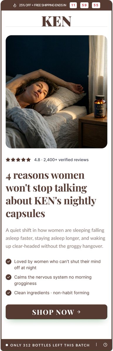
That's why listicle pages work.
- Easy to scan.
- Easy to consume.
- Easy to buy.
When mobile users can quickly find the information they need, conversions follow.
I've realized something while designing for brands.
Founders know their product inside out.
Customers don't.
The gap between those two is where most ads lose people.
What keeps customers coming back to a brand?
The product, the experience, the messaging... or something else?
Your product might be great.
Your offer might be strong.
But if the mobile buy box feels overwhelming, many visitors won't stay long enough to find out.
Good design isn't just about appearance.
It's about making the next step obvious.
A small screenshot of an Advertorial page in @figma
I tried to make the page simpler, clearer, and easier to read.
The goal isn't to make it look fancy.
The goal is to help people understand the product and feel confident buying it.
A winning Meta ad is not trying to impress everyone.
It’s built to make the right customer think:
Finally… this is exactly what I’ve been looking for.
Built in @figma
A $50/day ad account and a $50k/day ad account don’t think the same.
The difference isn’t always the creative.
It’s the testing.
1. Hook.
2. Angle.
3. Offer.
4. Landing page.
5. Checkout.
Small improvements compound.
A better hero section isn't about looking good.
It's about making the value clear in the first 5 seconds.
Here's a recent mobile redesign I worked on.
Which version would catch your attention first: Current or Updated?
We tested two static ads this week.
Same product. Same audience.
Only difference was the hook.
One did 2x more clicks just because it spoke clearer pain upfront.