Your product might be great.
Your offer might be strong.
But if the mobile buy box feels overwhelming, many visitors won't stay long enough to find out.
Good design isn't just about appearance.
It's about making the next step obvious.
A small screenshot of an Advertorial page in @figma
I tried to make the page simpler, clearer, and easier to read.
The goal isn't to make it look fancy.
The goal is to help people understand the product and feel confident buying it.
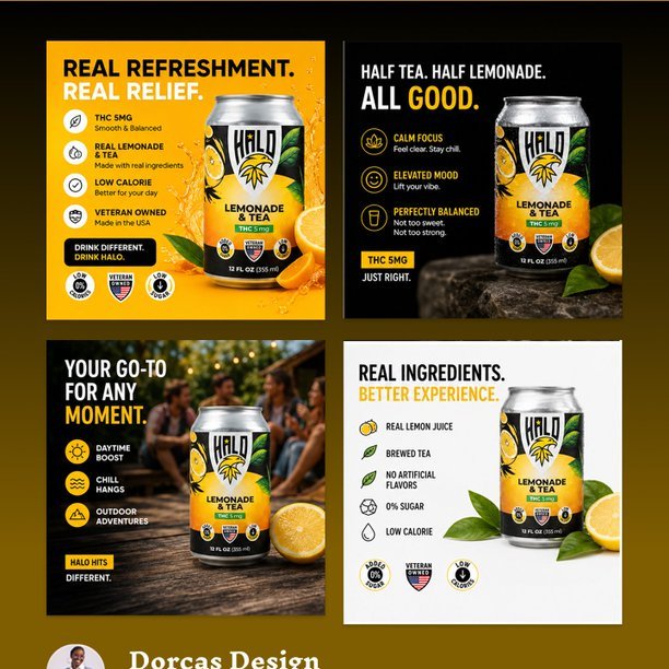
A winning Meta ad is not trying to impress everyone.
It’s built to make the right customer think:
Finally… this is exactly what I’ve been looking for.
Built in @figma
A $50/day ad account and a $50k/day ad account don’t think the same.
The difference isn’t always the creative.
It’s the testing.
1. Hook.
2. Angle.
3. Offer.
4. Landing page.
5. Checkout.
Small improvements compound.
A better hero section isn't about looking good.
It's about making the value clear in the first 5 seconds.
Here's a recent mobile redesign I worked on.
Which version would catch your attention first: Current or Updated?
We tested two static ads this week.
Same product. Same audience.
Only difference was the hook.
One did 2x more clicks just because it spoke clearer pain upfront.
Most brands are obsessed with making ads look premium.
Customers are obsessed with one thing:
"Will this actually work for me?"
That's why simple benefit-driven ads often outperform beautiful designs.
Trust beats aesthetics.
Results beat decoration.
Sales beat awards.
Your customers aren't reading your page on a 27-inch monitor.
They're scrolling on a phone.
That's why listicle pages work.
- Easy to scan.
- Easy to consume.
- Easy to buy.
When mobile users can quickly find the information they need, conversions follow.
Cold traffic rarely buys on first exposure.
A PDP expects trust that doesn’t exist yet.
A listicle page builds that trust first.
So instead of “visit → bounce”, it becomes:
visit
understand
compare
click
buy
That natural flow increases conversion without increasing traffic.
A client once asked for "more design."
What the ad actually needed was fewer distractions.
What i change?
I cleaned it up, simplified the copy, and the message became impossible to miss.
Simple doesn't mean boring.
I spent part of today refining a Buybox in @figma, and I kept asking myself one question:
If I landed here as a customer, would I feel confident enough to buy in the next 10 seconds?
That's the job of the buy box.
Not to look pretty.
Not to win design awards.
To remove doubt
People don't buy because your ad looks expensive.
They buy because your ad makes them feel understood.
Every static ad created should start with one question:
What problem is the customer trying to solve today?
Be honest, what makes you click an ad? The design or the words?
Brands obsess over creatives.
Customers obsess over the buy box.
The ad got the click.
The buy box has to earn the sale.
If your product page can't build trust, answer objections, and make the decision feel easy, no amount of creative testing will save it.
Cold traffic rarely buys on first exposure.
A PDP expects trust that doesn’t exist yet.
A listicle page builds that trust first.
So instead of “visit → bounce”, it becomes:
visit
understand
compare
click
buy
That natural flow increases conversion without increasing traffic.
You might be losing 70% of buyers in the first 5 seconds.
Not because the product is bad, but because the above-the-fold doesn’t make them stay.
The first screen decides everything.
#cro#ecomgrowth#landingpagedesign#dtcmarketing#branding