I can’t believe my daughter just turned 4
Time goes by way too fast and I absolutely hate it
I know I have a WAYS to go but my takeaway so far —the worst part about being a parent is watching them grow up
It’s not the tantrums.
Not the late night wake ups.
Not having to go back up to her room for 30 minutes to talk to her about how wolves won’t attack her while she sleeps (that’s on me for including mean wolves in my make-believe story).
It’s seeing her become this awesome little girl that’s forgotten the cute words she used to say that made no sense
Cherish every bit you can
It’s been magical but holy shit it also sucks
Good morning, world! 🌎
We have spectacular new high-resolution images of our home planet, all of us looking back through the Orion capsule window at our Artemis II astronauts as they continue their journey to the Moon.
From Fox:
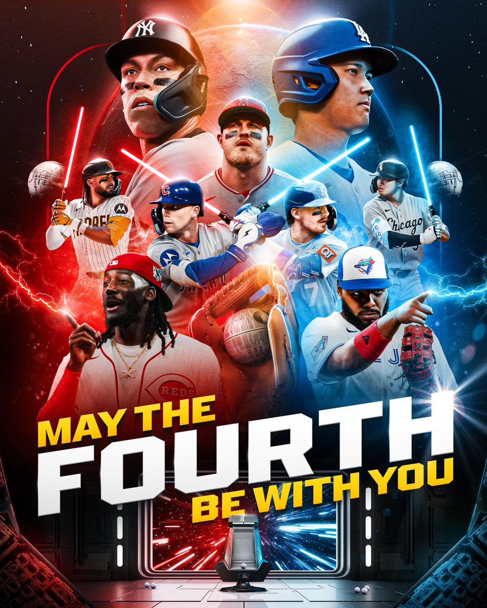
World Baseball Classic championship game viewers (in USA): 10.8 million
Comparisons among U.S. viewers:
2025 World Series average: 15.5 million
2025 NBA Finals average: 10.2 million
The IHSAA and Drive Toyota would like to congratulate Abby Lusk of Pocatello High School on being named this weeks Athlete of the Week! Congratulations🎉
Despite losing four starters from last year's championship team, the Pocatello girls basketball squad ran it back in 2026, defeating Sandpoint for the 5A state title! #IDPreps
https://t.co/lCh1nY2keg
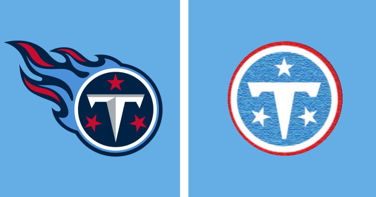
@TicTacTitans I just hate that it seems like they are abandoning the navy blue. I think the navy could look really good with this new rebrand as an accent color.
I honestly like the logo fine, but there is nothing that can convince me that it was a good idea to abandon navy blue. We are not the Oilers anymore. It’s a really cool throwback color scheme, but it’s not Titans.
Navy blue, light blue, and white - with subtle red accents - is a unique, sharp color scheme. And two-tone blue has been a core component of the Titans brand since inception. Would be a shame to jettison all of that in order to overcorrect a horrendous wardrobe run from 2018-25.
If this is truly the new Titans logo, it immediately becomes one of the worst in the NFL.
A complete downgrade that continues the absolutely terrible trend of minimalism in sports.
Show some uniqueness. Not just another lazy circle logo