PhD, geodetic engineer; map projections, cartographic tools; Opinions are my own.; It is good to live on the ellipsoid, because on the sphere would be too easy!
I am pleased to announce that the Equal Earth world map is now available in Macedonian, thanks to Daniel Evrosimoski, plus 18 other languages. You can download them for free here: https://t.co/mCHI9I8NBQ
Day 109 of #365DaysOfMaps. April 19th is National Hanging Out Day. A day to extol the benefits of air-drying your laundry. Yep. Really. Allows me to give a nod to a famous mapping quote, and AI to miscount an entire continent.
Hung Out to Dry 109/365
https://t.co/UyfUkKjCYp
Day 109 of #365DaysOfMaps. April 19th is National Hanging Out Day. A day to extol the benefits of air-drying your laundry. Yep. Really. Allows me to give a nod to a famous mapping quote, and AI to miscount an entire continent.
Hung Out to Dry 109/365
https://t.co/UyfUkKjCYp
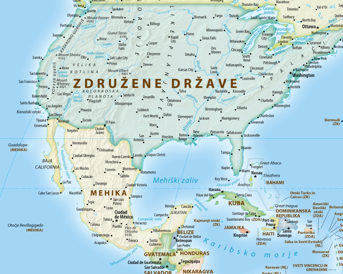
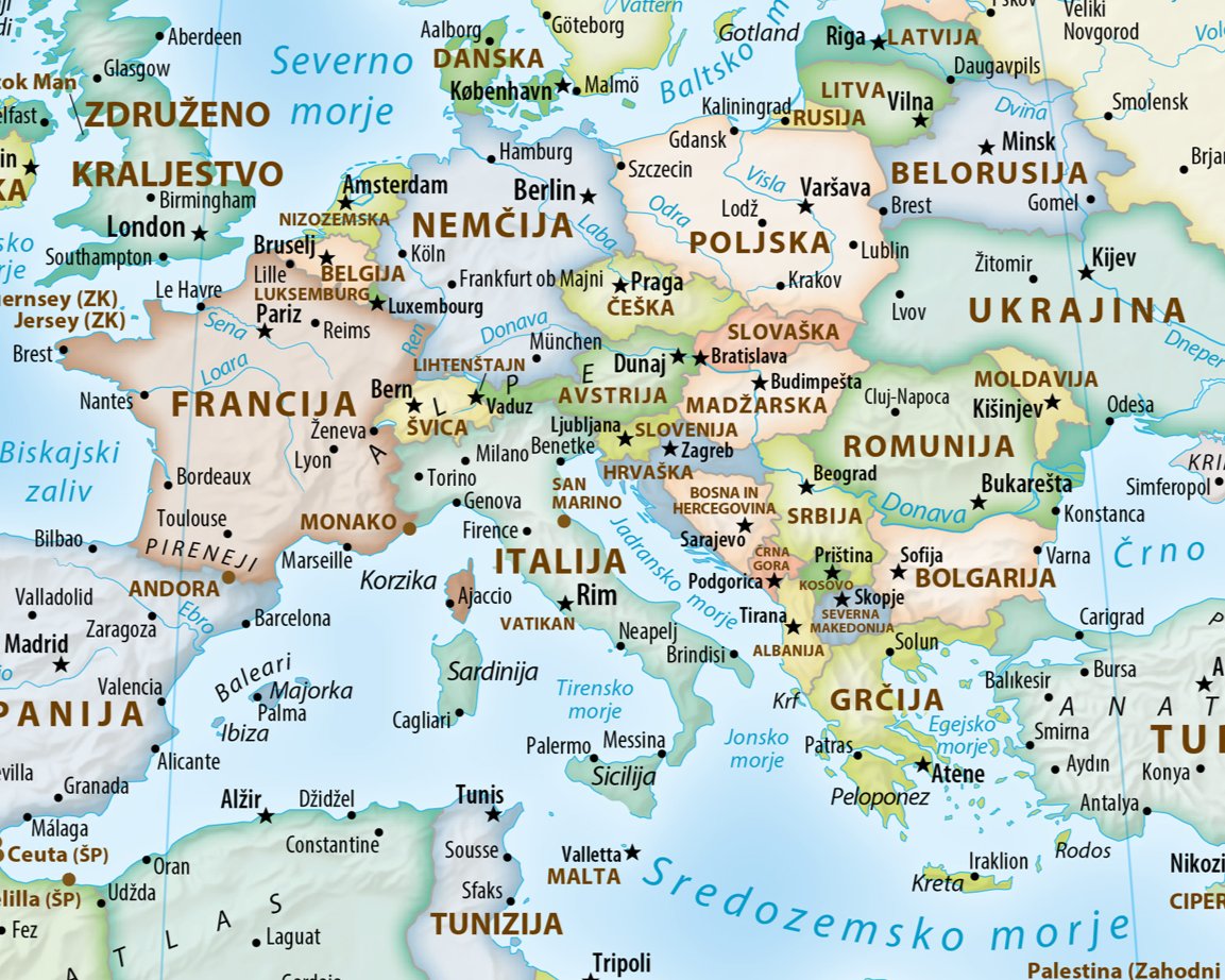
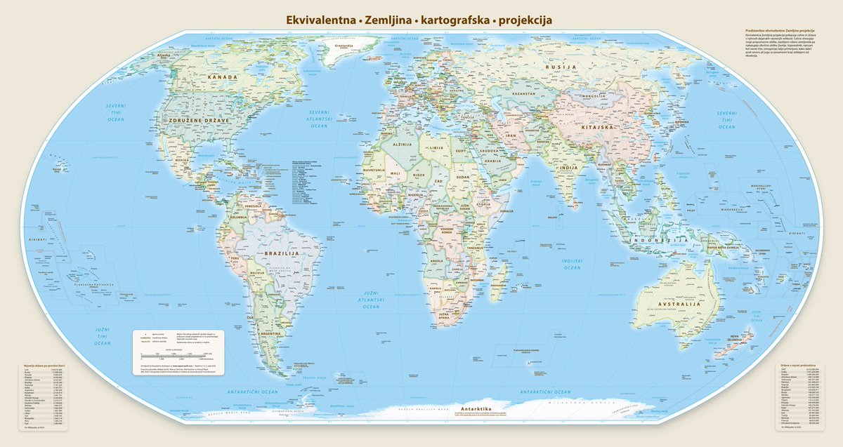
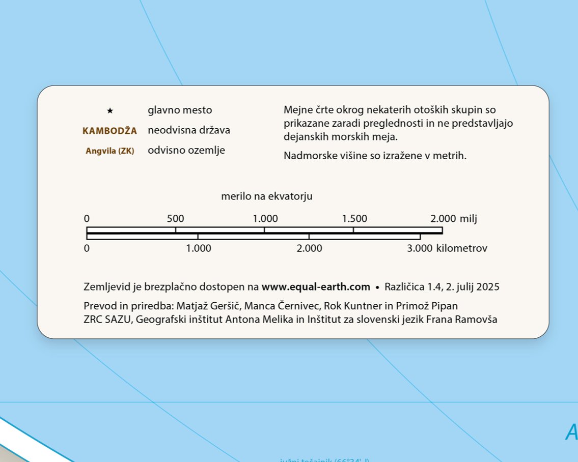
O ekvivalentni Zemljini projekciji ter o prevodu in priredbi Pattersonovega političnega zamljevida sveta na
@RadioOgnjisce. 👇🌍 #EqualEarthProjection
https://t.co/AQAG153Ik0
I am pleased to announce that the Equal Earth world map is now available in Slovenian, plus 17 other languages. You can download them for free here: https://t.co/mCHI9I8NBQ
Iskrena hvala Matjažu Geršiču ter ekipi z @ZrcSazu, Geografskega inštituta Antona Melika @geoinstitut in Inštituta za slovenski jezik Frana Ramovša za prevod. 👏👏
.@MtnMapper's politični zemljevid sveta v ekvivalentni Zemljini projekciji je zdaj na voljo tudi v slovenskem jeziku! 🤩🌍 #EqualEarthProjection
👉🔗 https://t.co/NE8W2LObTR
🌍 Surprised that Africa is 14× larger than Greenland? This StoryMap provides helpful resources on Coordinate Systems and Transformations to explain why maps often distort the true size of countries:
👉 https://t.co/OdlLTeo8lG
#WorldGeography#MapProjections#CoordinateSystems
🎧 Check out the latest @geomob podcast — Steven was grilling some #mapprojection nerd, and things got super geeky way too fast. 🤓🤣👉 https://t.co/8rS56o0vDo 🌍 #EqualEarthProjection
What if you project a projection? 🤔🌎Created in #ArcGISPro using picture markers and a creative twist on the View Dome tool, @nathancshephard’s animation “pushes” each map projection out from the place it was invented.
#30DayMapChallenge day 19: https://t.co/LdS9z2zsTQ
Eduard update 1.4.15 can replace void values with smooth feathering, export grids to small 16-bit GeoTIFF files with decimeter precision, and includes various improvements and bug fixes.
https://t.co/JZuWPG34BX
Using #ArcGISPro, Aubri Otis mapped the “Made In” labels from items in her house, creating a visual representation of her home’s global connections for the “My Data” theme.
Check out day 4 of the #30DayMapChallenge: https://t.co/7sM0S4L6z0
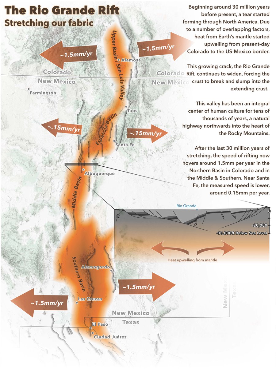
Map accessibility conversations often stop at contrast ratios and text sizes. Jakob Ruffner created this Rio Grande Rift map to demonstrate that the key is to consider every aspect of the map design process.
Check out day 7 of the #30DayMapChallenge: https://t.co/nBxzxH41C6
Inspired by 19th-century cartography, Edie Punt mapped Montreal in 1815, swapping out engraved hachures for stitches.
Check out day 9 of the #30DayMapChallenge: https://t.co/oXb0rglUA9