Top Tweets for #MapProjections

#Mapprojections: a practical guide to #commonmistakes and how to fix them – Dr Dominic Royé https://t.co/NgVurFhy7O

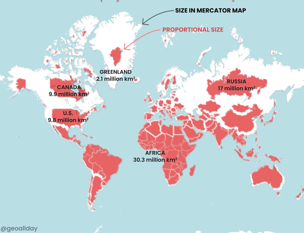
Most maps make Greenland look bigger than Africa—but Africa is far larger. 🌍
A powerful reminder that maps shape perspective and bias. Try using multiple projections in class.
Join Carly’s discussion: https://t.co/hsslhDeMju
#GeographyEducation #MapProjections


The world looks different depending on how it is mapped.
Some prioritise shape, others prioritise size, and some aim to balance both. The result is that the same world can look very different.
Explore:
https://t.co/sNNx4xML7J
#MapShop #Cartography #WorldMaps #MapProjections


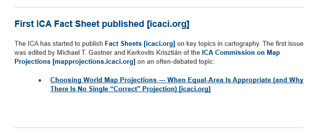
Wait, there is no single #mapprojection that shows true world? 🌎🌍🌏🤔
@icawebsite's first fact sheet is on #mapprojections!
👉🔗https://t.co/w5oryX2LM8
#mapprojectionsarehard #projectionsarehard #mapprojections #mapping #map #cartography #geospatial #GIS #gischat

Day 12. Same time zone data, 8 projections 🌐
Van der Grinten, Mollweide, Sinusoidal, Cassini and more.
A projection is always a decision. Most maps hide it. This one makes it visible.
#100DayMapChallenge #QGIS #MapProjections #Cartography

@GEO101SUNY
Did you know that we use different map projections for different reasons? some projections have better use then others depending on the occasion.
#Geology #mapprojections
https://t.co/dGVE7UmtUZ

🌍 Surprised that Africa is 14× larger than Greenland? This StoryMap provides helpful resources on Coordinate Systems and Transformations to explain why maps often distort the true size of countries:
👉 https://t.co/OdlLTeo8lG
#WorldGeography #MapProjections #CoordinateSystems


Australia often looks smaller on flat maps than it really is.
In reality, its landmass rivals entire continents, a reminder of how map projections distort our sense of scale.
#Geography #MapProjections #WorldMaps #GlobalScale #DataVisualization #VisualCapitalist


The Multifaceted Dymaxion Projection
Read more: https://t.co/us2p6fzsQL
#GeoICT #Dymaxion #MapProjections #Geography #GIS


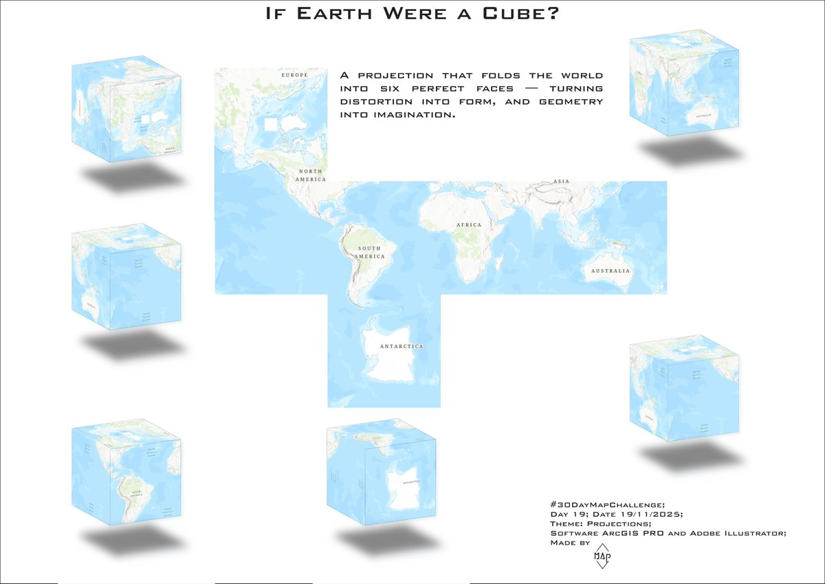
Day 19 - Projections
For GIS Day I mapped the world using a cubic projection, an unusual way to reveal how dramatically our planet’s shapes and areas change depending on the projection we choose.
#30DayMapChallenge #Day19 #Projections #Cartography #ArcGISPRO #MapProjections

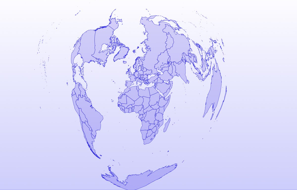
Today’s #30DayMapChallenge is all about projections.
Here’s the world through a heart-shaped projection, giving the map a creative twist the farther out you look.
#Cartography #MapProjections

A map projection necessarily distorts *something* -- it is a 2-dimensional representation of a 3-dimensional reality. Different projections distort different things (& get other things right) 🌍📷-- https://t.co/UTgu2gkqHw -- #MercatorProjection #MapProjections #Cartography
The Vastness of the Pacific Ocean
Read more: https://t.co/dqjy8qqARw
#GeoICT #PacificOcean #MapProjections #GIS
©️ Natural Earth


In 1569, Gerardus Mercator created a map projection that made navigation easier but distorted sizes. Greenland looks as big as Africa, but it's actually 14 times smaller! This "lie" influenced colonial views.
#geographyteacher #geography #MapProjections #GeographyFacts #WorldMaps


Lapaine, M., Frančula, N., Viličić, M.: #MapProjections and Sustainability / Kartografske projekcije i održivost, Kartografija i geoinformacije 23, 2024, 41, 52-64, https://t.co/Mf0GU7HQvV

10/ I’ve created visual comparisons of these projections—check them out! Which one do you use most in your work? Please share your thoughts! ⬇️
#RemoteSensing #GIS #SatelliteImagery #MapProjections #Geospatial #EarthObservation
I had the pleasure of giving a guest lecture to students in the @cartography_MSc program at TUM. Another group of future cartographers is now fully familiar with the concepts of #mapprojections, and they even gained experience in creating their own using the clementine technique.


Saviez-vous que le Groënland est en réalité plus petit que l'Algérie ?
#30DayMapChallenge - Jour 26 : #MapProjections
Superficie de l'Algérie : 2 382 000 km²
Superficie du Groënland : 2 166 000 km²
Si vous êtes curieux, découvrez ce site : https://t.co/Ui9lzWDc1k
#ArcGIS #Maps


#30DayMapChallenge 🗺️ (Day 26: #MapProjections)
Perth, Western Australia, is often referred to as the world's most isolated major city. This map visualises the international flights departing from Perth. This map uses an #AzimuthalEquidistantProjection with Perth as the origin.

Trends for you
Most Popular Users

Elon Musk 
@elonmusk
240.1M followers

Barack Obama
@barackobama
119.3M followers

Donald J. Trump
@realdonaldtrump
111.6M followers

Cristiano Ronaldo
@cristiano
108.8M followers

Narendra Modi
@narendramodi
106.9M followers

Rihanna
@rihanna
97.2M followers

NASA
@nasa
92.1M followers

Justin Bieber
@justinbieber
90.5M followers

KATY PERRY
@katyperry
86.7M followers

Taylor Swift
@taylorswift13
80.5M followers

Lady Gaga
@ladygaga
72.1M followers

Kim Kardashian
@kimkardashian
69.3M followers

YouTube
@youtube
68.6M followers

Virat Kohli
@imvkohli
68.4M followers

Bill Gates
@billgates
63.4M followers

The Ellen Show
@theellenshow
62.5M followers

CNN
@cnn
61.9M followers

Neymar Jr
@neymarjr
60.9M followers

X
@x
60.9M followers

CNN Breaking News
@cnnbrk
59.9M followers