#geographyteacher and #geographystudents don't forget about this website to help you create great data presentation for your #NEA. Always check the data presented and details like scales and labels - and whether you can add this on your map. https://t.co/cEkIzoKC1J
Students watching a video about cognitive load theory scored higher on delayed tests of factual recall and comprehension if they had to generate a relevant example while retrieving knowledge, or rewatching the video: https://t.co/KSGOvnsomZ ($)
Use our interactive article to look up current average house prices and private rental prices in your area and see how they have changed over time.
Explore the data ➡️ https://t.co/yNMrIIkOOP
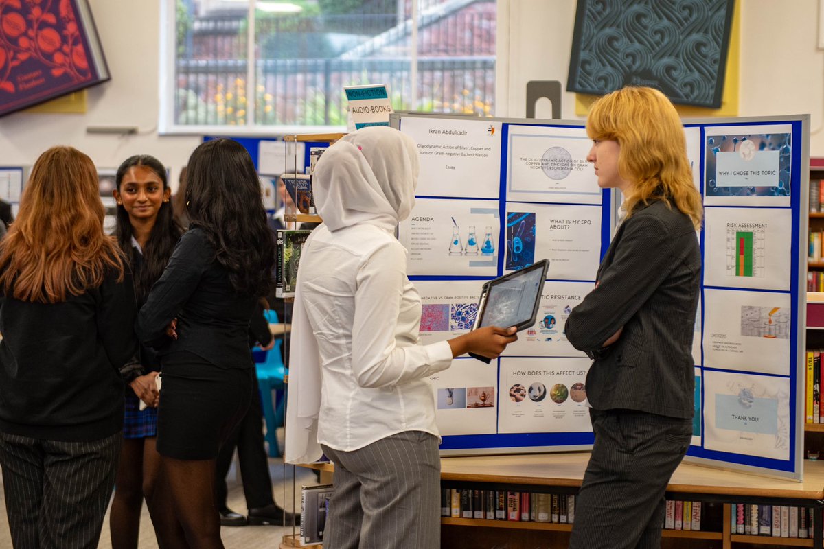
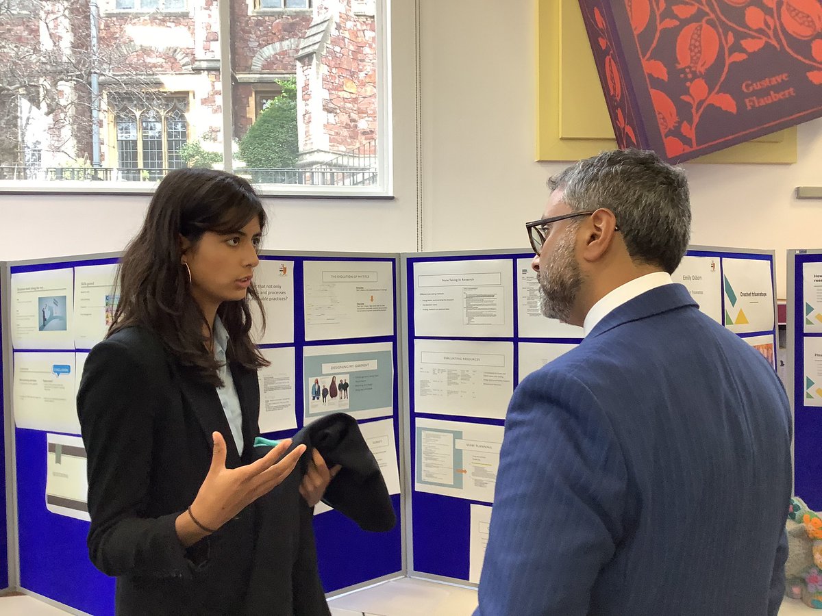
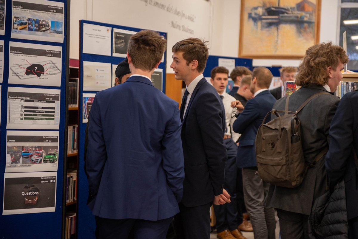
What an amazing collection of EPQ projects, proudly presented by the Upper Sixth Students last week at the EPQ showcase. It was a pleasure to see so many speaking with such authority and passion about their work in their Lower Sixth Elective. #proudtobebgs@BGSBristol
Love this! Type a word into this website and it generates Landsat images of that word with locations. Something for a #geographyteacher to help displays?
https://t.co/P4fCcrvsNn
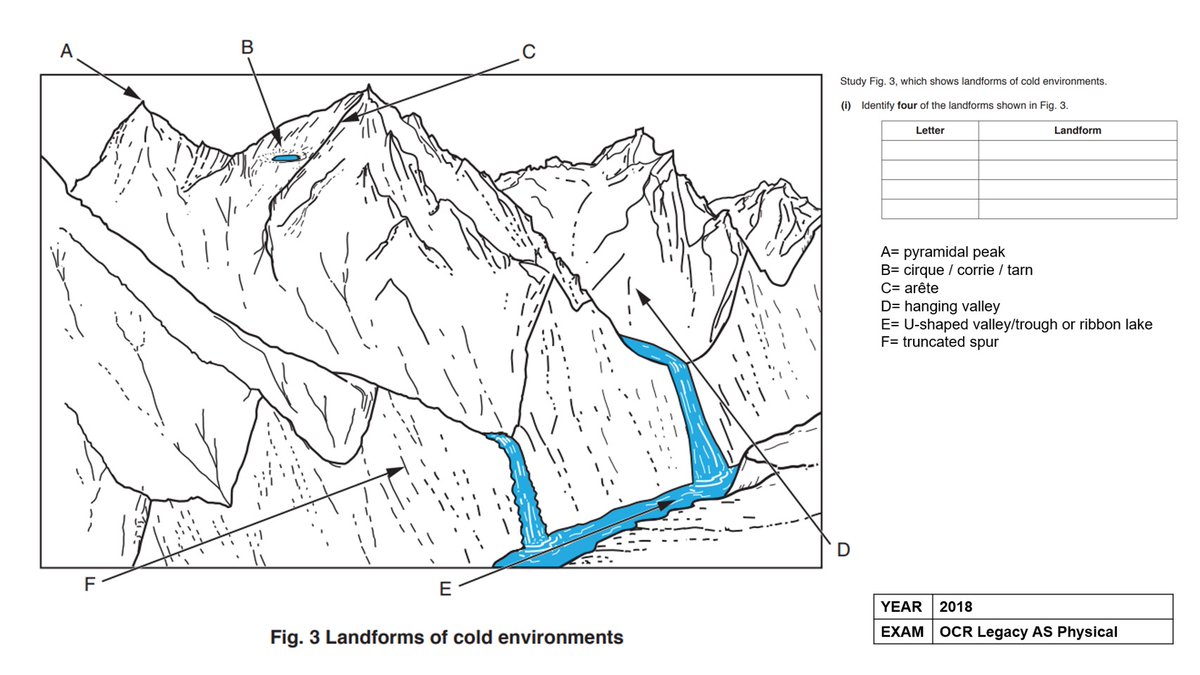
Geography gold: I found a few more handy figures for teaching glaciation. From OCR, AQA and Edexcel past exam papers. Link in pinned post. #geography#geographyteacher
Summer term is right around the corner & for many of you it will be the start of the NEA journey with Y12!
Here is a short thread 🧵 on the link between sub-questions and data collection methods, and the reasons for getting it right the first time around, tough though it is!
Animated map shows human migration throughout history. Nice touch to have the map display relief data. I like how at 9 seconds humans hit the Himalayas and wisely decided to head eastwards. Source: https://t.co/G1hHQZlVQG
This amazing little tool simply draws all streets in any city you want. As examples here are the town I grew up in (20k residents) and the city I live in (5M residents). Have a play with it. The exported screenshots make great desktop backgrounds. Source: https://t.co/GmEQnq8ALj
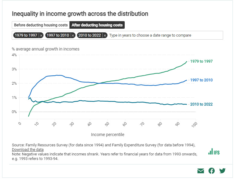
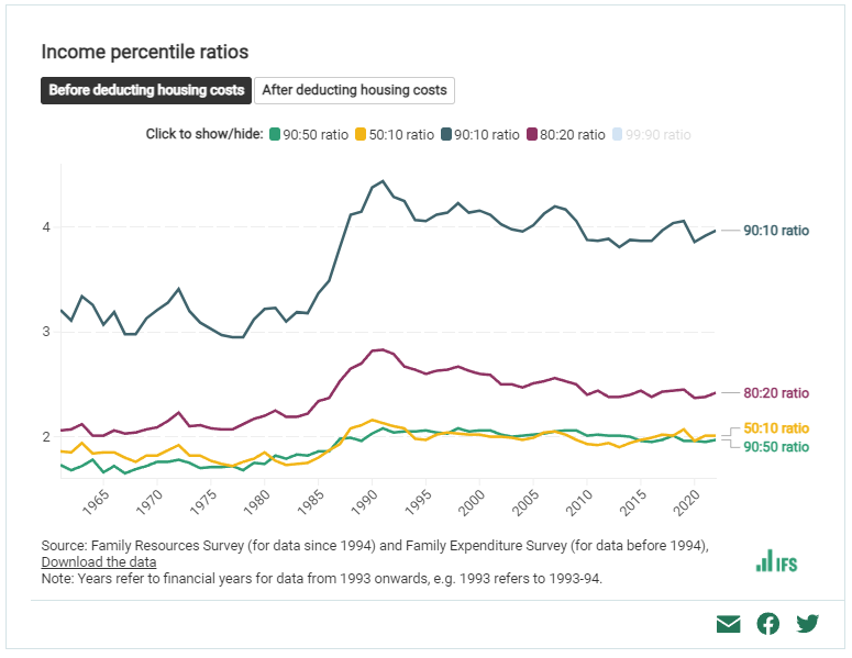
Fabulous new resource on the @TheIFS site here, with a whole load of interactive charts showing what's happened to inequality, living standards and poverty in the UK (with all data available to download).
https://t.co/dl2p8VIck1
Strong southerly winds will bring in mild air across many northern and western parts today
A Foehn effect could lift temperatures across north Wales and northern Scotland to 15 or 16 Celsius 🌡️
More info on this can be found here: https://t.co/HnzgqF904x.