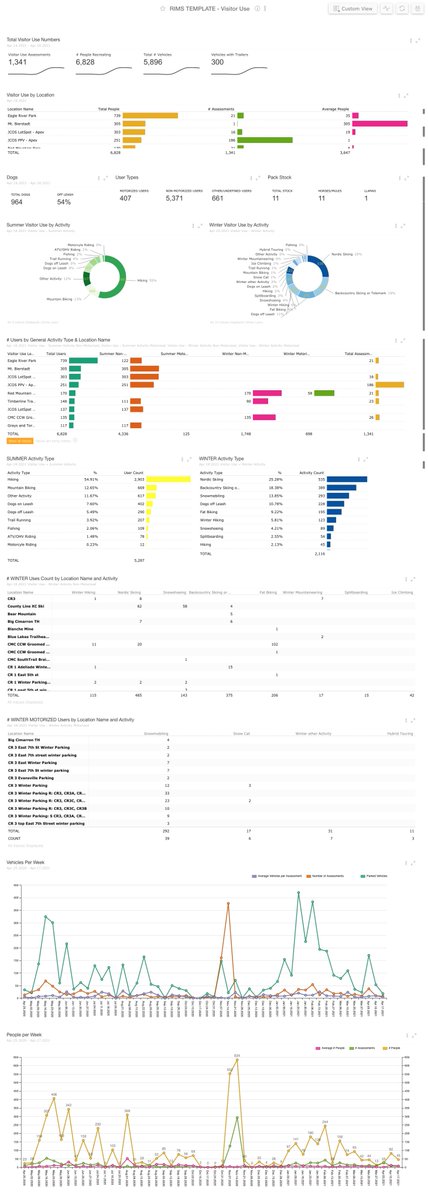
One of our super users built this beautiful information dashboard in our Ri360 software. Colorful, balanced, informational, actionable. It checks all the boxes! #businessanalytics#dataviz#Dashboard
@CoachEilidh Idea: assuming this is for non-tech folks, the 3 slides sould be the problem and your major finding(s). You can make the remaining slides available to them post-meeting, if they would like.
Nobel prizes are awarded for discoveries, not unsupported theories, and complex ideas may take longer to prove than they did a century ago https://t.co/V4Qnuj3w7Y
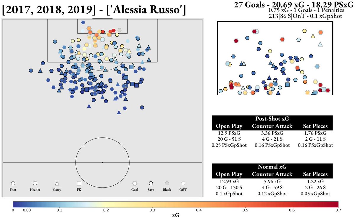
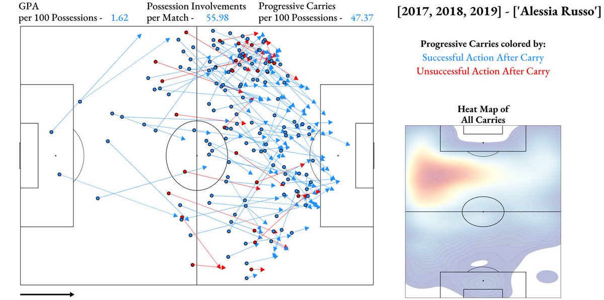
To add onto @NwslAnalitica and Russo to #MUFC news, here are some looks at some of Russo's shots, pass, and carry maps from 2017-2019 - it will be interesting to see Russo at United
Statistical models are mathematical representations of the real world. So if you lose sight of either the real world *or what the math you're applying is actually doing*, your model will be prone to failure.
Urban Cycling Patterns During a Pandemic: Seattle Bike Counter Analysis .... analysis from Lucia Darrow at our partner @CANA_Advisors
https://t.co/ttDKolebva
One of my biggest lessons learned as a data scientist is to never underestimate the amount of business knowledge required to design and implement a successful data / ML product.
I really like my county's COVID-19 dashboard. Effective Google data studio views with an up-to-date video explainer, which is always a great idea when possible. #COVIDー19@EagleCounty
https://t.co/1f6gtpFydF
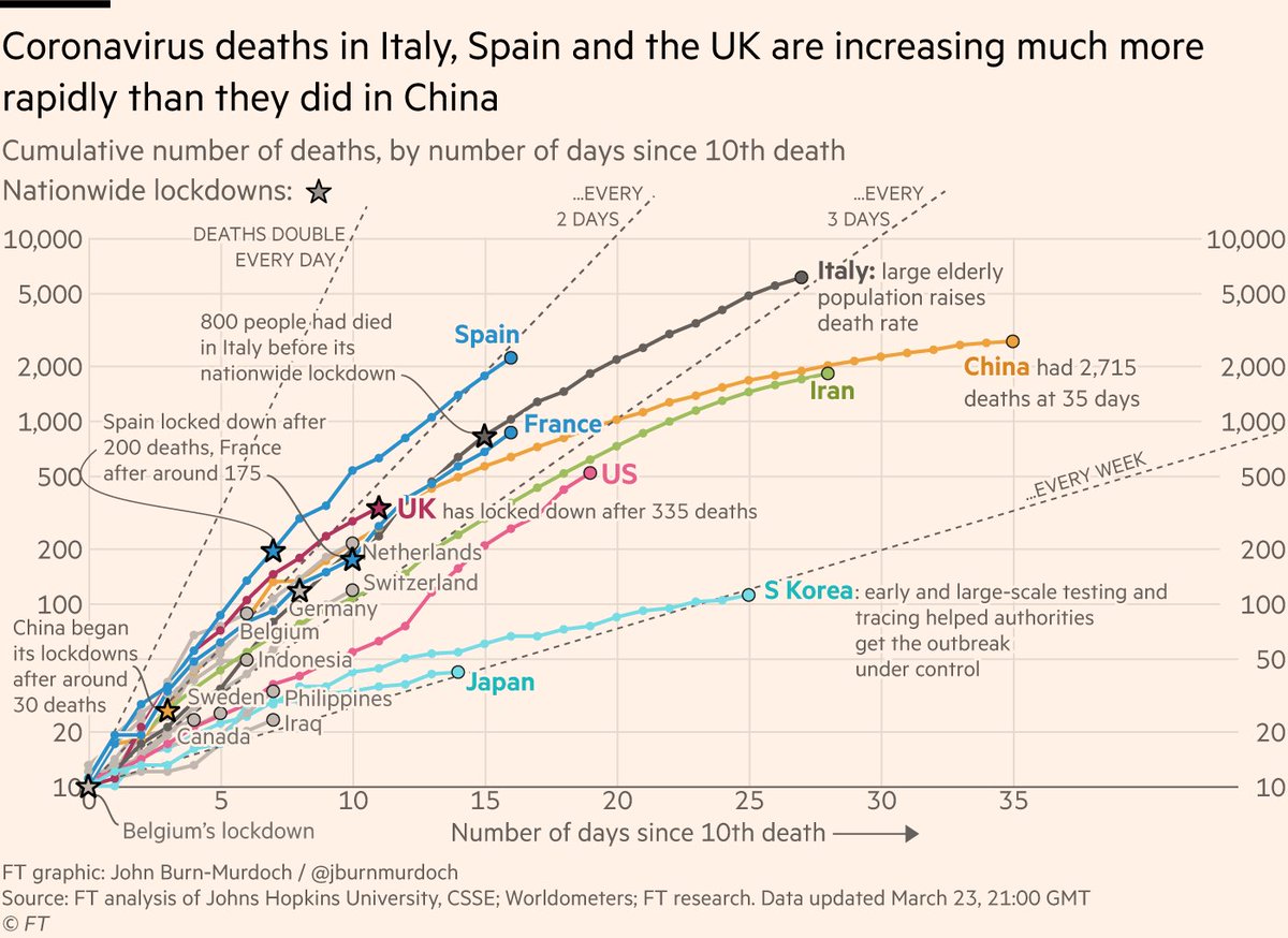
NEW: Monday 23 March update of our coronavirus mortality trajectories tracker
• UK is finally locking down, as its death tolls reaches 355
• US death curve continues to steepen, passing 500 with no national lockdown
Live version 🔥 FREE TO READ 🔥 here https://t.co/VcSZISFxzF