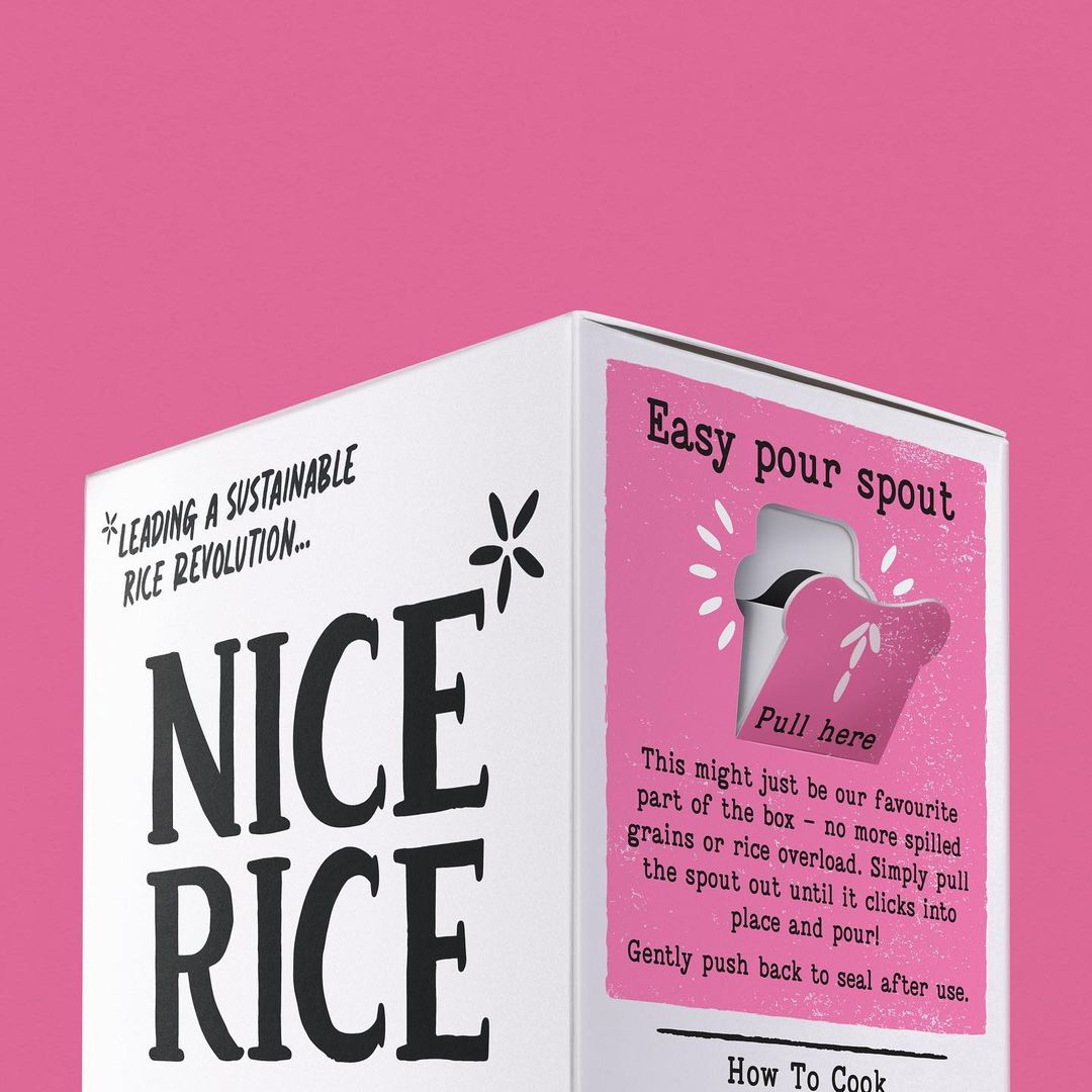
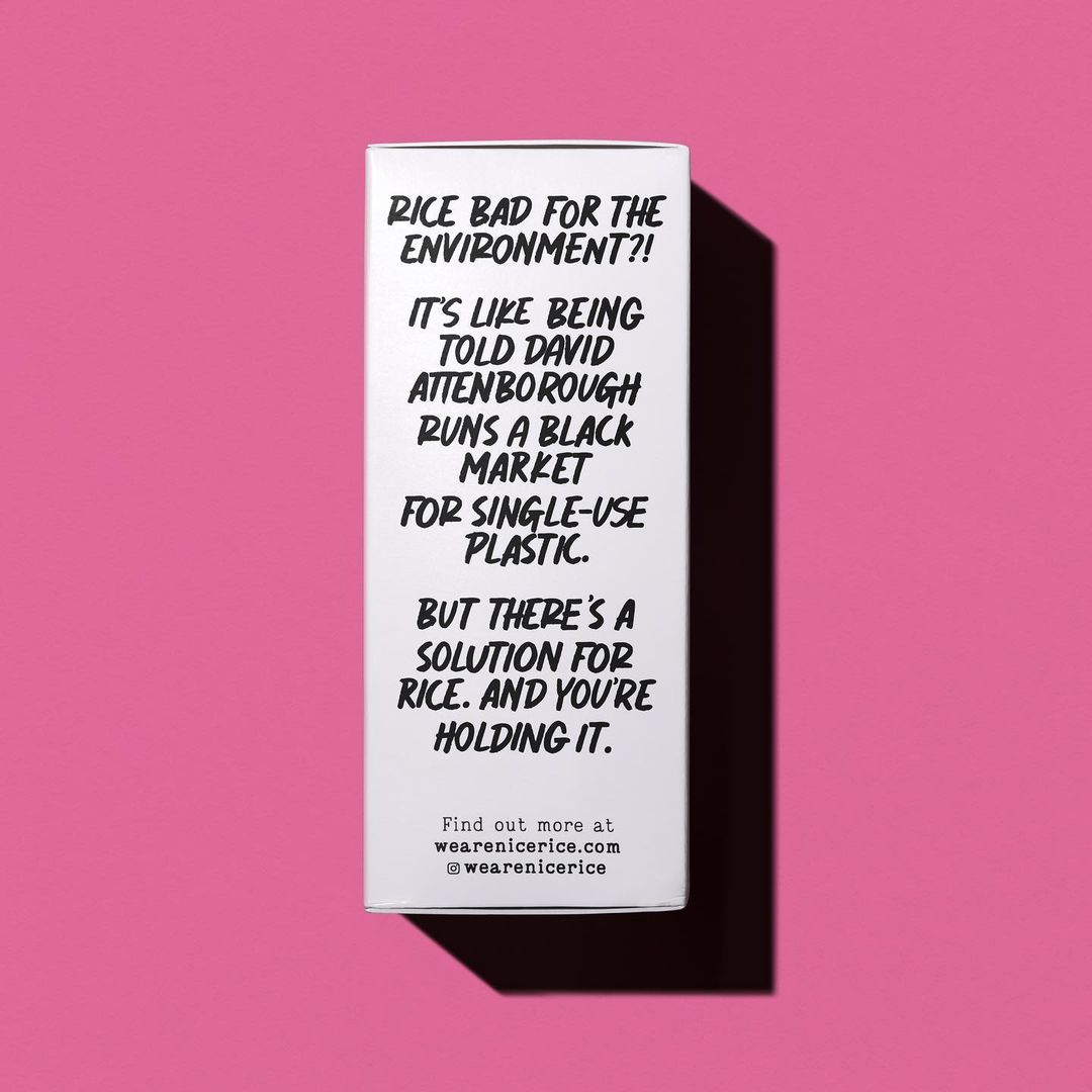
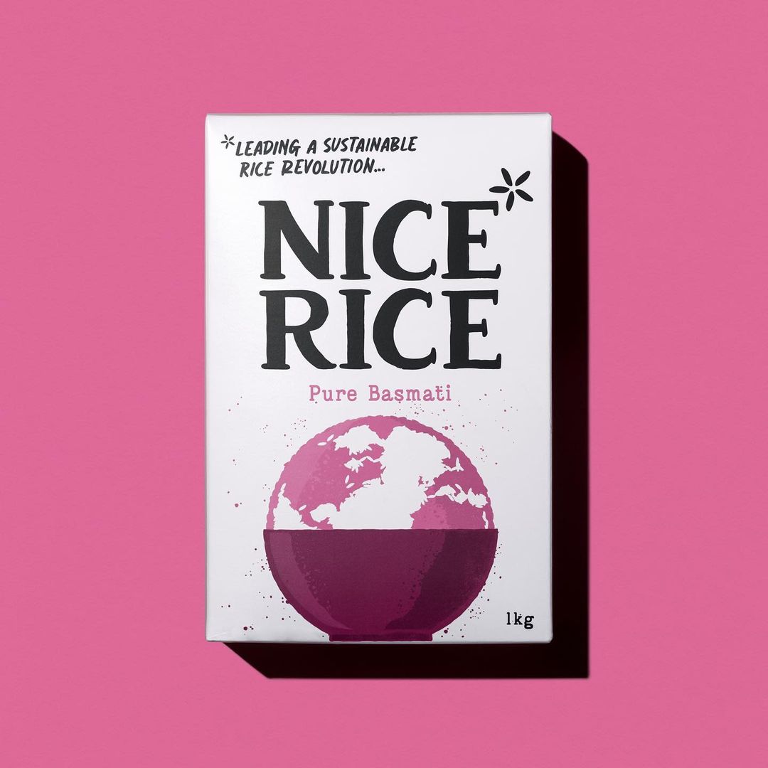
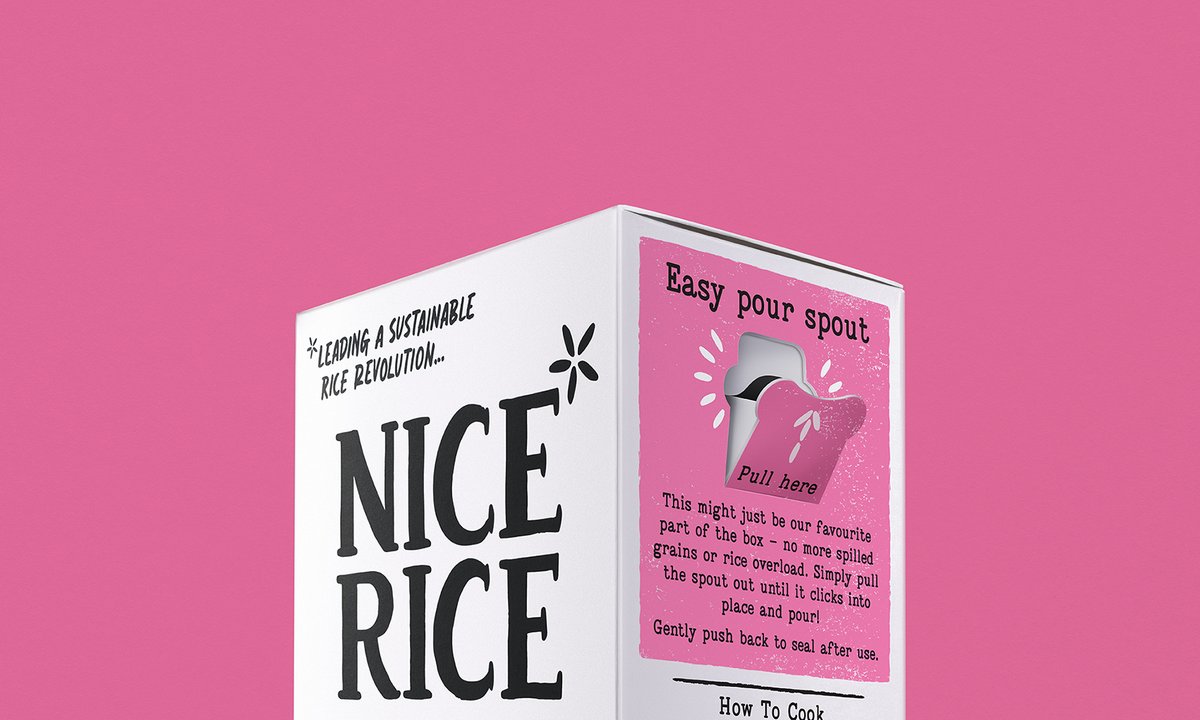
@RED_DOT_STUDIO_'s #packagingdesign for Nice Rice features a simple black-and-white colour palette, bold typography, and human-focused iconography to effectively communicate complex brand messages, making the packaging stand out on supermarket shelves. #DailyDesignInspiration
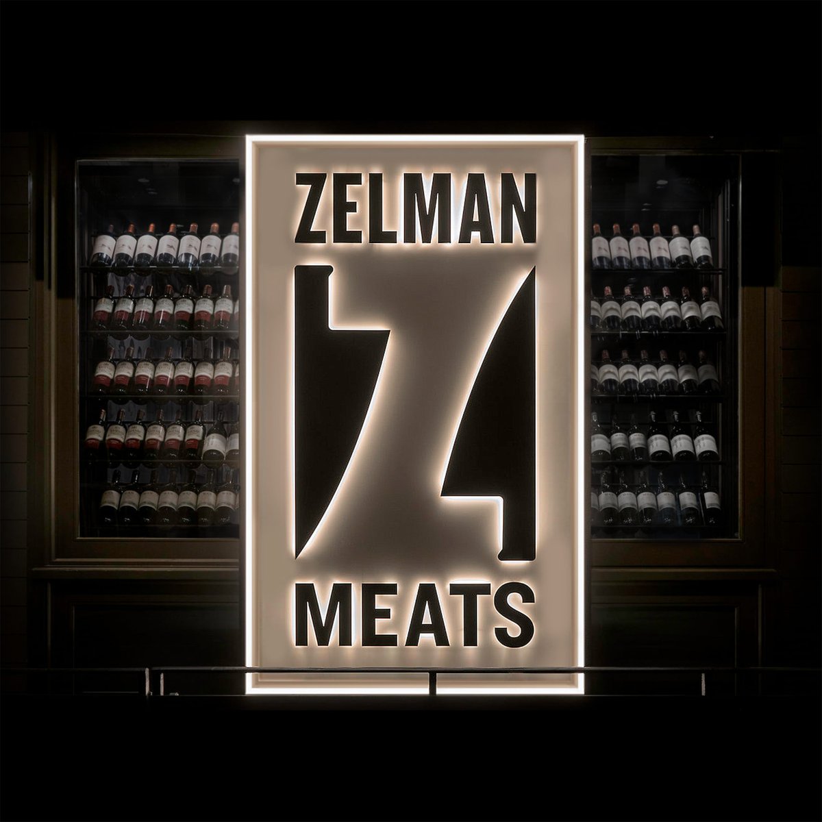
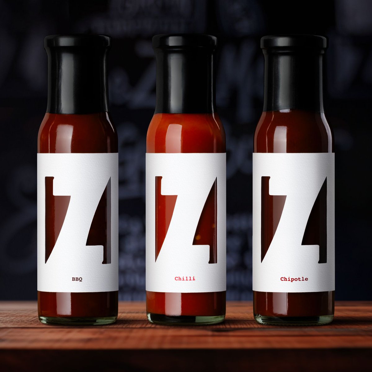
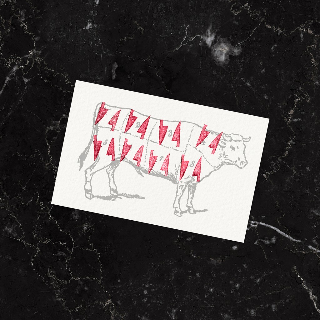
The simplest idea is often the best one. @RED_DOT_STUDIO_'s identity for meat-centric restaurant Zelman Meats makes a case for simplicity with its two knives creating a ‘Z’ in between. Clever, concise and to the point, the brand underpins the power of negative space.
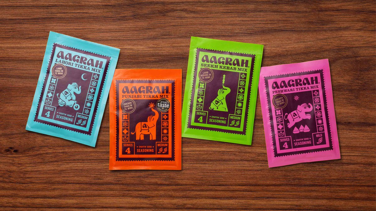
We don’t know why, but Indian spice design is really on a roll lately. Designers are giving the kitchen mainstays plenty of personality, with vibrant color palettes, eclectic typography, and all the shiny panache of a Bollywood musical number. https://t.co/OQHEVOD4eE
We don’t know why, but Indian spice design is really on a roll lately. Designers are giving the kitchen mainstays plenty of personality, with vibrant color palettes, eclectic typography, and all the shiny panache of a Bollywood musical number. https://t.co/OQHEVOD4eE