Apple Maps has such a much nicer UI & UX in comparison to Google Maps.
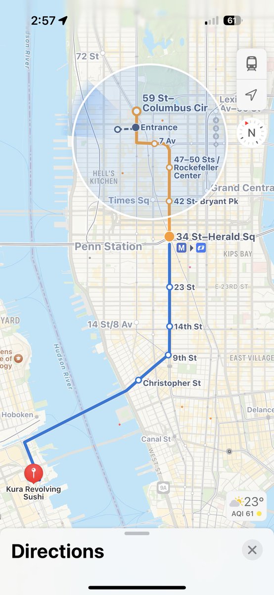
With Apple Maps, I know exactly what stations i’ll be going through, and the lines actually match the real-life signage colours (Orange for the BDFM Lines, Blue for the PATH line)
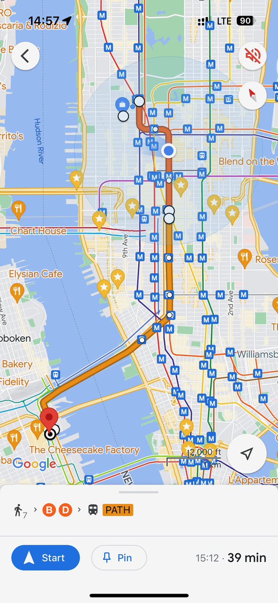
Meanwhile… Google seems to think I want to know where OTHER stations are along with showing me random saved pins which have nothing to do with my journey. Not to mention the fact the lines do not match their real-life colours.
Apple Maps has a great ability to make the content you don’t need fade away, while Google Maps shoves everything in your face.
So many of my friends have gotten lost while using Google Maps Transit directions, while none have gotten lost on Apple Maps Transit. Says a lot!
Hopefully Google rectifies this at some point, since their mapping data tends to be more accurate in other countries outside the US!
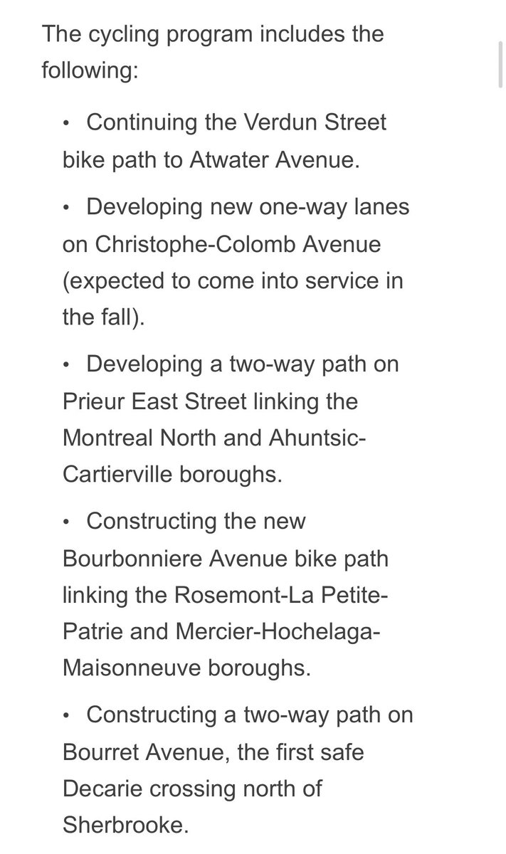
BREAKING & BIG: Montreal announced today another $30 million in NEW FUNDING for 53 bike infrastructure projects to expand & improve bike-lanes in 14 less-serviced areas!
“Merchants are now ASKING for good bike infrastructure.” (video)
THIS IS LEADERSHIP!
https://t.co/Ag2SDhDAS9
"Using a commercial gas leaf blower for an hour produces emissions equal to driving from Denver to Los Angeles" -- while annoying the hell out of neighbors.
To quote @dccdudley, leaf blowers are the devil's hair dryer. Ban them as fast as you can.
https://t.co/WcjuStVUPz