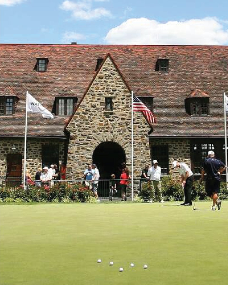
For a club of Aronimink's stature, I always thought this was one of the laziest/most generic logos ever. They deserve better!
Their clubhouse seems to be "the picture" -- and the famous main entrance has a prominent "A" shape.
IDK, I threw this together quickly 🤷♂️
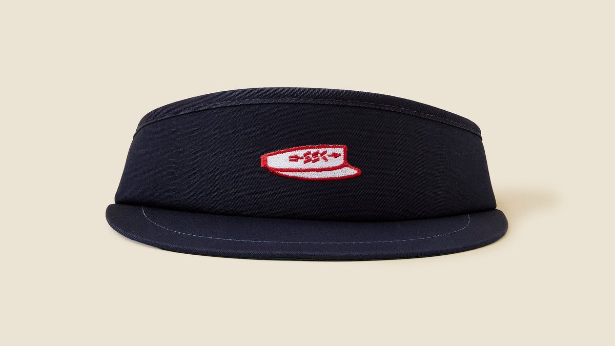
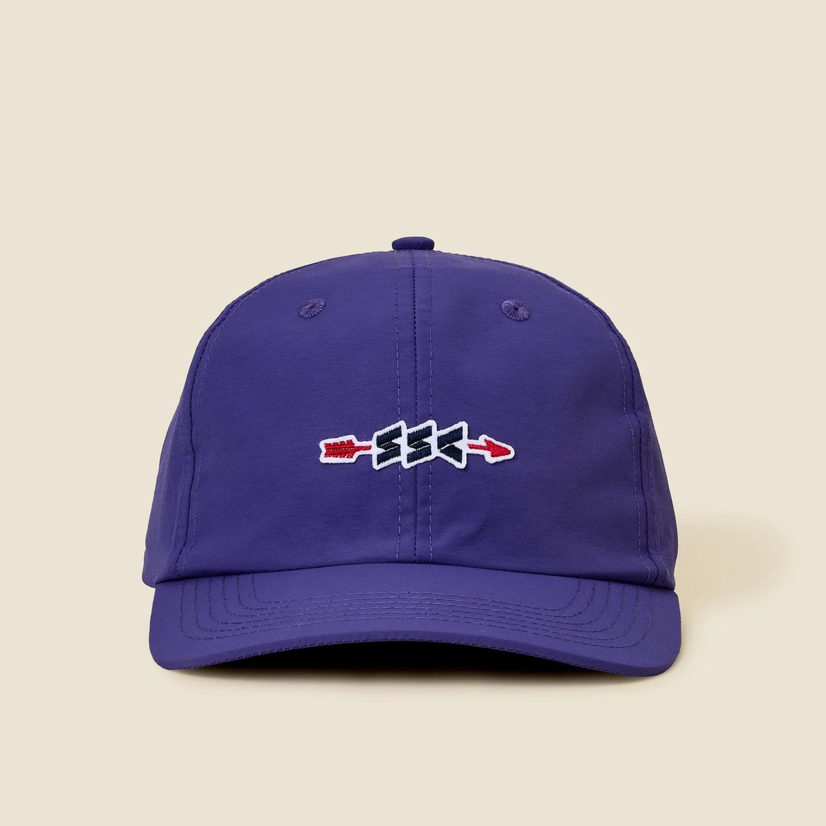
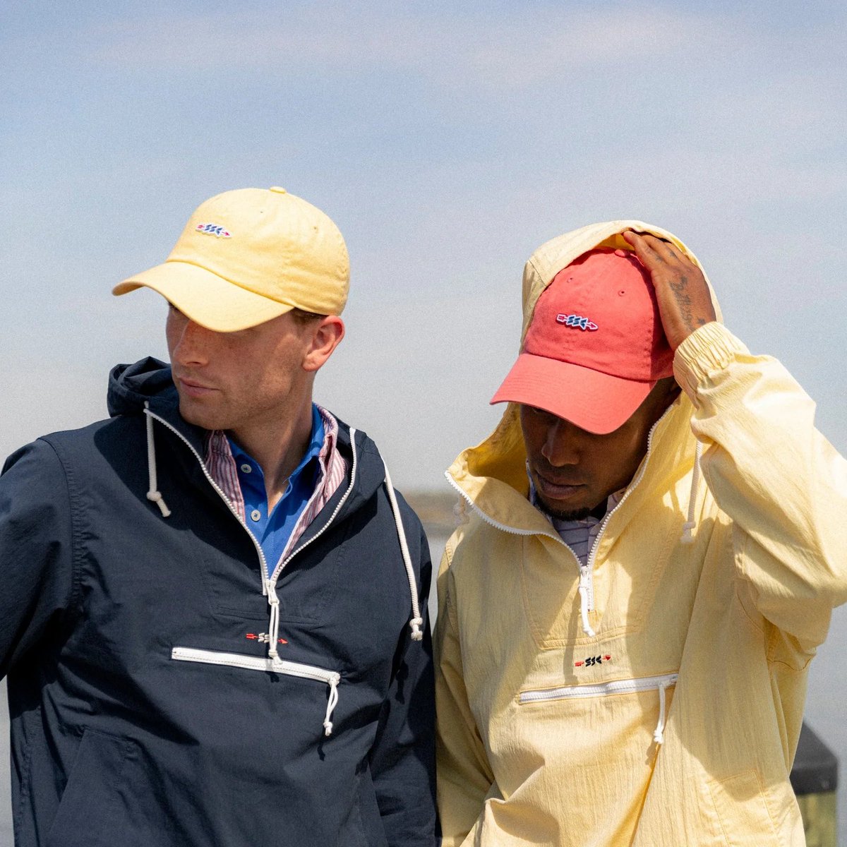
Brought back our cult classic Worldwide Caps, plus some sick High Crown Visors and some other useful caps for your summer golf needs
hashtag expand SSC High Crown Visors
hashtag shrink big letter hats
https://t.co/SgDBhgsFYO
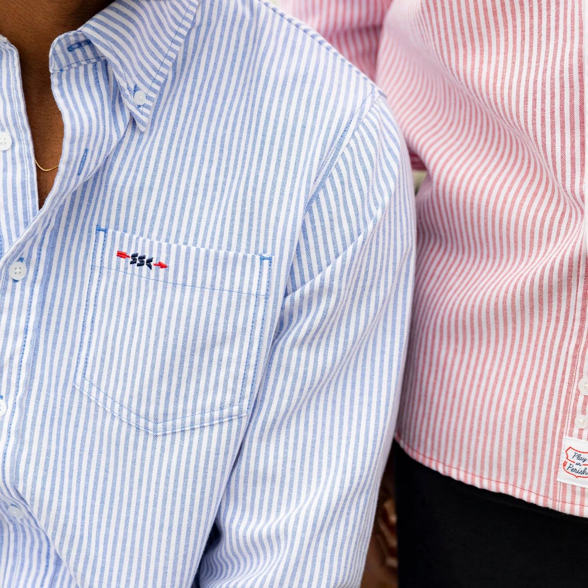
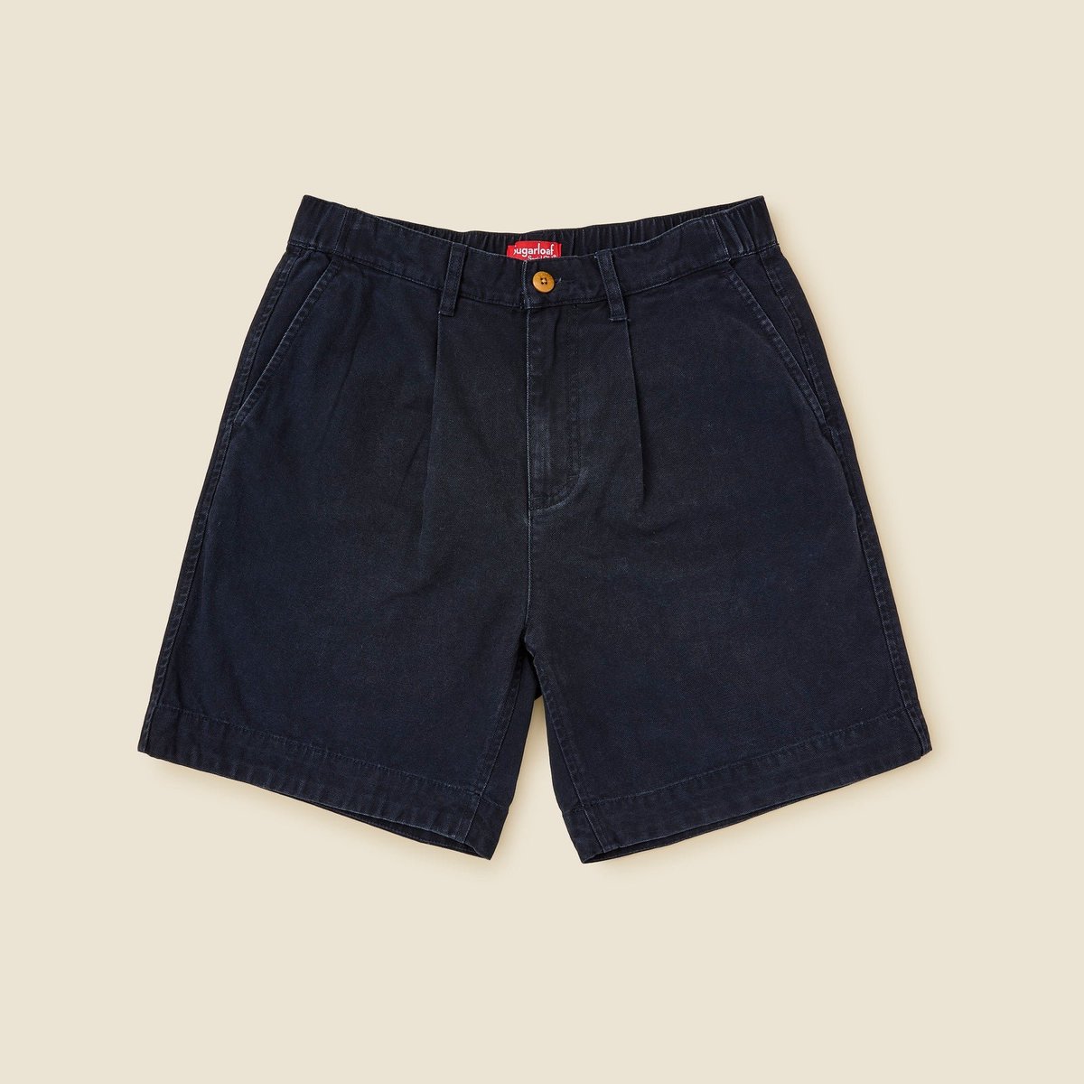
This might be the clearest version of @SLoafSocialClub we’ve seen. I get the blessing of seeing things early, & when this came through, my exact words were, "This is the team’s best work to date."
In a space where noise and influence can shift brands, they’ve stayed true to who they are. A golf purist brand through and through. One of the most tasteful in the sport.