❗️NEW POST❗️
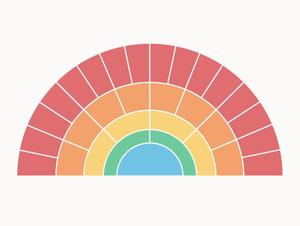
📊 DocuBurst
A chart that attempts to answer ‘what is this document about?’ through visualising the text-based content with a Sunburst Diagram.
https://t.co/1vDDDbMne6
#DataViz#DataVisualization#Analysis#Documents#Sunburst
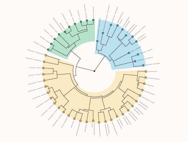
New Post: Dendrograms
A variation of a Tree Diagram that illustrates the arrangement of clusters formed by hierarchical clustering.
https://t.co/Yc1fWr1PcP
#Dataviz#DataVisualization#DataAnalysis#Science#Data
Looking to make dataviz education fun and engaging? Get 20% off The Graphic Continuum: Match It Game this September!
https://t.co/TMENFX4zZq
#dataviz#datavisualisation
New Post: Jitter plots
A Strip Plot variation that provides a better view of any overlapping data points by adding a small amount of random shifting to the position of plotted dots.
https://t.co/nbB3CUGjGF
#Dataviz#DataVisualization#DataAnalysis#Datascience#Data
The flow of new charts continues on!
10 new charts have been added, bringing the total to 40 new charts in 2024. There are now 100 charts referenced in The Data Visualisation Catalogue.
https://t.co/GS9mTgNn76
#Dataviz#DataVisualization#DataAnalysis#Datascience#Data
New Post: Area Unit Charts
An axes-less variation of a Dot Plot / Unit Chart that organises unit shape markers or icons into groups to display quantities between categories.
https://t.co/tyv2LmNphn
#Dataviz#DataVisualization#UnitChart#DataAnalytics
New Post: Cleveland Dot Plots
A simple form of data visualisation that plots dots to compare the values of a one-dimensional variable across multiple categories.
https://t.co/aaWopxaj86
#Dataviz#DataVisualization#DotPlot#DataAnalytics