Running Clarity Audits for early-stage founders this month. Written audit document, 3–5 days, starting from $150. Full details here 👇
https://t.co/cHj9IE43g1
@saen_dev Exactly this. Onboarding almost never feels urgent enough to fix because the user just quietly leaves, no error, no complaint, nothing to debug.
The "I don't understand what this does" problem is invisible until your retention numbers tell you it isn't.
The fastest way to lose a user in the first 30 seconds?
Make them think.
Not about your product. About how to use it.
That's not a design problem. That's a thinking problem.
1/ Most founders think they have a feature problem.
Most of the time, it's actually an onboarding clarity problem.
Here are 5 signs your onboarding is confusing users 🧵
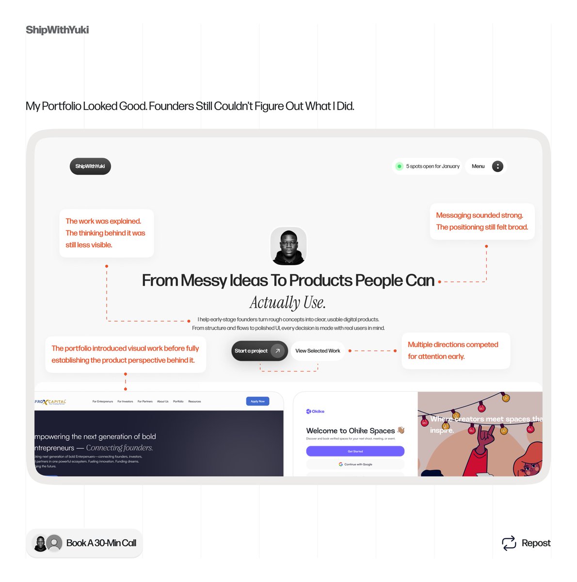
A friend came to me with an idea.
Fashion vendors drowning in the same DMs every day. No way to visualize the solution.
My job wasn't to build it. It was to make it believable.
Not making things pretty. Making ideas legible.
This is Haul.
Founders don't have a design problem. They have a clarity problem.
The interface isn't what's confusing users. It's the thinking behind it.
Fix the clarity first. The design follows.
Before I touch any product I ask 3 questions.
Most designers skip all of them.
Q1: What does a confused user actually do?
Q2: What has to be true for this to work?
Q3: What's the one thing this screen needs to do?
Start there. Everything else follows.
Clarity Audits from $150
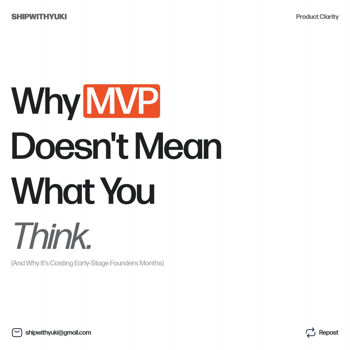
Most founders misunderstand what an MVP actually is.
They think MVP means:
fewer features
stripped-down product
smaller version of the final app
But MVP really means:
minimum viable learning.
A thread:
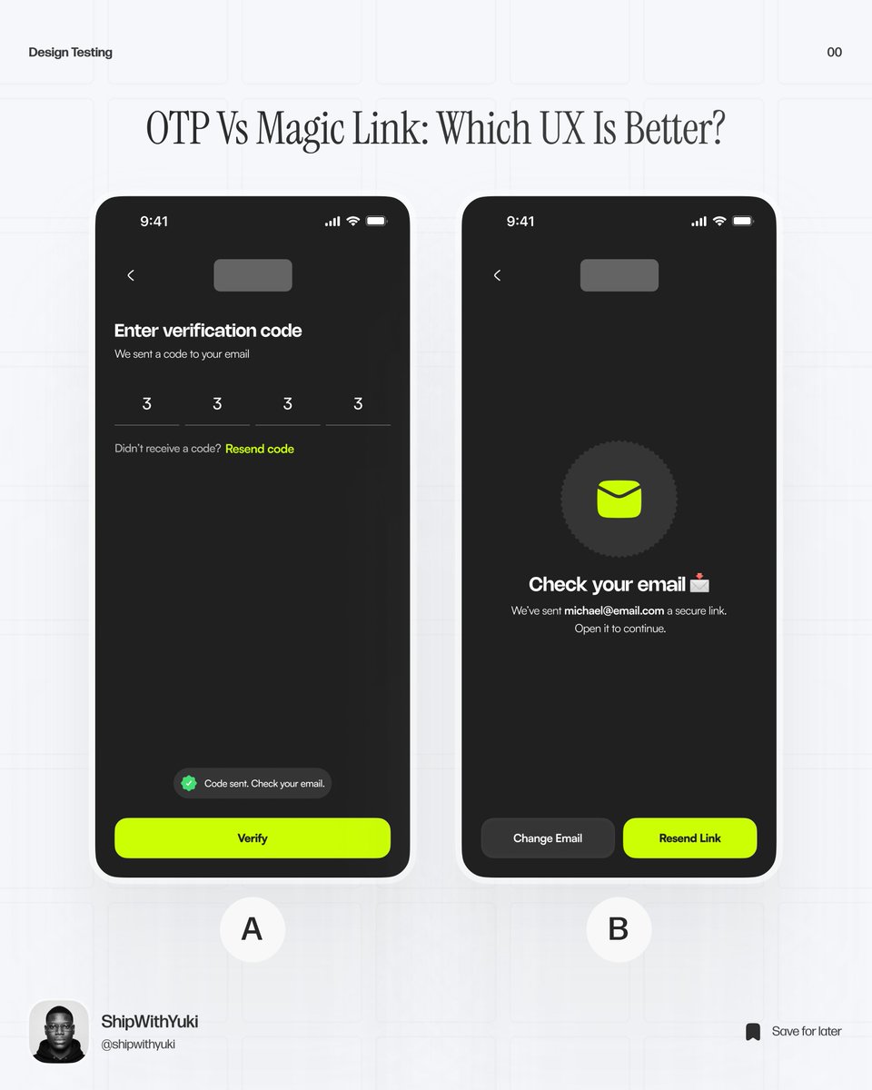
OTP vs Magic Link which one actually feels better to use?
Both solve the same problem.
But the experience is very different:
OTP → fast, familiar, but adds friction
Magic link → smoother, but depends on email flow
Curious which one would you ship and why? 👇
Not every good design starts clear.
Sometimes you’re figuring things out as you go -
what matters, what doesn’t, what to remove.
That messy part?
That’s where most of the real work happens.
Trying to get better at that.
“AI will replace designers” they said…
So I tried it.
Same brief:
→ One done by me
→ One generated with AI
AI is fast. no doubt. ⚡
But speed without direction?
You get something that looks okay…
but doesn’t really work
The real job isn’t pushing pixels anymore.
It’s deciding:
what matters
what shows first
what users actually need to do
AI makes the process faster.
But clarity still needs a human.
More from this project 👇
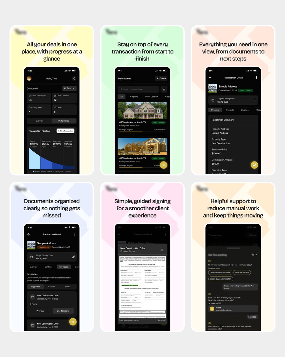
Shared this recently, but here’s a deeper look at the product.
The goal wasn’t just to design screens,
but to make something that actually works in real use.
Here’s feedback from the team after delivery ✨
That’s always the real test.
More screens + video ↓
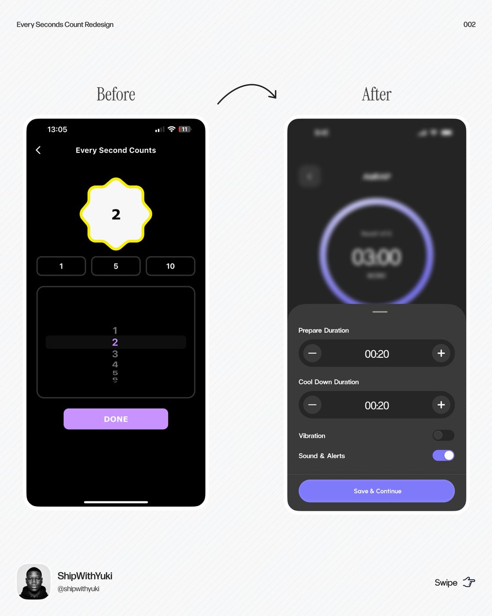
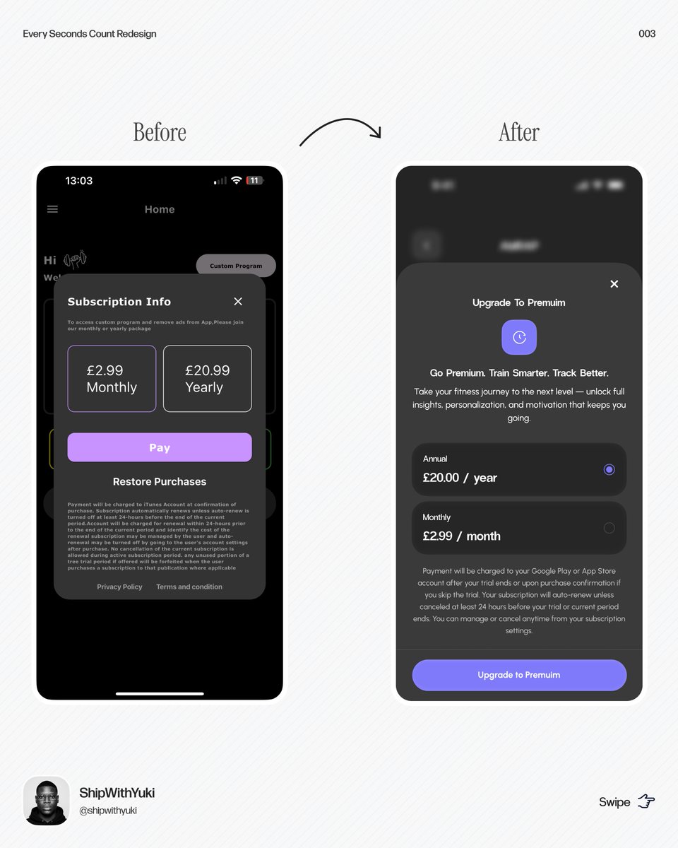
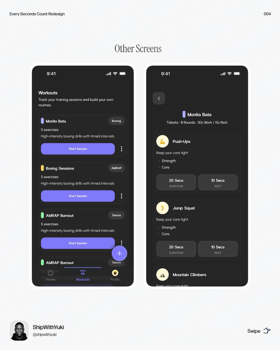
Built this in 7 days.
Every Second Counts started as a basic workout timer.
We turned it into something coaches can actually use:
• Run live sessions
• Save workouts
• Convert viewers into clients (QR during workouts)
Built in collaboration with @gbadamosixxl Lovable Mvp
This is how we approach products:
• Move fast, but don’t rush decisions
• Keep it simple and focused
• Design for real use, not just visuals
AI helped speed things up.
But the real work was structuring the product and making it make sense.
Speed is useful.
Clarity is necessary.
Quality is non-negotiable. 🚀
Screens ↓
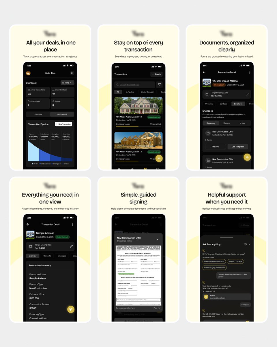
Pheww… almost broke my streak today.
Balancing a full-time role and staying consistent here isn’t always smooth, but no excuses.
Been working on an app launching soon 👀
Can’t share the name just yet, but this one was a solid ride.
Here are some app screenshots ↓
Guess which one they rejected - A or B?