The yield curve is unpredictable
But the very long term moving average of the yield curve is nearly a perfect deterministic mathematical function
Its first derivative is screaming "time for un-inversion"
You might want to start paying attention
@FibonacciInves1@adamtaggart Yep. Simple math most people don't seem able to do
70–90% of active managers underperform a broad index like the S&P 500 in a given year
For the vast majority of investors there is no benefit to anything beyond passive indexing so relatively, most advisors are a negative ROI
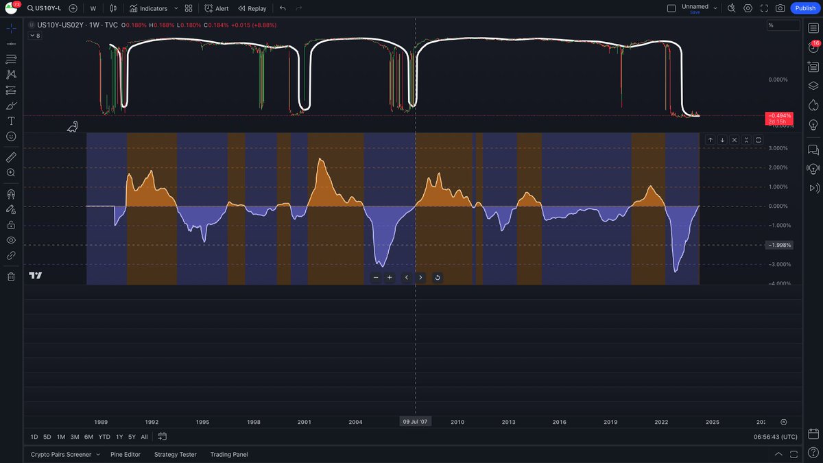
Unemployment deviation from averages ribbon
Tops in rates tend to be above the red line, while bottoms in rates tend to occur beneath it
Lags tend to be more pronounced in inflationary environments like the 1970's, with the ribbon leading rates
#Bitcoin deviation from 200 Week SMA
Average decline from the red 12 year long trend line will put Bitcoin at $27k*
*I took some liberties with this calculation, if you want the details just ask
Don't get washed out of your trades because of short timeframe stochastic fluctuations.
Long duration bond market signals are almost exclusively found on long timeframes. Small timeframe moves are mostly noise.
Signal >>> Noise
Long Timeframes >>> Short
Smoothed Data >>> Raw
Note that the price never rose above the upper Bollinger band this cycle as in previous cycles
That could be another indication of a midcycle top or 2 part market cycle (one cycle stretched over 2 normal cycle periods)
One of the most accurate Bitcoin bottom indicators I've found, which predicted FTX crash
This shows the percent above close 2.3 standard deviations above the average value is (% above close the upper Bollinger band is)
Current level is where final capitulations begin not end
@Boyddog7@hotpotato3141 I try not to focus on the reasons, which might sound strange. I assume the historical data set, if long enough, contains billions of independent variables and 100% of the dep. By focusing on that, I don't get distracted by narratives with some but not not total explanatory power.
@Boyddog7@hotpotato3141 There are two other periods where rates remained higher for longer, relative to the rest of the 100 year period studied here: the Volcker Peak in the early 1980s and the 2007/8 Great Financial Crisis.
My current theory is that this could indicate peaks with greater momentum.
@hotpotato3141 This is what I came up with: I used your series and compared it to rates using your script
This is a really nice find. If you don't mind, I'll post it to my account giving you the credit
More interesting support for the idea of a midcycle top
The green line is the only metric I've seen that has called all tops back to the 2011 cycle - it's the deviation of #Bitcoin's average value from its R^2 = 0.99 power regression line (pink line)
Everything in this chart
@hotpotato3141 Looks to me like you used close and 5 as the input values and got a great result. Since we are in the business of empirically finding patterns, I think it's valid and useful. Let me play around with this data set and see what I personally would do with it & get back to you