We developed the branding design for Nola Africa with a focus on clarity, consistency, and distinction, creating a visual system that is instantly recognizable and effortlessly understood.
#clientspotlight#brandingdesign#graphicdesign#creativeagency
The Golden Ratio Secret Behind Warner Bros.’ Sleek 2019 Makeover.
In 2019, Emily Oberman and her team at Pentagram spearheaded a bold modernisation of the legendary Warner Bros. shield. Recognizing the need for a versatile "digital-first" identity, Oberman streamlined the 1923 classic by removing the iconic sash and refining the proportions of the "WB" letters using the golden ratio. The redesign transitioned the brand from a static, heavy emblem to a sleek, flat-blue monogram that thrives across social media and mobile platforms. By introducing the custom "Warner Bros. Sans" typeface, Oberman created a cohesive visual language that successfully bridges the studio’s storied Hollywood heritage with a contemporary, minimalist aesthetic.
#logodecks
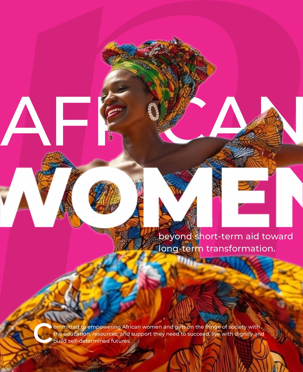
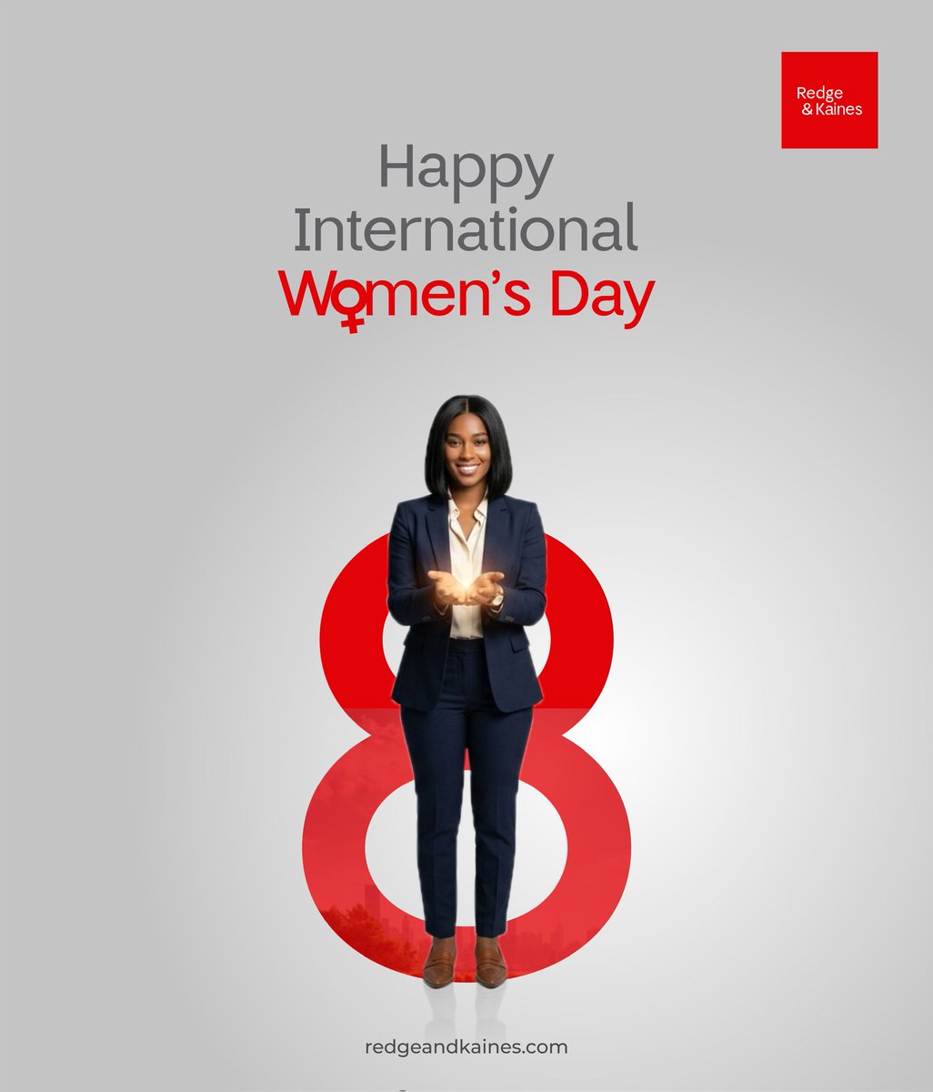
Today, we celebrate the strength and incredible impact of women everywhere.
At Redge & Kaines, we proudly stand with women making a difference in every walk of life, and we reaffirm our commitment to supporting their growth.
Happy International Women's Day.
#IWD2026#GiveToGain
Season’s greetings! 🎄
Thank you for your trust and support throughout the year.
We wish you a Merry Christmas and a prosperous New Year.
https://t.co/Fzw2ieMsex
@SimFubaraKSC Hello, His Excellency (and the person managing this account), these una designs good for una eyes like this?
We believe your visuals deserves a more refined and professional touch, and we're ready to offer this for free!
We dey this PH! Visit https://t.co/SLjdZ2WzjZ
At Snowall, we go beyond clean design; we create websites that drive results.
For @RedgeKaines, a powerhouse in corporate PR and Marketing, we built a sleek professional platform that amplifies their authority and strengthens client trust.
https://t.co/cwwLuoj6m4
At Snowall, we help smart brands show up with an identity that can’t be ignored.
For @fruttishng , we poured freshness, colour, and bold personality into every detail, shaping a brand identity that’s unforgettable as a juicy experience.
https://t.co/cwwLuoj6m4
#brandingdesign
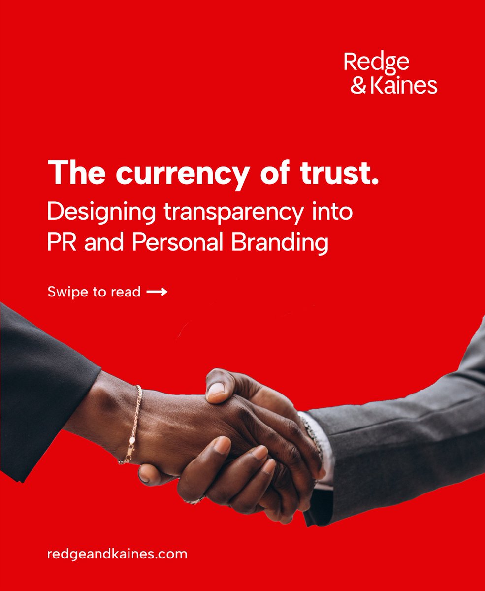
The days of PR being solely focused on projecting a clean image are long gone. Today, the focus is on telling a genuine story.
Whether you’re a startup, thought leader, or a corporate CEO, your audience want to know what you stand for and how you demonstrate it.
#monday
An app that links houses directly to tenants seeking.
Landlords will also post their apartment directly.
Anyone who wants to rent apartments can go there to check.
Exiting tenants can also drop notifications of exit on the app, so others can rent it.
Make Sense??
We've led the rebranding of @mycreebie, shaping it into a sleek, dynamic, and future-ready platform.
From strategy to execution, every detail embodies innovation, and the bold spirit of Creebie.
We're proud to support this exceptional brand!
#ClientSpolight#brandingdesign
As we step into 2025, we extend our heartfelt gratitude to you, our valued clients, for your steadfast support over the years.
Your trust inspires us to aim higher, and we're excited for another year of collaboration and shared success.
#HappyNewYear