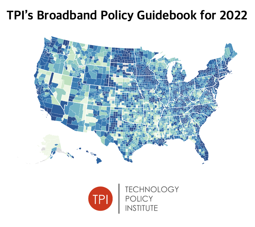
TPI is excited to announce the release of its 2022 Broadband Policy Guidebook! By examining policy lessons of past connectivity programs, our guide summarizes decades of economic research to help inform efficient subsidy allocation.
Check it out ⬇️
https://t.co/GsU8uovNkB
Next Wednesday, @scottwallsten will join @msbgu to share the insights he's developed using @TPIBroadband to identify gaps in broadband access & suggest customized solutions to digital divides that could be provided with IIJA money. #TechNuggets
Register ➡ https://t.co/3HwTqiIqoB
On a new #TwoThinkMinimum, our Senior Fellows discussed all things @TPIBroadband. With an unrivaled combination of data & analytics, it is the only tool policymakers need to focus their efforts on communities in dire need & pursue cost-effective solutions.
https://t.co/Jhh1UGAYI6
The latest edition of Two Think Minimum is all about @TPIBroadband's maps!! For data to be useful, it needs to be put into context. Our maps let users explore relationships between variables to reach insights that would be impossible to gather elsewhere
https://t.co/Jhh1UGAYI6
Just showing a map of data is interesting, but it doesn't help decision-makers. To extract actionable insights from data, you need to put it into context. @TPIBroadband allows users to combine datasets & run regressions to explore relationships between variables #canyourmapdothat
Alabama lawmakers have recently introduced bills to expand #broadband access in underserved communities. @TPIBroadband's state maps help legislators identify areas that would benefit from policy intervention, allowing them to pursue cost-effective solutions where it's needed most
Introducing TPI's "State of Broadband" Maps!! Focusing on connectivity at the state level, our new "Broadband Snapshots" help users easily identify areas likely to benefit from policy interventions and receive infrastructure grants! Visit https://t.co/F7IBLDXUkf for more
Accurately targeting broadband subsidies requires data. Lots of it! @TPIBroadband's Connectivity Index uses a principal components analysis to cut through the noise & objectively rate regional connectivity levels on a 1-10 scale. County-level ratings from Florida are shown below
Finding the number of households enrolled in the #EBB Program has never been easier! @TPIBroadband's map tracks signups at the state level & across zip codes. Data tracking signups in South Los Angeles is shown below! Visit https://t.co/DkI922riPi to see our map in action!!
The #BipartisanInfrastructureBill will deliver $65 billion to help get every American online! But without a comprehensive understanding of which areas are truly underserved, $ can't be directed where it's needed most. Don't waste $65 billion. Get data from @TPIBroadband instead!
Funding matters, but to really make a difference in people's lives, we need to make sure it's going to the right places. Without more comprehensive, complete, and accurate knowledge of which areas don't have service, it'll be impossible to close the digital divide.
A competitive bidding process is still the gold standard for allocating spectrum licenses, and @FCC sending letters to "197 applicants concerning areas where there was evidence of existing service or questions of waste," is an important step to building more successful auctions
.@TPIBroadband's map tracks EBB uptake across geographies, from full states to single zip-codes. By learning which areas have lagged behind in program adoption, officials can better target their outreach efforts & get more households connected #EBB#canyourmapdothat
Results from @ConsumerReports' "Let's Broadband Together Initiative" are coming soon! With over 50k respondents, it presents an opportunity to gain unique insights from subgroups in the sample. @scottwallsten has some ideas to maximize the data's potential https://t.co/4VIL0oBWIo
We have the money to close the digital divide! Just today, @FCC authorized #RDOF support for 469 bids across the nation. But securing funding is the easy part. Ensuring that money is spent in the right place is harder & that's where @TPIBroadband can help https://t.co/ViklYX333p
Comparing connectivity levels across geographies? @TPIBroadband's Connectivity Index (BCI) makes things easy by using info from multiple datasets to score overall connectivty on a 1-10 scale. To uncover the magic behind our BCI, read @scottwallsten's blog https://t.co/gAZKdEXkL1
NEW blog: @scottwallsten explains how a principal components analysis, like the one used to calculate @TPIBroadband's Broadband Connectivity Index, can help policymakers prioritize areas for buildout & identify types of assistance that might be most useful https://t.co/gAZKdEXkL1
Want to learn about broadband adoption in your area? @TPIBroadband has data from the American Community Survey, broken down by connection type, subscriber demographics & speed. Beyond the data, the map allows for comparisons across geographies, from states to census blocks
A study by Brian Whitacre & Roberto Gallardo found rural counties with quality broadband tend to retain population better than those lacking access. @TPIBroadband identifies areas in need, making it easier to direct funding & support communities https://t.co/gkLZhhkcZJ
Many states are attempting to revamp their broadband mapping efforts & yield more granular insights. @TPIBroadband can give them a headstart by providing metrics from 7 different datasets on availability, speed, & adoption, be it for the whole state or just a census block