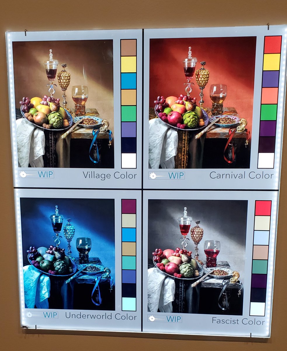
This example of how a scene is color-keyed, from the exhibit of Guillermo Del Toro's PINOCCHIO, is a fantastic demonstration of much storytelling you can do with color alone.
Don Bluth’s method on drawing hands, I remember watching this a few years back and used this method now I don’t really need it anymore since its all muscle memory now :]
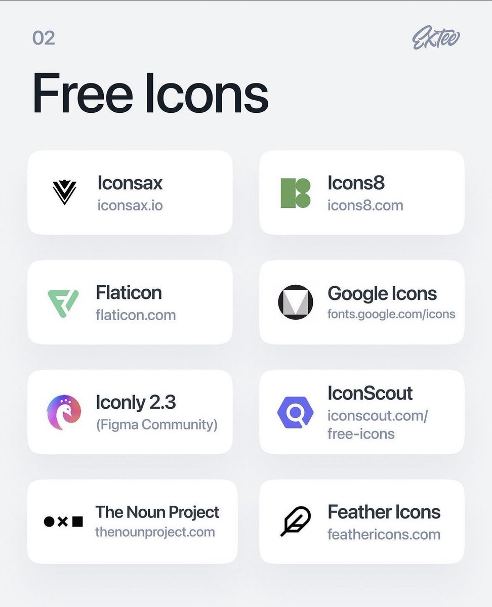
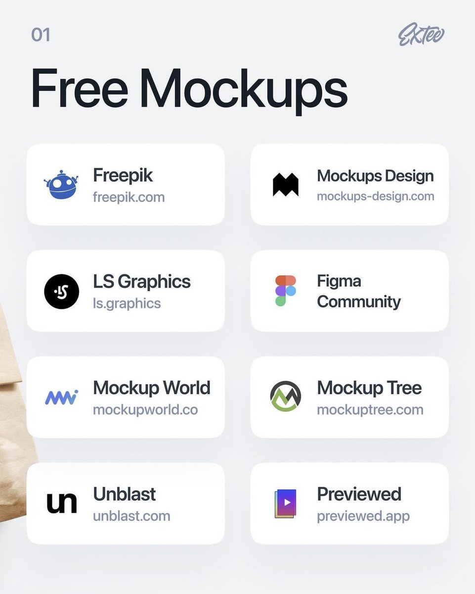
I'm a firm believer in not gatekeeping anything to do with design.
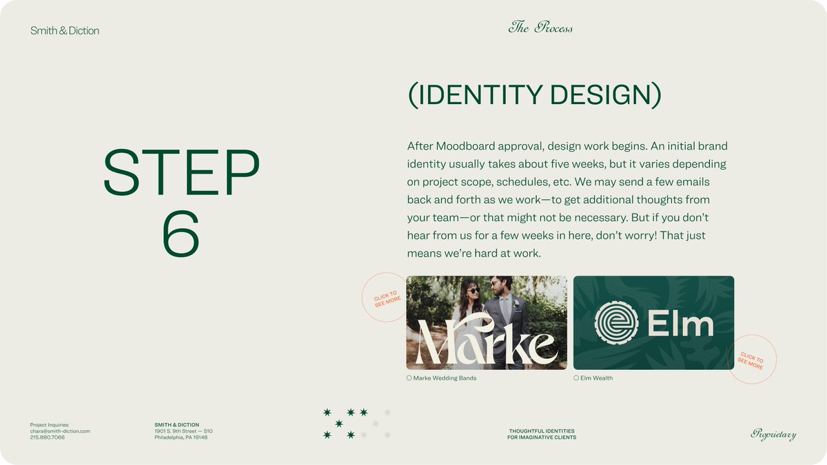
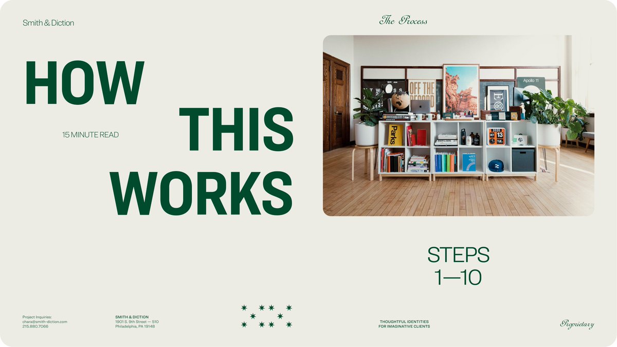
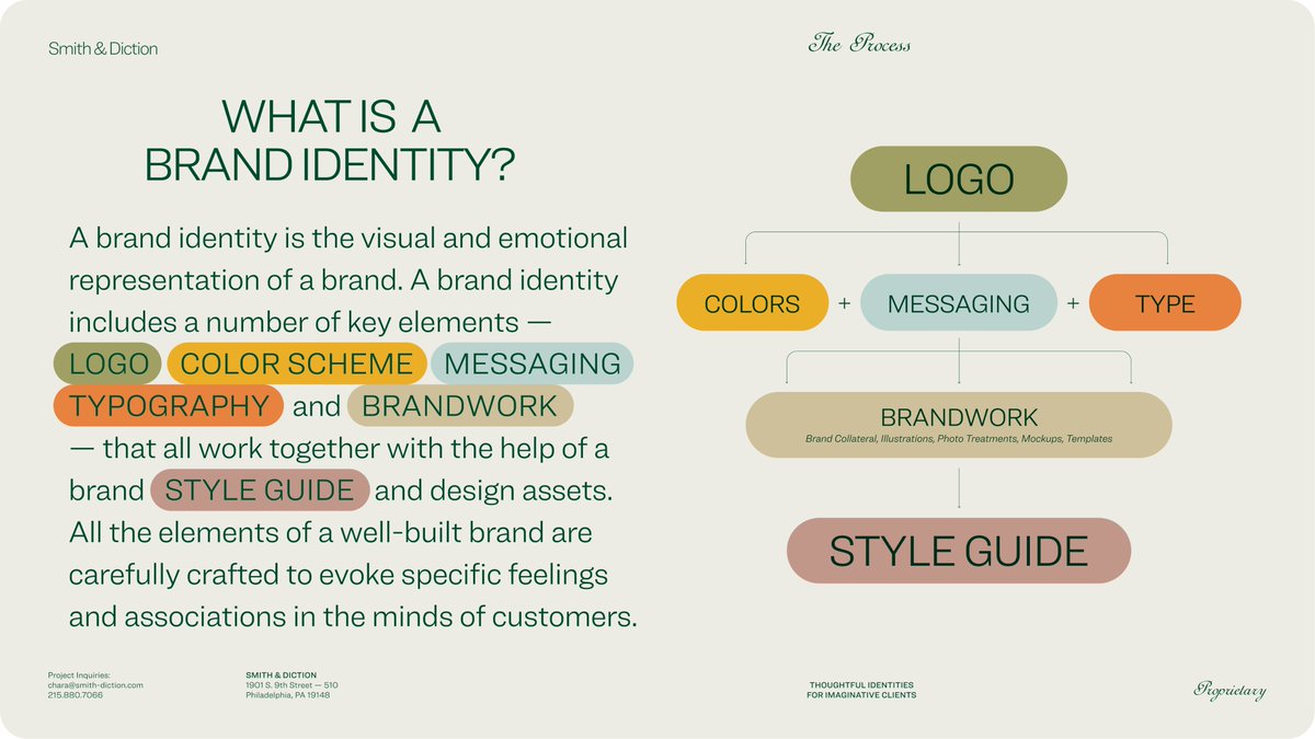
With immense pride I give you @Smith_Diction's process. There's no secret sauce or magic question. But there is a process. So here it is for you.
https://t.co/i8ZqNDI6ux
For the past 2 years, the weavers of Aubusson (France) are making beautiful & official tapestries inspired by Hayao Miyazaki's movies.
Their new "Spirited Away" tapestry will be unveiled today by International City of Tapestry in Aubusson.
Youtube stream : https://t.co/fnYZixXqpZ
How to conduct design review meetings that don’t get derailed (https://t.co/mlL6wRU5hH), a simple technique for conducting an efficient design review, by @growthoutcome.
Design Review Figma template
https://t.co/OA78aUNwNX
Useful tips:
https://t.co/OXNSZA6p98
#ux#design
I recently discovered an illustrator trick about the pen tool and decided to try it out in figma and it works!
This is like the easiest pen tool trick ever, for those who don’t use grids like me for custom type logos.
RT, a novice like mua could learn 🫶🏼😊🌸
The ending tho 😅
Finally, sneak peek into my personal website, "New Year New Me" is here.
Tried my hands for the first time in building a website through Webflow.
Show some love folks! ❤️
https://t.co/D7A4Hhkg2D
Currently open to opportunities. Feedbacks are most welcome.
#webflow#portfolio
Someone sent me a question about imagery in website hero sections, so here's some thoughts/ideas/inspiration, with examples.
1. The standard approach is to have text content (headings, text, buttons) and imagery (photos, illustrations) side-by-side.