3. Kerning comes last:
Before kerning, make sure typeface, font-size, leading, and tracking get finalized.
4. Spatial consistency
Similar letter combinations should have consistent optical spacing.
In this post, we see the remaining character pairs and how you can kern them properly.
4. Diagonal/Diagonal
5. Diagonal/Curve
6. Diagonal/Straight
Diagonal/Diagonal
If you have a diagonal next to a diagonal, this would have open spacing.
#kerning#opticaladjustment#typography
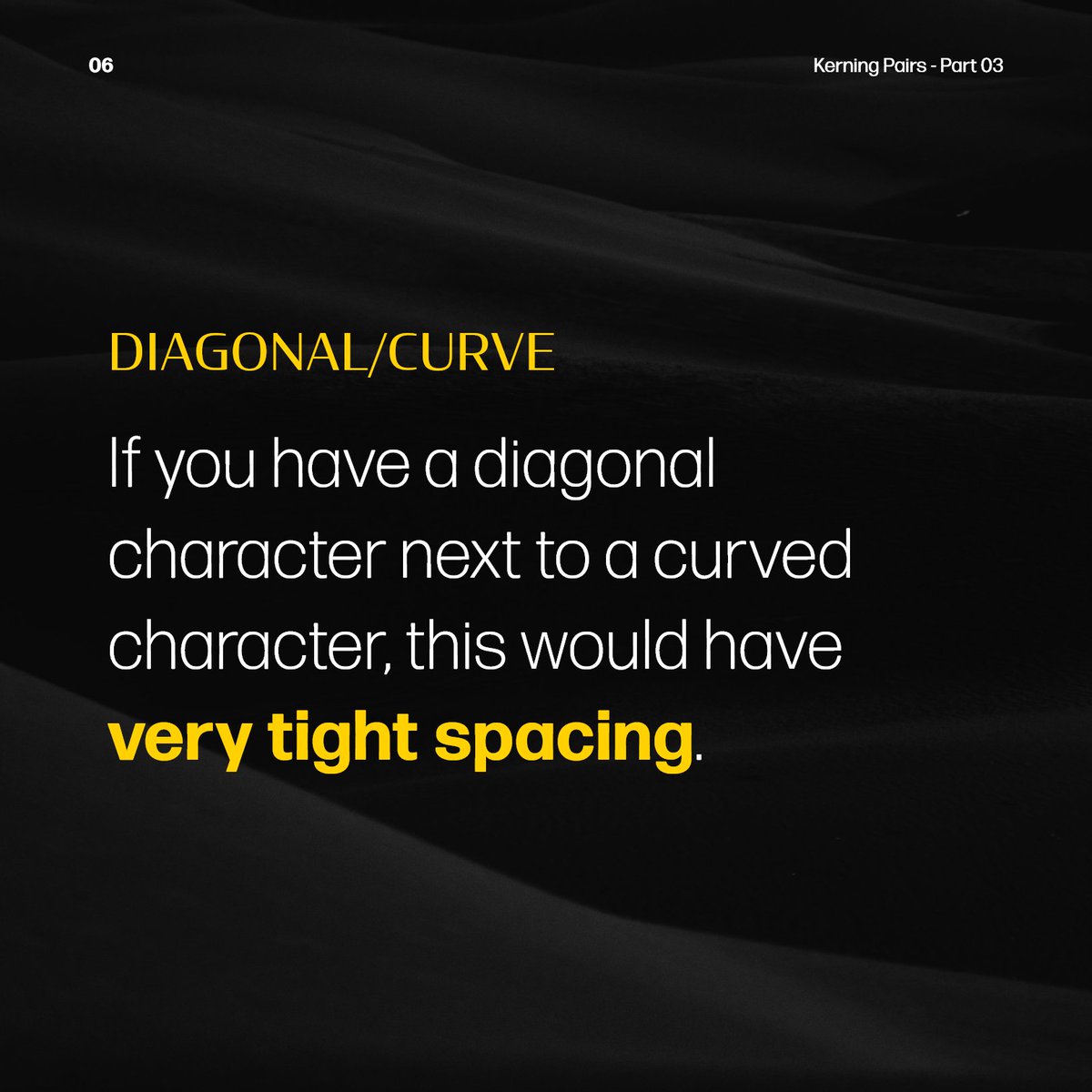
Diagonal/Curve
If you have a diagonal character next to a curved character, this would have very tight spacing.
Diagonal/Straight
If it's a diagonal against a straight, the spacing would be normal.
In this post, we see some common character pairs and how you can kern them properly.
1. Straight/Straight
If you have a straight vertical next to a straight vertical, this would have very open spacing.
2. Straight/Curve
If you have a straight character next to a curved character, this would have normal spacing.
3. Curve/Curve
If it's a curve against a curve, the spacing would be very tight.
There are mainly 6 basic scenarios of character pairing.
Common Character Pairs:
========
1. Straight/Straight
2. Straight/Curve
3. Curve/Curve
4. Diagonal/Diagonal
5. Diagonal/Curve
6. Diagonal/Straight
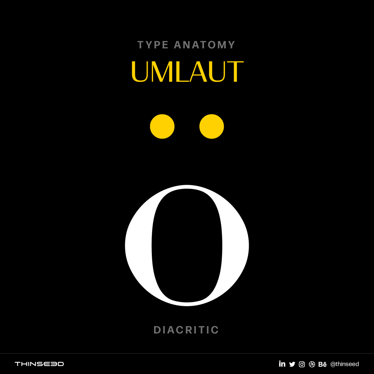
Umlaut (pronounced as um·lowt)
A mark (¨) used over a vowel, especially in German, to indicate a different vowel quality.
To pronounce the ö-sound, say “ay” as in day.
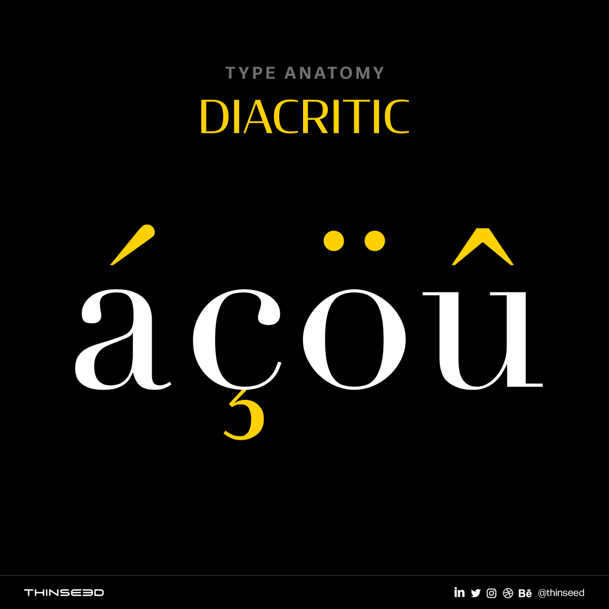
Diacritic is a special mark added to a letter to indicate a different pronunciation, stress, tone, or meaning.
These marks may appear above or below a letter, within it, or between two letters.
These marks are common in foreign languages, but they're also used in English.
Minuscules:
Small letters are called lowercase or more formally minuscules.
Minuscules are letters with variable heights.
Originally, the Latin alphabet didn't have any lowercase letters.
Capital letters are called uppercase or majuscules.
The terms uppercase and lowercase come from how print shops were organized hundreds of years ago.
Metal type were kept in boxes called cases. Small letters were kept in a lower case. Capital letters were kept in an upper case.