@ChiKyle94@north0fnorth Found this on Reddit. It's paywalled but this article links to it and apparently NYT articles linking to paywalled ones bypass the paywall https://t.co/ghYM8xPxlO
Scroll down to the end of the article and click the link that says "How Y’all, Youse and You Guys Talk."
Introducing Fin: The world’s first AI Chief Financial Officer.
Fin outperforms humans 100% of the time.
RT + Comment “FIN” and I’ll send you an AI agent that saves 6-7 figures/year.
Of course, a sales funnel on a single channel is incomplete; the full multi-channel experience, including different paths to a user, is best viewed overall to identify commonalities and friction points to address.
Here's the Tesla Model Y process overall:
And we're off to another 14 weeks of all things digital analytics with 50+ students ready for a whirlwind of all things analytics from e-commerce optimization, influencer roi, campaign analysis, a/b testing, cross-channel social media competitive comparison and more!
"Portrait orientation" has historically meant "a tall image", in contrast to "landscape orientation". In 2016, Apple released "portrait mode" for iPhone, which blurs out the background of an image (I developed most of Google's equivalent tech from 2013-2015, we called it "lens blur" initially and then adopted "portrait mode" in 2017).
Since then, vertical video has become ubiquitous and background defocus has become an invisible part of many mobile photography pipelines, and as such "portrait mode" has slowly absorbed the meaning of "portrait orientation" to the point where it has now almost completely displaced it! Watching this slow linguistic shift over the past decade has been a strange experience for me.
We also built a spreadsheet agent similar to @tryshortcutai.
Spreadsheet UI on the left, AI chat on the right. The agent has database tools - query, read, write, delete - and code execution built in.
Ask it to create tables, run calculations, or add formulas. It executes the operations and updates the sheet directly.
The agent decides what database operations or code to run based on your request.
Most companies are *vastly* overcomplicating their analytics.
Everything is tracked clicks, scrolls, impressions, events.
Which is fine. Logging is cheap. We also need them when we need to understand rare phenomena.
But attention isn’t cheap. Most of what we track never helps us make better decisions.
The truth is, only about 100 metrics really matter.
These 100 metrics explain 90% of what’s happening in your business and product.
And the same principle holds elsewhere too:
Only 50 events truly matter for understanding user and system behavior.
Only 150 entity characteristics — the key attributes of your users, products, or content — explain most outcomes.
Everything else lives in the long tail: useful for special cases, but not essential for running the business on a daily basis.
This is because everybusiness can be represented as a system, and these systems can be written as a set of equations.
When you express your business as equations, you expose its levers. These levers are potentially actionable and can actually move results.
Take Facebook’s revenue model. It can be simplified into four components:
1. Revenue = Users × Impressions per User × Ad Impressions per Impression × Revenue per Ad
That’s it. Four levers at the highest level.
To grow revenue, you can:
1. Increase users (growth)
2. Increase engagement (more impressions per user)
3. Raise ad load (more ads per impression)
4. Improve monetization (revenue per ad)
Each of these can be broken down further.
Let’s choose Monthly Active Users (MAU) as a proxy for growth. You can decompose MAU by an equation.
MAU = New Users + Retained Users + Resurrected Users
You can also grow your active users by getting new users, resurrecting churned users and keeping the existing users from churning. Now, let’s go one layer deeper.
New Users
= Visitors
× (Downloads / Visitors)
× (App Opens / Downloads)
× (Registrations / App Opens)
× (New Users / Registrations)
If we define a new user as someone who registers and then takes an action, growth comes from improving each step of that journey. We can bring in more visitors at the top of the funnel, get more of them to download the app, increase the share who open it, raise the percentage who register, and finally help more of them take their first action.
Each step is measurable.
Each can be improved.
Each has a story behind it.
And if you want, you can keep peeling — looking at funnel drop-offs, activation, or engagement drivers.
This is the beauty of decomposition.
When you break the system into equations, you can see what drives what.
After you do this for the key levers of your business, add all your metrics up. I'd be surprised if what *truly* matters is more than 100 metrics.
More on our latest post in Opinionated Intelligence dot substak.
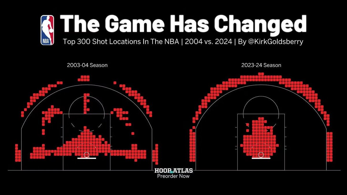
Still thinking about this chart, wherein NBA is most concerned w/optimizing shots - at cost of entertaining gameplay - and since doing this viewership is down significantly. Is what happens when you let spreadsheet-brained NPCs run everything -music, movies etc all made boring
Most product teams live and die by analytics.
We obsess over every click, every drop-off, every chart on the dashboard.
But ask anyone what their users were actually thinking when they left and you’ll get silence.
Every company has the same blind spot. Data tells you what happened. It never tells you why.
Now imagine this: the answer was hiding in a forgotten tool. Nearly every founder once used it. Then it disappeared.
Back in 2009, analytics set the pace for every product decision. Heatmaps tracked every tap and funnel, but no tool could explain what users felt in the moments that mattered. Everyone in product knew the gap. Interviews took too long and reached too few. Traditional surveys were exhausting and went unanswered.
That gap became our mission. Alongside Sean Ellis, we built a survey tool to assess product/market fit. That tool was just the starting point.
We built a way to embed the whole product/market fit survey on a website. That was the original inspiration that started it all.
The tool evolved into an entirely new product.
What changed everything was giving teams a way to listen directly, right as decisions happened. The survey appeared on the website, not in an inbox. Thousands of startups started using the tool to catch answers in real time.
A SaaS founder could ask, “What almost stopped you from signing up?” and see insights appear before the next deploy.
E-commerce brands dropped, “What made you leave your cart?” right at the point of hesitation and saw patterns emerge in a single afternoon.
One team learned their pricing page was confusing after hearing it from dozens of users in just a week. Another caught the phrase “missing features” so many times that their roadmap shifted overnight.
The lesson was simple. Context is everything. If you ask at the right moment, even the quietest users will tell you what matters most.
We wanted to go even further. Early prototypes were scrappy. Hand-drawn boxes pasted on screenshots, phone calls with a single question, landing pages that promised, “Ask your users in 30 seconds.”
Every version focused on one goal: make it effortless to ask a question right at the point of friction.
KISSinsights became the purest form of this idea. Teams dropped a small script onto their site.
Instantly, a question box appeared wherever it was needed. There were no settings to configure and no training required.
Founders put surveys on pricing pages to ask, “What’s missing before you pick a plan?”
Marketers added them to sign-up flows, asking, “What almost stopped you from joining?”
Product teams set a survey for users about to leave, asking, “What didn’t you find today?”
The answers landed instantly in the team’s inbox, often within seconds of the user’s decision.
What surprised us was how users responded. They answered, and many even thanked the team for caring enough to ask.
One customer wrote, “This is the only pop-up I actually want to see.” Another founder said they learned more in two days from KISSinsights than from months of analytics reports. By meeting users where they were, teams finally heard honest feedback from people who would have otherwise stayed silent.
There was an unexpected growth loop, too. Every survey ended with a simple line: “Powered by KISSinsights.” Curious users clicked, set up their own micro-surveys, and the idea spread.
A founder who saw the pop-up during checkout added it to their own launch page a week later. Teams swapped stories in forums and group chats about the best questions to ask. One growth marketer shared how a single survey on the pricing page led to a thirty percent jump in conversions after they fixed a confusing headline.
Within months, more than twenty-five thousand teams were using KISSinsights. It spread founder to founder, blog to demo, and conference to Slack channel.
For a time, micro-surveys became a default part of every serious product and marketing team’s workflow. The best teams made it a habit to ask a real question at the moment of truth, every week.
But change came quickly. Voice-of-customer suites and enterprise vendors took over. Free plans disappeared or became heavily limited. The simple experience was replaced with dashboards and paywalls. Multi-step surveys became the norm. The original discipline of ask one real question, at the exact right moment, was left behind.
What was lost went beyond speed or simplicity. Teams lost the habit of meeting users in context. Today, most teams have more dashboards and less clarity. The most honest answers that surface the why in the user’s own words have almost vanished.
If you want to know why people leave, or what’s stopping them from buying, you still need to ask the right question in the right moment. Micro-surveys were about making it so easy to listen that no team could ignore the answers.
It’s easy to forget how much a single, well-timed question can teach you. But if you built products in those years, you remember the little box that changed everything.
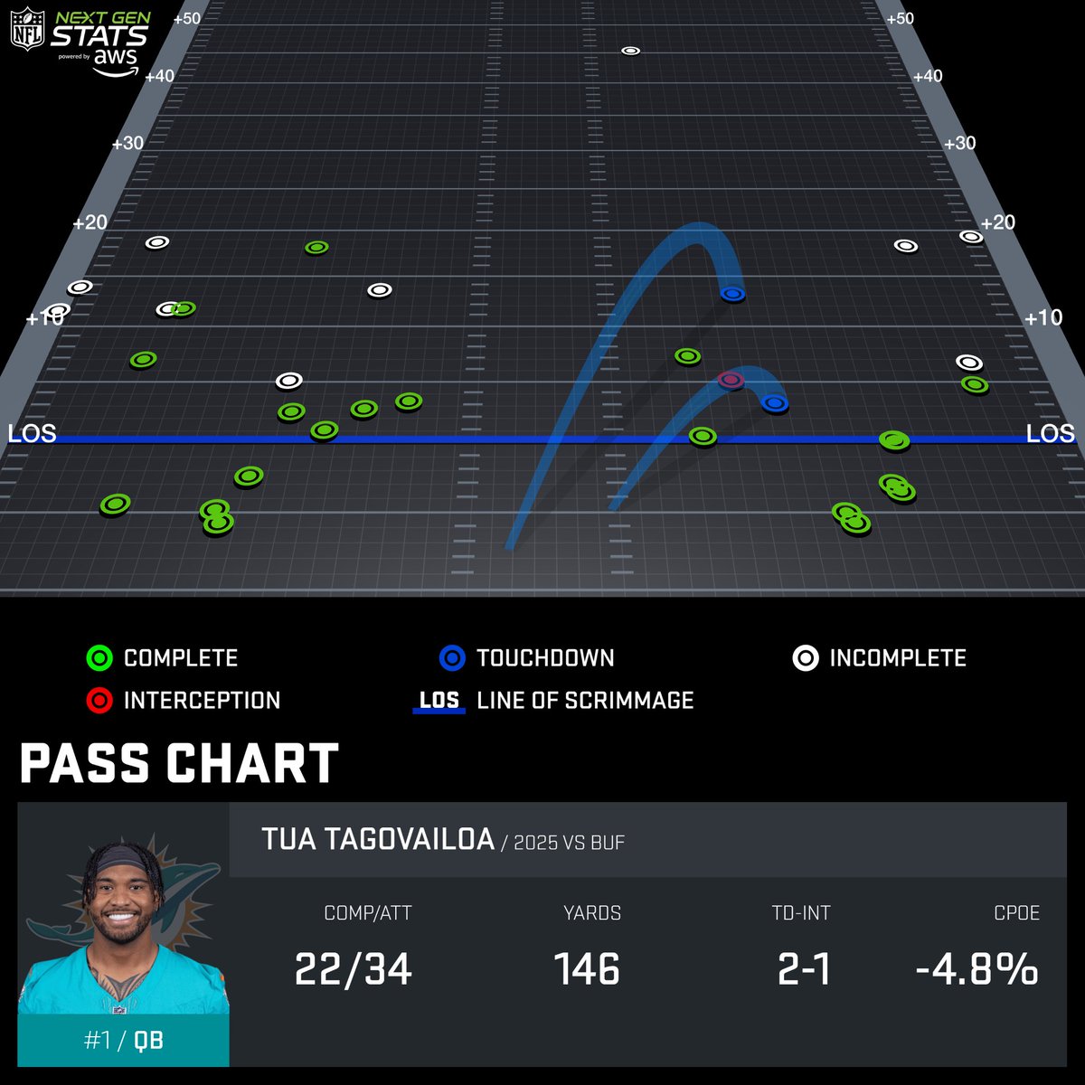
Josh Allen & Tua Tagovailoa combined to average 1.5 air yards per completion, the lowest mark in a game in the NGS era (since 2016).
Allen attempted only one pass over 10 air yards, while Tua completed as many passes behind the LOS as past it (11 each).
Powered by @awscloud
As a neurosurgeon I care a lot about road safety.
By now you’ve probably seen @Waymo’s stunning safety results (like 91% fewer serious crashes). But they didn’t just publish data headlines. They released the raw CSV files and data dictionaries.
I did a much deeper analysis. A fascinating story emerges when you analyze how they’re achieving this.
This isn’t incremental improvement - it’s categorical. We’re looking at the potential elimination of traffic deaths as a leading cause of mortality.
The intersection breakthrough: Waymo has essentially solved intersection crashes, with 95% fewer injury incidents than human drivers in the same locations. That’s transforming the deadliest driving scenario.
The national math: If every US vehicle performed like Waymo, we’d prevent 33,000-39,000 deaths annually and save $0.9-1.25 trillion in societal costs. Even partial adoption at 27% would save ~10,000 lives per year. In terms of magnitude, this would be the equivalent of eliminating every pedestrian death nationally in a year.
The physics signature: Here’s what fascinates me: 47% of Waymo’s contacts involve less than 1 mph delta-V. They’re not just avoiding crashes; they’re converting unavoidable incidents into gentle bumps. It’s like having physics itself on your side.
We’re not talking about marginal safety gains. The data represents a fundamental shift from harm reduction to harm prevention.
The methodology matters: I used their dynamic geographic benchmarks (comparing like-for-like road conditions) and verified the findings hold across San Francisco, Phoenix, LA, and Austin. The safety advantage actually increases in more complex urban environments.
Link to raw data below….
Notes on my approach:
Analysis based on 96 million miles of Waymo Rider-Only (RO) data through June 2025, utilizing Waymo's dynamic geographic benchmarks to compare Waymo Driver performance against human drivers under similar road conditions and operational design domains.
The projections for national impact (deaths prevented, societal costs) involve several assumptions. Given Waymo's zero reported fatalities, the direct serious injury reductions were mapped to national fatality statistics using established NHTSA-derived ratios that correlate serious injury crash rates with fatality rates. This extrapolation assumes that Waymo's observed serious injury prevention capability would translate proportionally to fatality prevention. Societal cost savings are estimated by applying average per-fatality and per-injury economic costs (e.g., medical, lost productivity, quality of life) as published by NHTSA, scaling these national averages to the projected number of avoided fatalities and injuries based on Waymo's safety performance. These figures represent the potential annual impact if the Waymo Driver's safety profile were widely integrated into the national fleet.
@ethanteicher
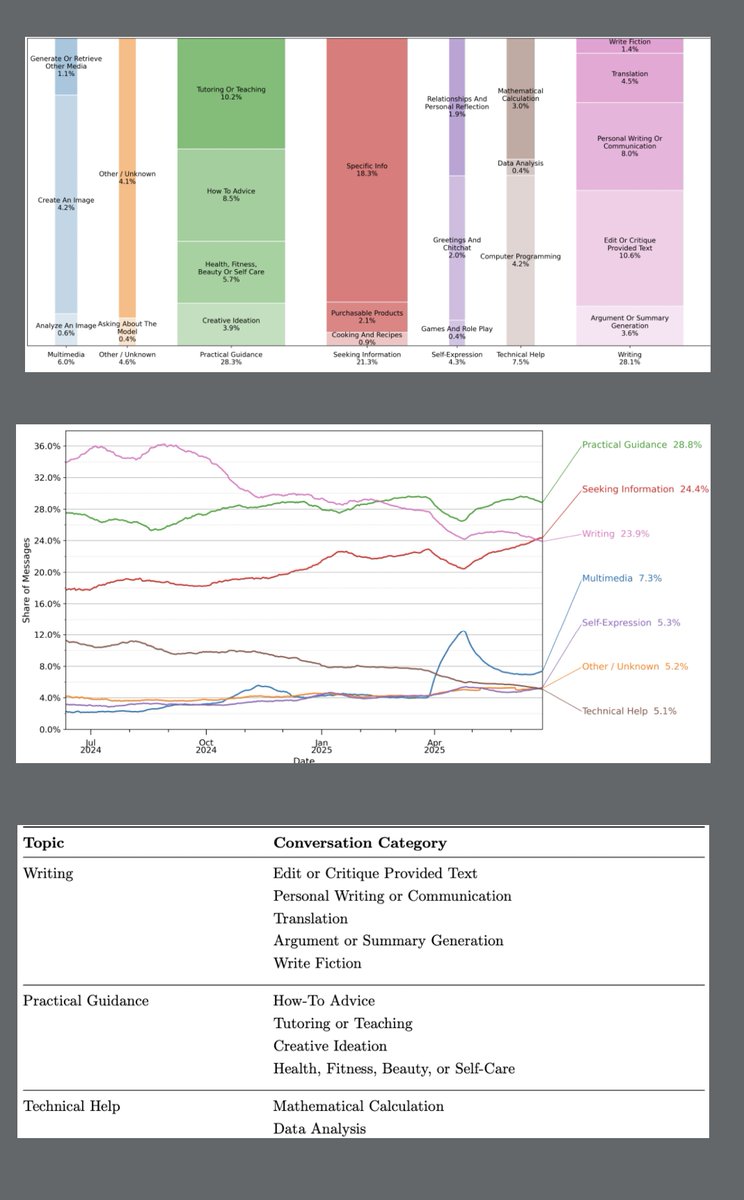
Must-read SEO article: OpenAI released a 10,000+ word research paper titled "How People Use ChatGPT".
The study gives TONS of data on conversation intent, topics + more: