Day 15/30 🎨
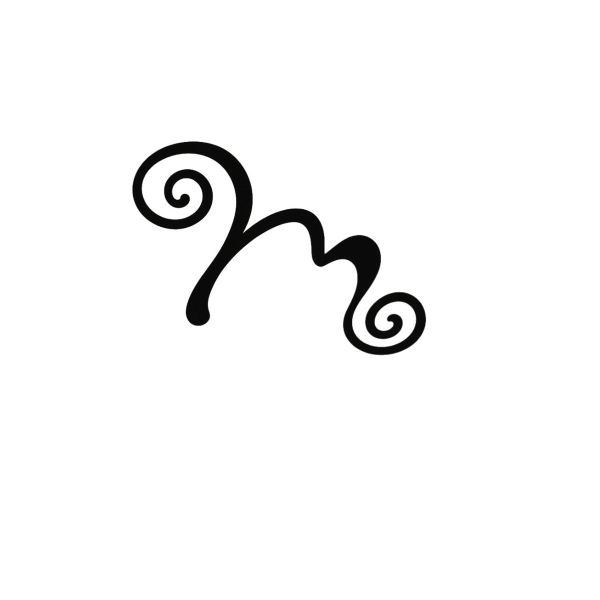
Today, I created a logo concept for MARELLE, a fictional bakery brand.
I explored 3 directions before choosing a monogram built around the letter “M” , keeping it elegant, warm, and memorable.
15/30 ✅
#30DayDesignChallenge#LogoDesign#GraphicDesign
Day 14/30 🎨
I struggled to improve my previous TYPE FEST poster, so I changed direction. I tweaked the text, repositioned elements, refined the spacing, and pushed the typography further until it came together.
Which do you prefer?
#30DaysOfDesign#GraphicDesign#Typography
Day 13/30 🎨
Exploring the 1970s with this retro-inspired GROOVE FM poster. Vintage radio, bold typography, warm colours and grainy textures to capture the soul, funk and disco era.
#30DaysOfDesign#GraphicDesign
Day 12/30 🎨
Today’s challenge: create an event flyer using a strict grid.
I focused on alignment, spacing, hierarchy, and visual balance.
Event concept: Creative Convergence, a gathering for people who make things.
12 days down. 18 to go. 🔥
#30DayDesignChallenge#GraphicDesign
Day 11/30 🎨
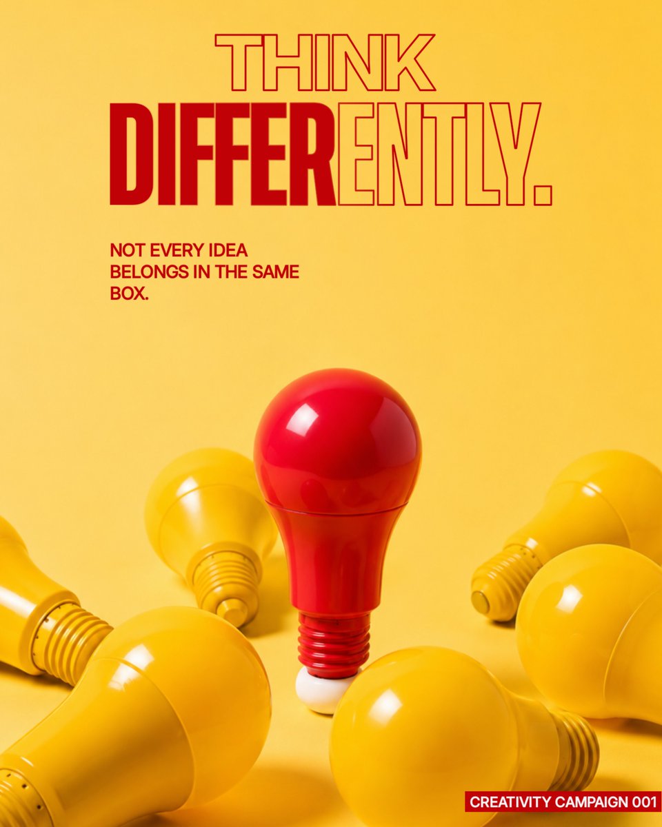
THINK DIFFERENTLY.
For today’s challenge, I created an awareness poster centered on creativity, originality, and the courage to step outside the norm.
Not every idea belongs in the same box. 💡
#30DayDesignChallenge#GraphicDesign#Creativity#Design
Day 10/30 — Typography Poster 🎨
No images. No icons. Just type.
For today’s challenge, I created TYPEFEST 2026, a fictional typography event where the typography itself becomes the visual.
Exploring scale, repetition, contrast & hierarchy.
10/30 ✅
Day 9/30 — Negative Space.
For today’s challenge, I created a fictional luxury fragrance brand, ÉLANE, and designed a single-product poster around one idea: less can say more.
I focused on typography, balance, and intentional empty space.
#30DaysOfDesign#GraphicDesign
Day 7/30 🎨
I went back to my Day 4 coffee design and redesigned it with fresh eyes.
V2 focuses on stronger hierarchy, typography, composition, and brand consistency.
V1 → V2. Same concept, better execution.
#30DaysOfDesign#GraphicDesign
Day 8/30 🎨
For today’s challenge, I designed a fictional concert poster for AFTER DARK, an Afro-fusion experience.
The focus was bold typography, strong hierarchy, and a single hero image.
Slowly but surely, getting better. 🔥
#30DayDesignChallenge#GraphicDesign
Day 6/30 🎨📸
For today’s challenge, I color-graded and cropped 3 urban photos to create one consistent mood.
I went for a warm, dark, cinematic look with muted tones and deeper shadows.
Focus: consistency, mood & storytelling.
#30DayDesignChallenge#GraphicDesign
X
Day 5/30 🎨
I vectorized two fictional brand concepts: Pace (speed & movement) and Bolt (energy & tech).
Today’s challenge: Create 2 simple abstract logo marks using vector shapes. Quantity over perfection.
#30DayDesignChallenge#GraphicDesign
X
Day 4/30 ☕️
Today’s challenge: create a promotional Instagram post for a fictional coffee brand in just 45 minutes.
I went for a warm, premium feel for “Roast & Rise” while keeping the layout simple and focused on the offer.
#30DaysOfDesign#GraphicDesign
X
Day 4/30 ☕️
Today’s challenge: create a promotional Instagram post for a fictional coffee brand in just 45 minutes.
I went for a warm, premium feel for “Roast & Rise” while keeping the layout simple and focused on the offer.
#30DaysOfDesign#GraphicDesign