🇦🇺🇮🇳🏴 @ABSStats data released today shows that India has narrowly overtaken England to become Australia’s largest overseas country of birth for the first time. As at June 2025, there were 971,020 India-born residents compared to 970,950 born in England.
In 1996, these figures were 80,470 Indian born & 956,680 English. Since then, India-born has grown ~31k p.a on average vs ~500 p.a for England-born; over the past five years, ~+50k p.a. 🇮🇳vs −3k p.a 🏴. The median age of India-born residents is 36.1, compared to 59.8 for England
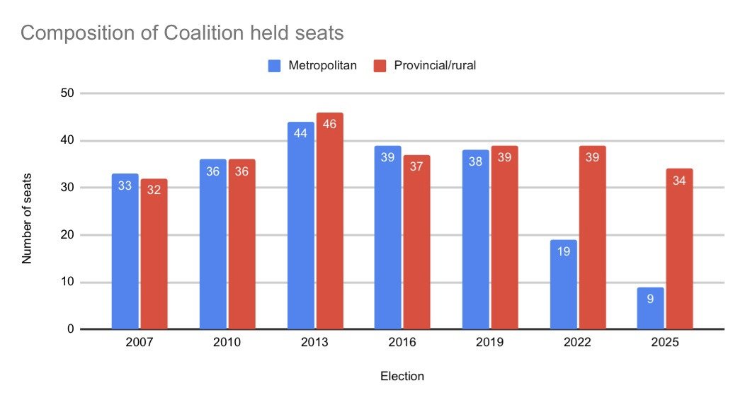
Australia is one of the world’s most urbanised democracies, yet the centre right faces a profound challenge in its cities. A longer essay on why, and how Liberal renewal might be possible, informed by work with demographer @TobyMPW. Link in comment below.
Australia is drifting toward a future of higher reliance on migration or population decline.
The practical question is whether our policies and cities make it easier or harder for people to have the number of children they want.
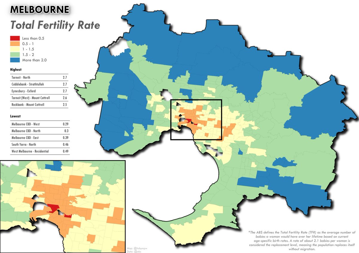
Australia’s birth rate is at a record low and still falling. In Melbourne and Sydney, many dense inner city areas have total fertility rates well below 1.0 per woman. Only small pockets exceed 2.0, the level needed to sustain population without migration.
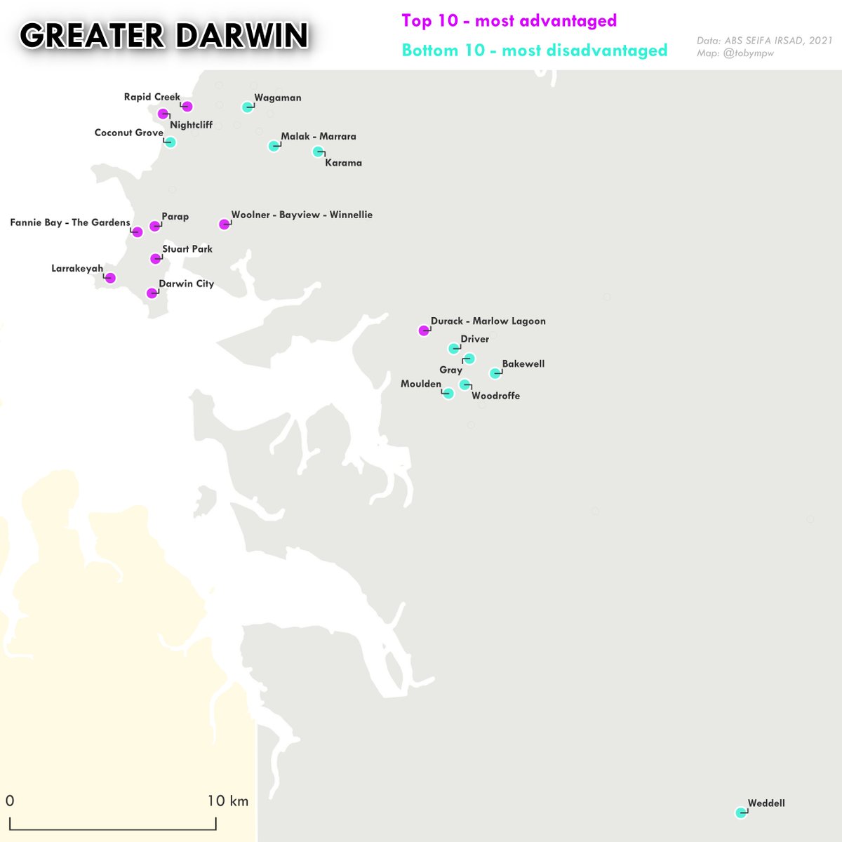
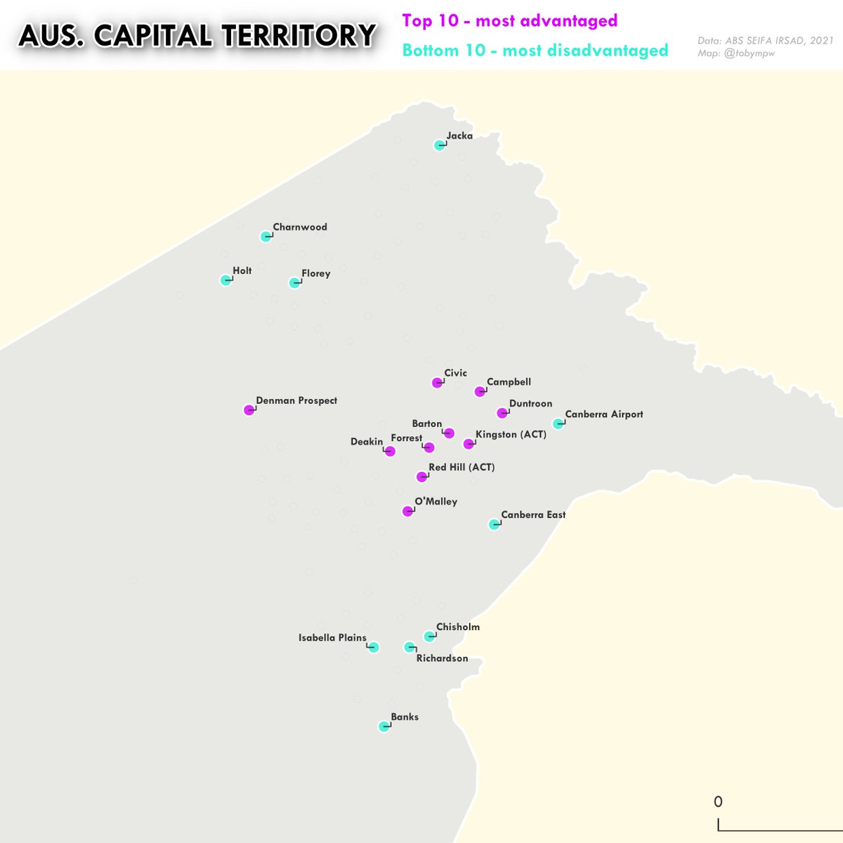
SEIFA is an @ABSStats index summarising the average socio-economic advantage / disadvantage of an area, based on income, education, employment and housing. Thanks to @undertheraedar for the map inspiration. Link to the UK's 2025 Deprivation Index data: https://t.co/Sr00UMwesx
With the UK’s 2025 Deprivation Index now released, it’s worth noting Australia has its own version - SEIFA - which measures the relative socio-economic conditions of communities.
Here are the 10 most advantaged and 10 most disadvantaged areas across Australia’s capital cities.
New from @Ipsos_in_the_UK Keir Starmer is the most unpopular PM in the history of Ipsos polling.
Net satisfaction with PM -66
Meanwhile Reform lead at 12.
Reform 34
Labour 22
Conservatives 14 (record low)
Lib Dems 12
Greens 12
Professional Women have led Australia’s workforce transformation.
They overtook Professional Men in May 2004, then Male Technicians & Trades Workers in May 2015, becoming the largest occupational group - charts below.
The gap’s only grown since. A shift decades in the making
@KosSamaras Since the party’s founding in 1945, 13 of its 16 leaders have represented metropolitan seats (11 from inner-metro). And across that time, the party has been led by someone from a metropolitan seat for 89% of its history
@ShaunRatcliff@hughriminton@KosSamaras Yep - with the citizen filter only Cabramatta, NSW has a non Australian highest country of birth (37% Vietnam). Broadening to all residents, there are 36 suburbs - most small, but 12 big NSW ones (list in next tweet). This is based on plurality, suburbs >50% o/s born much wider.
This builds on extensive commentary and analysis from @KosSamaras, SBS’s analysis over the weekend + a tweet I shared a few years back!
All maps are original & based on data from the ABS Census, filtered for Australian citizens.
https://t.co/mtZz2GuB3B
https://t.co/3zaGVOA35S
🗺️🇦🇺 Australian census map showing the most common country of birth (other than Australia) by local government area across Australia’s major capital cities.
🧵🗺️Top country of birth (excl. Australia) by Melbourne suburb: 2006 vs 2021 with 2025 federal electoral boundaries overlaid.
These maps show 15 yrs of change, with major shifts in Indian, Chinese, English & Italian communities in the maps below.
Italy 🇮🇹 – Victoria’s 2nd largest diaspora in 2006 – now 6th (<1%). Once strongly concentrated in Melbourne’s north & northwest, still present but less dominant today.