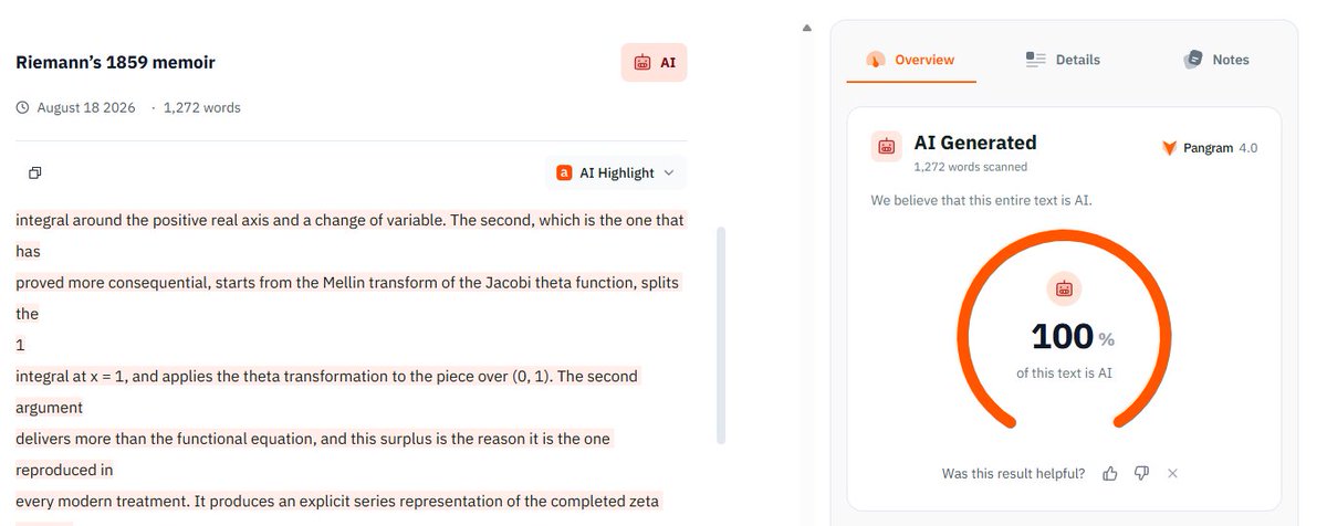
@zdch@TheStalwart@pangram@max_spero_ Okay, but the UI allows as few as 50 words and will gladly tell you if it thinks it’s ai or not. Beyond that, the model still gives a bold confident (100%) response even on small word counts. It’s selling a feature they even claim they cannot create yet.
@zdch@TheStalwart@pangram@max_spero_ No, he completely ignored the substance of the critique and punted accountability to the user. If your product cannot adequately function on 200 words of text, you shouldn’t be commercially offering it.
@cryptopunk7213@zerohedge This is our god? His puts are effectively trashed now no? He bought them prior to end of March, intel stock has been up 140% since.
@JacobAShell@AlecMacGillis Hard to make the claim that StL had a more pronounced downfall than Detroit when STL metro population increases every year and Detroit metro has decreased for the past 25. The OP is incorrect, StL population is simply shifting to west suburbs.
@Wan_Chong_Shan@StatModeling lol “cultural conservative” “education researchers” aren’t sending their best. You completely misread Wainer’s argument and now make a strawman. Truncating one tail doesn’t mean the other subject should rise.
@Wan_Chong_Shan@StatModeling Yes, kids repeat the whole grade, but only reading determines who advances. NAEP tests 4th graders that year, and the weakest readers aren’t there but the weakest math students are. The correlation between the two is not 1:1.
@ryxcommar@profplum99@besttrousers @SageWonk There is A for B swap in opm. Your example assumes the basket is replaced, like ETFs. The OPM basket is always the 1963 food-plan ×3. CPI prices it, it doesn’t reconstitute it. There is no “updating” of anything. CPI does not replace the base, it scales it. SPM would fit better.
@ryxcommar@profplum99@besttrousers @SageWonk That’s incorrect. You’re treating the CPI basket as the OPM basket. In the OPM, CPI is just a scalar applied to a fixed 1963 food-plan bundle. For your ETF analogy to hold, a 1963 ETF would never rebalance, it would just multiply its original holdings by a market index.
@Beastness_Max@SemiCynic@profplum99@mattyglesias No, if you’re going to compare average family of 3 it was 23–25% in 1955. I’m not trying to say it was the lowest quintile at all. Also not arguing he’s not directionally correct. The 33% was for low income family of 3+.
@GreatDecoupling@profplum99@mattyglesias I couldn’t read beyond the paywall, open to hearing the defense. I’m not disputing the broader thesis, just the use of the Orshansky multiplier. Substituting the food share of all households for the food share of poor households, yet still treating it as a ‘poverty’ threshold.
@SemiCynic@profplum99@mattyglesias Households in the lowest income quintile spent on average $5,278/year on food (and that represented 32.6% of their after-tax income).
@profplum99@mattyglesias Not sure how your $140,000 number is defendable. Orshansky’s method uses the poor’s food share, which much higher (33ish still, not 5-7). Plug that in and the multiplier stays ~3, so a modern line lands around $40–45k. Yours is less poverty and more middle class.
@besttrousers@Argyese@profplum99 The better arg against him: His $140k “real poverty line” comes from using a 5–7% food share that reflects all households. Orshansky’s method uses the poor’s food share, which much higher (33?). Plug that in and the multiplier stays ~3, so a modern line lands around $40–45k.