Want to start an online business?
Web design is perfect for beginners
This course will teach ALL of the technical skills you need from scratch (no experience required)
AND show you how to find clients (includes video pitches you can copy paste)
https://t.co/429gkWnJtW
@IsaAbuhuseina I can build you a website that looks just like @theaymanarab agency website.
It will showcase your portfolio of video edits and explain what you can do for your clients
The website will be super fast and practical whilst also having a modern slick design🔥
Send me a DM?
NUMBERS IN WEB DESIGN:
This is a rookie mistake that I see too often with new businesses.
Use digits instead of letters for numbers.
People hate reading numbers when they are written in letters, it makes it difficult to understand what you are trying to say.
Digits are more user-friendly and convert higher!
SOCIAL PROOF IN WEB DESIGN:
Social proof is EVERYTHING when it comes to sales.
As soon as people see your website, your social proof should be visible immediately!
You can do this by adding verification/awards badges in your hero section.
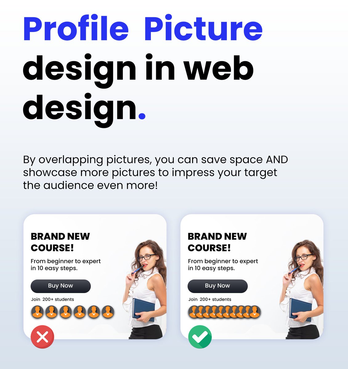
Using profile pictures in Web Design:
When using profile pictures for your landing pages or websites, always overlap them.
You don't have enough space to show off your social proof if you choose to place profile pictures next to each other.
🚩Rookie mistake I see very often!
Many people underline their call to action and then wonder why their website & landing pages aren't converting.
You NEED to create a button that can't be missed!
This mistake is very common on squeeze pages with email signups & lead magnets
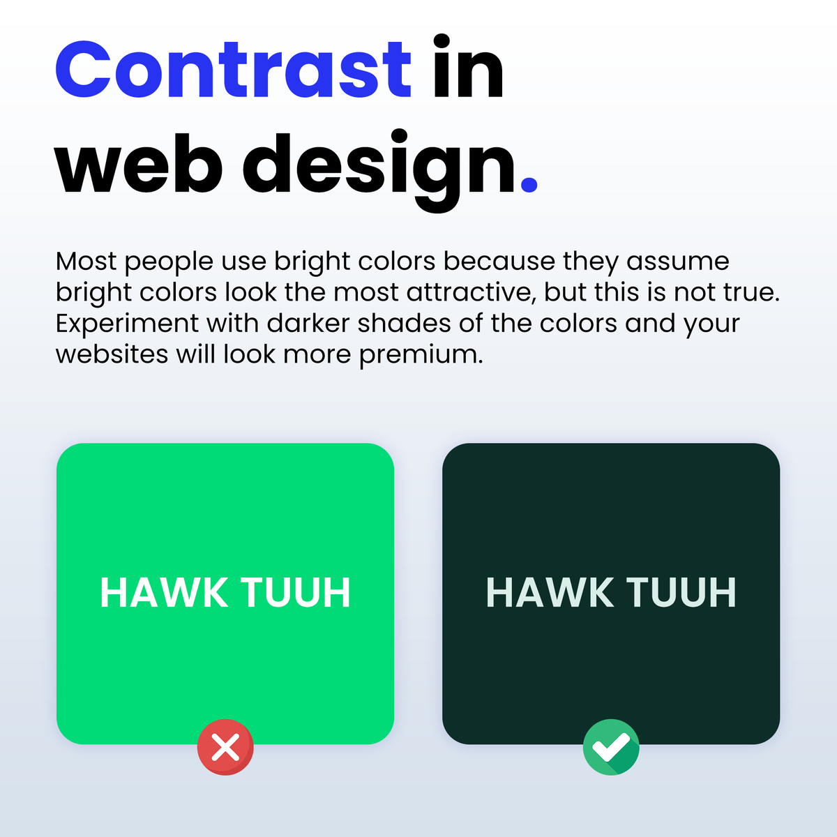
CONTRAST IN WEB DESIGN:
Most people use bright colors because they assume bright colors look the most attractive, but this is not true🚩
Experiment with darker shades of the colors and your websites will start to look modern and premium!
USER EXPERIENCE IN WEB DESIGN:
Ever got annoyed because you "touched" the wrong button on your phone by mistake?
Your website Vistors might be experiencing the same problem!
Never cram elements in your website because people will struggle to touch the correct button.
Always leave 20px to 40px space in between buttons.
@letis24_web 100%
People are always looking at multiple websites at the same time as well, so you have a small window of time to catch their attention.
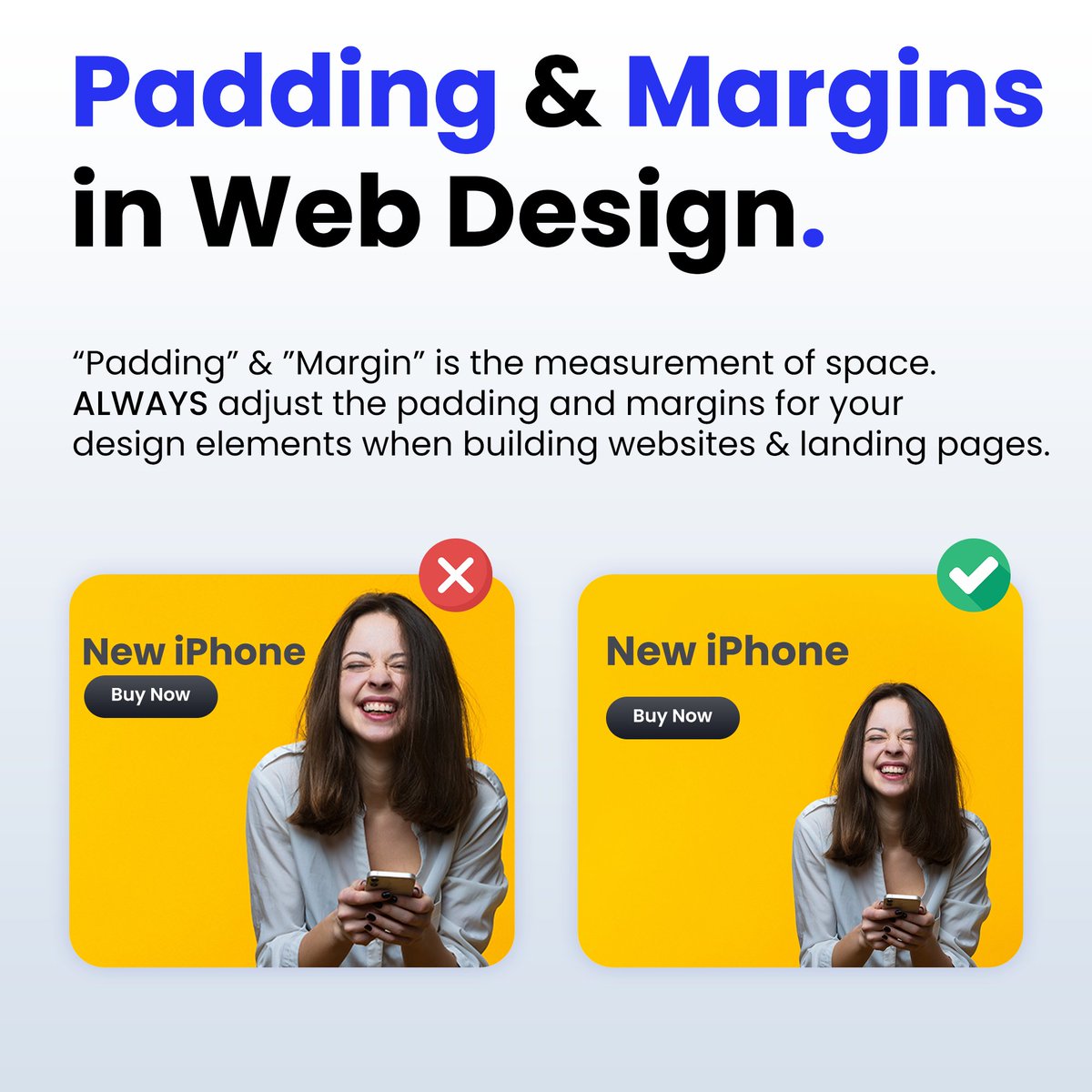
Padding & Margins in Web Design:
“Padding” & "Margin” is the measurement of space.
ALWAYS adjust the padding and margins for your design elements when building websites & landing pages.
Mobile Navigation Menu Design in Website Design:
Always use a hamburger menu for mobile devices when building your websites.
✅ Case studies show that hamburger menus have a higher engagement and conversation rate.
✅ Hamburger menus make it so much easier to navigate the website.
✅ People are used to websites having hamburger menus so it feels familiar and they already know how to use it.
@KaiCromwell You are correct, it's because most of the "big" companies have so many clients that they don't care about quality of service.
I used to work with a guy who made $50k/month from SEO.
He used to pay me $2,500+ per website and I would deliver in 3 days max.