After seeing the situation with freshers lately, I get why companies ask DSA now.
It tests your thinking, problem-solving, and honestly, basic coding fundamentals.
I used to think DSA interviews were overkill. Now I’m actually enjoying preparing for DSA for my placements😭
Just heard this from someone learning frontend almost entirely through AI:
"aria-label is used to cover the area."
We NEED to bring back reading docs! 😭
Old client: frontend and design is dead, just ship everything with AI
Current client: pays more for the same work, actually values design and spent a whole hour today defending my design to his own client
yeah, frontend and design aren't dead, just gotta find people who care🤯
Got a new freelance task: refactor one dashboard, redesign + refactor another.
I did both using Composer 2.5 and Grok 4.5 in just 1.5 weeks, but I still have my monthly limits left 😱
I am loving @cursor_ai wayyyyy more than i used to last year!
Rejoined a company after a year. the CRM i built before leaving is still running. same code, maybe 10 bugs total.
And it's not some side tool, it's literally their main revenue generating product.
nobody rewrote it. it just works.
Didn't expect to feel this proud about a CRM 🤯
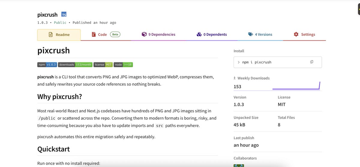
Most image tools just convert a folder and leave you to manually fix hundreds of broken code imports.
I built pixcrush to fix that. It optimizes your files locally and safely rewrites your actual code references.
Live on Product Hunt! 👇
https://t.co/bQmFhz8YQW
In the post-AI era, how do you guys actually start a new frontend project?
Do you still maintain a personal starter? Clone an old project and strip it down?
Just prompt Cursor or Claude to scaffold everything from scratch?
What's your current setup?
not an app but very relevant here, built a CLI that cleans up after vibe-coded projects 😅 one thing I always find is unoptimized PNG/JPG images everywhere.
It fixes that, converts to webp and rewrites all your imports automatically. try it on whatever you just built 👀
https://t.co/7TsTDpjlkg
Why do devs still ship raw PNGs in 2026 😭
been cleaning up codebases for 4 years and its ALWAYS the same thing: giant images, no webp, lighthouse having a breakdown and then you have to fix it manually.
so i just built a tool that does it in one command:
npx pixcrush .
converts everything to webp and updates your imports automatically.
npm: https://t.co/IxnxNl1i2L
Github: https://t.co/7TsTDpiNuI
I had a conversation with a client this week about feedback for a medical dashboard app.
They pointed out something so simple that I honestly wondered: "Why didn't I think of this before?"
The app is used by patients of all ages, from young adults to seniors, mostly on iPads.
The catch? The birth year dropdown.
For a senior user, scrolling back 60+ years to find their birth year isn't just annoying. It's exhausting.
The solution my client suggested: just let them type it.
Instead of forcing users to scroll through decades, we switched to a numeric input field. They type their birth year, we validate it, and it auto-formats instantly. No more endless scrolling. No more frustration.
One small change that saves people time. Sometimes the best fix is just letting users do what feels obvious to them.
Have you ever gotten annoyed by the Back button on a website?
It's usually not broken. It's just built around the wrong mental model.
Developers usually think of a "new page" as a new route in code. Users don't think like that. For users, if a view looks different enough or feels like a new step, it's a new page to them, even if technically it isn't.
So when someone clicks Back, they're not trying to go to the previous route. They're trying to go back to the last page they felt they were on. That mismatch creates friction.
For example, Think about how people actually browse an ecommerce product listing:
filter → click product → back to browse listing → click another product → back.
Break that flow and people leave.
I've seen this across many products. The back button works, but it doesn't respect what the user was doing. Filters reset. Scroll position lost. They have to start over.
The fix is straightforward. Every framework has a way to push state to browser history. Takes a few minutes to wire up. But it rarely makes the priority list.
Small detail. But getting it right makes your product feel like it actually understands how people use it.
I turned off my WiFi to see which apps actually planned for offline.
Most didn't. Infinite spinners for content that was just on screen. Blank states for articles I was literally reading 5 seconds ago.
But two apps handled it extremely well:
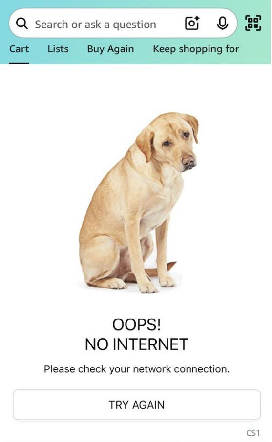
- Amazon shows a dedicated offline screen with random dog pictures. At least they're honest instead of pretending to load.
- WhatsApp gives you every message, full search, even lets you type and queue messages to send later. Treats offline like a normal thing, not an error.
Different approaches, same principle: offline is a normal state, not a disaster.
People are in tunnels, elevators, dead zones constantly. If your app becomes useless the moment WiFi drops - even for data it already loaded - that's a design choice, not a technical constraint.
Not everything needs offline-first architecture. But don't make users stare at spinners for content you already showed them.