Are you in the diaspora? Renewing your Nigerian passport is now easier than ever. Swipe through for the updated step-by-step guide to the NIS Contactless Passport Application System. 🇳🇬
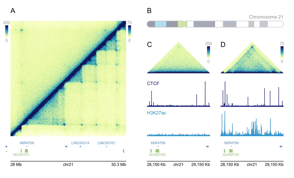
Two tools for plotting genomics data:
figeno: Tool for making genomics figures in #python.
https://t.co/Pe9dRxCCZO
Plotting Multi-omic Data with plotgardener in #rstats
https://t.co/SEp3wHAPzO
Most R users know it as a statistics and visualization tool. But did you know you can also process and analyze images directly in R?
The imager package turns R into a lightweight image processing toolkit. You can load photos, apply filters, detect edges, segment regions, and even prototype computer vision workflows without leaving R.
Some things you can do with imager:
🔹 Read and write image files
🔹 Apply blurring, sharpening, and transformations
🔹 Run edge detection and feature extraction
🔹 Work with color channels and pixel-level data
🔹 Visualize results interactively inside R
The figure below shows several examples from the package website: detecting objects in a star field, applying abstract transformations, filtering a sailboat image, and highlighting motion differences between video frames.
You can find the package website here: https://t.co/NWDdMYBzNs
If you’d like more tips and resources on R, Python, statistics, and data science, you might enjoy my newsletter. Check out this link for more details: https://t.co/X93SeCe0rb
#Python #Python3 #database #RStats #RStudio #DataAnalytics
Adding statistical test results directly to your plots is a powerful way to make your findings clear and accessible at a glance. With tidyplots, functions like add_test_pvalue and add_test_asterisks make it easy to display p-values or significance levels on your charts, helping viewers quickly understand the statistical differences between groups.
Using add_test_pvalue, you can place exact p-values between groups, as shown in the example plot, where p-values highlight the differences between treatment groups A, B, C, and D. Alternatively, add_test_asterisks enables you to display significance levels with asterisks, conveying statistical insights without detailed numbers.
✔️ Quick Setup: With just a few lines of code, you can emphasize significant differences between groups.
✔️ Clear Communication: These functions enhance readability by allowing viewers to easily interpret the significance of results.
✔️ Flexible Options: Customize the format, choose specific groups for comparison, and display either exact p-values or simplified asterisks.
The example plot shown here illustrates the use of add_test_pvalue to show p-values between treatment groups. Each line represents a comparison, with p-values displayed above. This example is taken from the tidyplots website: https://t.co/fgIWzxFVZI
To dive deeper into data visualization in R, consider joining my Data Visualization in R Using ggplot2 & Friends course.
More details are available at this link: https://t.co/ztlEzoEDWv
#datavis #R4DS #tidyverse #RStats #datastructure #DataAnalytics #datasciencetraining
When performing multiple imputation of missing data, it is essential to evaluate how the imputed values compare to the observed data. The bwplot() function of the mice package in R offers a straightforward way to visualize and assess these relationships using boxplots.
The attached image, created with the bwplot() function, showcases how the distributions of observed and imputed values vary across different imputations for multiple variables. Here's what the plot reveals!
🔹 Plot Explained: The plot compares the distributions of observed (blue boxplots, labeled "0") and imputed values (pink boxplots, labeled "1" to "5") for each variable across five imputations.
🔹 Observed vs. Imputed Data: For variables such as wgt and bmi, the imputed values closely align with the observed data, indicating that the imputation model effectively captures the underlying structure of the data. However, differences between observed and imputed distributions do not necessarily signify an issue. They may reflect systematic patterns in the missing data that are accurately modeled by the imputation algorithm.
🔹 Imputation Consistency: Stable distributions across imputations demonstrate consistency and reliability in the imputation process. If variability persists between imputations, it may indicate the need for further iterations or adjustments to the imputation model.
To generate this plot using the mice package in R:
library(mice)
my_imp <- mice(boys)
bwplot(my_imp)
Get free, high-quality tips on data science, statistics, Python, and R by joining my newsletter.
More details are available at this link: https://t.co/X93SeCe0rb
#DataViz #programming #DataVisualization #Rpackage #datastructure #DataScience
Know an Evolutionary Genomicist looking for a faculty job? Join us @UTK_EEB & @UTKnoxville
Position is open for any organismal focus, but personally I have some botany bias. 🌱
Apply before Sept 19 for full consideration.
https://t.co/W9D5v52e3d
Please share widely. Thanks!
📢 Excited to share our work out now in @Nature! 📢
We present the phased pan-genome of the European tetraploid potato, based on 10 historical cultivars representing 85% of European potato diversity.
Learn more below!
🔗 https://t.co/JNuZEMWKxQ
1/7
1/
If you're doing bioinformatics and not using Git, you're walking a tightrope without a safety net.
But it’s easier than you think.
🧵 6 Git commands that every bioinformatician should know:
🧵 How to Use samtools – A Must-Know Tool for NGS Data
If you're working with sequencing data, samtools is essential. It was developed by Heng Li, who also created BWA and minimap2. Let's dive into its usage. 👇