I think we might need to have a global conversation about overdesign. And especially about X’s algorithm perpetuating the problem.
Sometimes adding visual delight really helps an experience feel great. And I can see some whimsy in this that feels good on first viewing.
But let’s take a step back and think about the experience here. The person on your site is trying to sign up for a new service. They’re likely unfamiliar with what you offer but caught enough from marketing to be interested.
Not one signal person has ever wanted to create an account. It sucks and usually leads to email noise and password fatigue. So I get that making sign up visually fun might make an annoying process seem better. But… most people want to breeze through sign up as fast as possible… they want to get in to your product!
Sign-up should be clean, fast, and as simple as possible. Bring this kind of visual delight to the first experience when interacting with a core part of the product experience, sure, during onboarding makes even more sense, but here it feels like overdesign to me.
Also a tiny thing, if the input doesn’t fit the criteria, I shouldn’t have to press the Sign Up button to know. You can debounce the input and trigger the error state without pressing a button so its real l-time with the debounce preventing it triggering on every key press.
—
To be clear, not trying to dunk explicitly on Tushti here! Just using this as an illustrative example given it popped up in my timeline.
@dom_gag_96 I titoli di "anomalie e potenziali sprechi" sono rossi e gialli, difficili da leggere. Li lascerei neri e metterei un accento colorato come bordo sinistro della riga.
Proverei anche ad aggiungere uno sfondo grigio chiaro alla pagina per far risaltare le card bianche.
@dom_gag_96 Ci sono tante info, pulirei la UI per facilitare la lettura togliendo:
- la freccia a sinistra del titolo "panoramica italia" non serve
- le icone nelle card in alto
- i loghi in basso possono essere in BW, sono secondari
- meno colori (sono troppi e scollegati)
Found a fun way to generate QR codes that don’t look like QR codes.
- Enter a URL and it grows a 3D tree from the code itself
- The ground grid is the actual scannable QR
- Switch between Spring, Summer, and Autumn looks
- Runs fully in the browser, nothing uploaded
- Tap the tree to flatten it and scan
https://t.co/133ukElFea
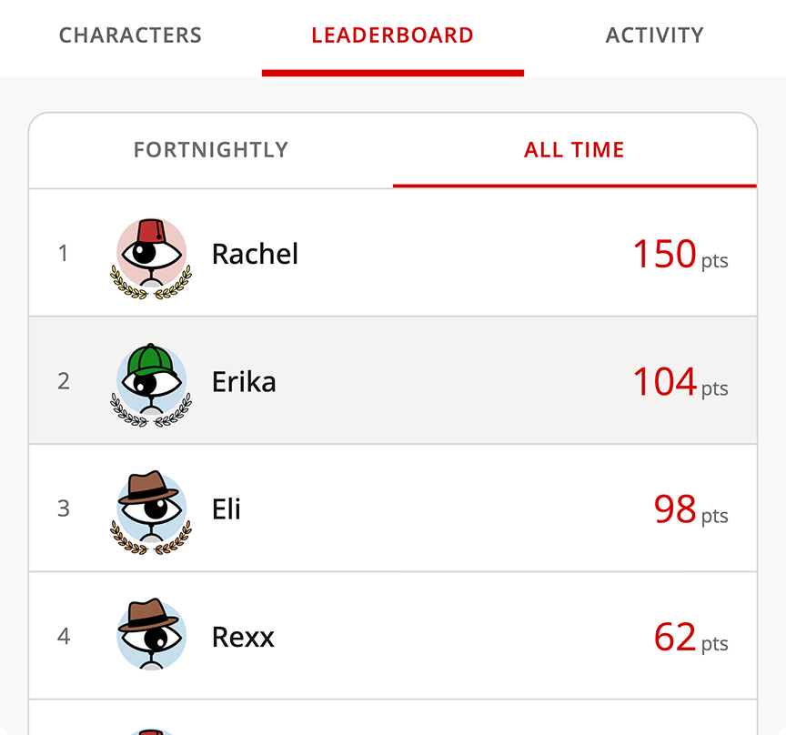
Thinking of customizable avatars for an app.
The usual photo upload takes effort for users, they might not do it, it'd likely be too small to be visible, and I'd need to store them.
Customizable avatars are on-brand with the app and a much better and unexpected experience.