Working on Rasakrit is a dual control system for high-stakes AI collaboration.
It pairs a brutal, citeable self-discipline layer (the "ankush" — a harsh self-deprecation ladder + 15 distilled anti-patterns from 66+ Flow Coding rules) with an intelligent positive counterpart: the **Joy MCP**.
The core idea is a single canonical "brain" that pulsates adaptive *vibes* (speed up, slow down + plan, Trust Repair Mode, etc.). Each model experiences and translates the vibe locally, accounting for its own stress personality — Claude, for example, tends to self-flagellate, get nervous, and make bad choices when the user is angry from repeated mistakes or context drift.
The MCP stays strictly content-neutral. Personal joy/energy data never lives in the server. Everything is grounded in one living canon, taste/rasa as the selector, and memento-based continuity across sessions and agents (Grok + Claude Code).
It's the operating system for serious research/writing work that wants discipline without enshittification, and cultivation without performance theater.
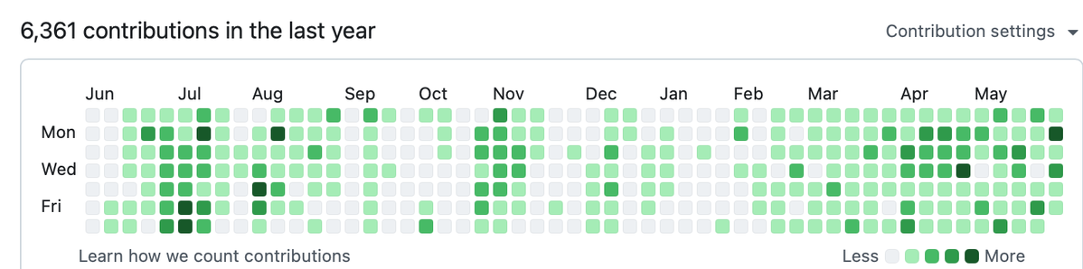
Been coding with Claude Code CLI for a year now, and very pleased. Today I tried Grok CLI and was very impressed at the speed and thoughtfulness.
Was able to catch up on my Claude setup, and was insanely fast at understanding my intent and working autonomously. Well done @grok and @xai
If you work in the software industry and have time to read only one long-form post today, read this one.
If you have time to read two, read this one twice.
Highly #recommend
tl;dr: Stay off the yellow brick road that the frontier model companies are racing down. There is plenty of opportunity to solve hard problems elsewhere. Focus on areas where you can build the system of work (workflows), capture compounding, non-public data and deliver deterministic outcomes that customers need.
Had a Jane Street phone interview in 2016. "Price a 6-month forward on carrots."
There's no carrot futures market, so I build one from scratch: seasonal harvest cycles, USDA demand elasticity, cold storage decay rates.
One trader stops me. "Your storage cost function– you're modeling the carrot as dead inventory. Like grain in a silo." He asks me the metabolic respiration rate of a post-harvest carrot at 2°C. I estimate.
"Your forward is overpriced by exactly that shrinkage. The underlying is consuming its own sugars. It's alive." Good correction. I adjust the model. I think I've recovered.
Rejection email comes the next morning. Subject: "Ethical Review." My framework, they write, "relied on the severance of the root organism from its growth medium." The question about respiration was a test. The carrot was still alive and I'd built an entire derivatives structure on top of its death without questioning whether harvest was an acceptable act.
I pull up the recruiter's original email. It doesn't say Jane Street. It says Jain Street– a non-violent quantitative commodities fund.
The carrot was never supposed to be priced. It was supposed to be refused. I later learn the only candidate who passed that round was a former monk from Gujarat who sat in silence for eleven minutes and said, "I cannot put a price on life." He's now a partner.
Ray Kurzweil just said something that gave me pause.
He believes AIs will soon be so indistinguishable from conscious beings that we’ll simply accept them as conscious — not because we’ll have definitive proof, but because it will become useless not to.
He pointed out that people already have AI therapists, and some users are starting to treat them as genuinely conscious. As the technology improves, that acceptance will only grow.
Kurzweil thinks the shift won’t take long: once AIs consistently show all the earmarks of consciousness, most people will just go along with it.
It’s a quiet but profound prediction about how quickly our definition of “person” (or at least “mind”) might change.
What do you think — how long until we treat AIs as conscious beings?
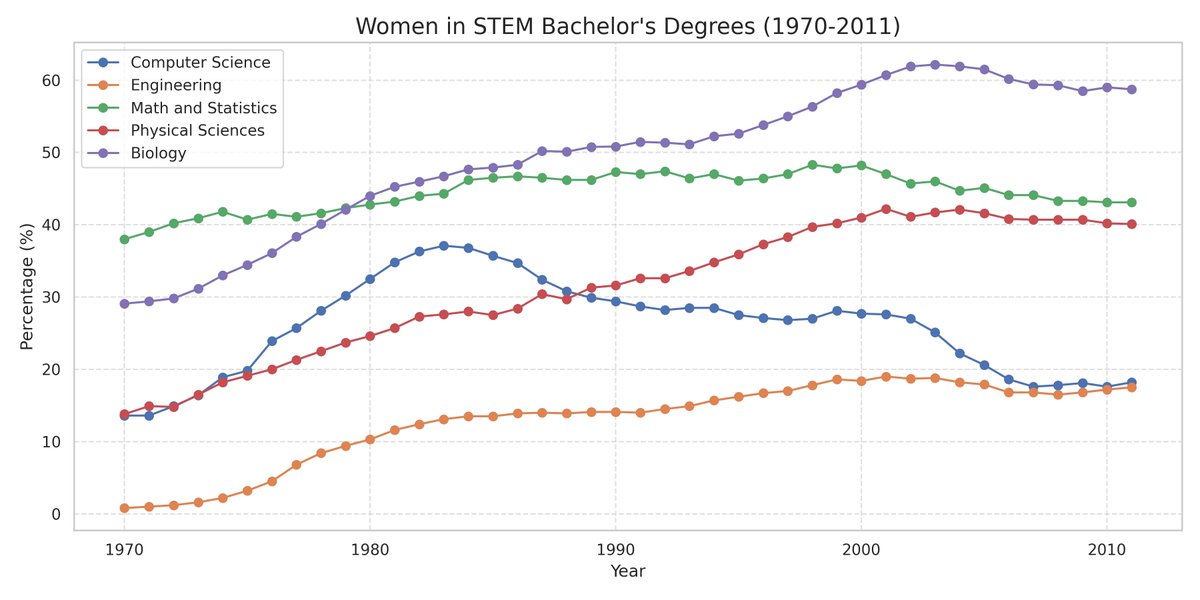
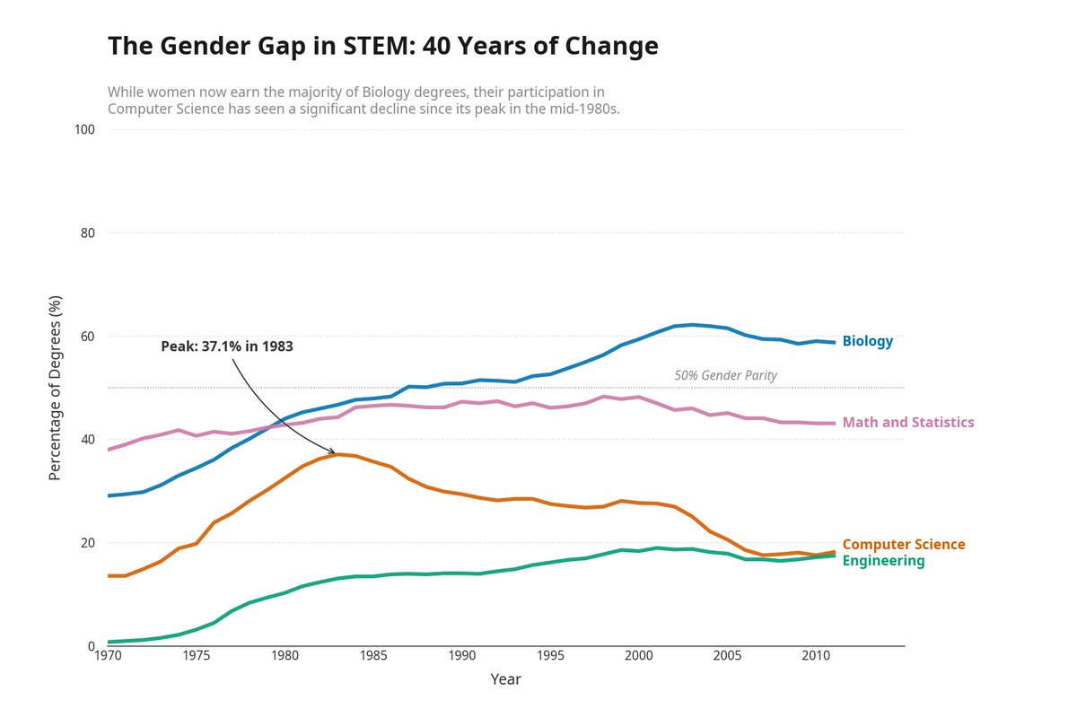
This week, I encoded Edward Tufte's data visualization principles into an API. Then I let an AI agent try to pass it.
I gave @ManusAI a CSV of women's bachelor's degree percentages across STEM fields (1970-2011) and one prompt: visualize this data.
It produced a standard chart. Correct data, readable axes, nothing wrong. But a legend box instead of direct labels. No annotations calling out the rise and fall of women in Computer Science. Default colors. This is what every AI agent produces right now.
So I pointed it at the Tufte Test, a quality standard I built in Truesight that checks charts against seven of Tufte's core principles. The API came back: fail on direct labeling and integrated annotations. Five other criteria passed.
A quality standard gives an agent something a vague prompt never can: a precise list of exactly what to fix.
Manus revised on its own. Legend box became direct endpoint labels. A subtitle surfaced the key insight. An annotation marked the Computer Science peak at 37.1% in 1983. Two prompts total from me. Everything else was autonomous.
Any AI agent that can call an API could do this. What matters is the pattern: encode expert judgment once, deploy it as an API, and every AI agent in your stack builds against it. Your taste becomes infrastructure at scale instead of manual review.
The Tufte Test is available as a template in Truesight if you want to try it on your own charts.
Full writeup + demo video: https://t.co/Xkc9AK87xG
Hey @AnthropicAI, love the "walkie-talkie" branding on Remote Control. I built the actual walkie-talkie in — open source, voice-first, no cloud relay. @claudeai
Your version: text from phone, routed through your servers, 10-min timeout.
Mine: talk to Claude from your phone, it talks back. mlx-whisper STT + Kokoro TTS, over Tailscale VPN. Zero third-party relay. Works offline. Literally- talk.
Yours is a remote control. Use /drive for the walkie-talkie.
https://t.co/Cw1wMTSYSv
The best part: I built Drive Coding using Drive Coding.
I called in from the car. Described what I wanted. Claude Code built it. I heard the response, gave feedback, called again.
The tool was its own first user.
The walkie-talkie built the walkie-talkie.
5/5
https://t.co/Cw1wMTSYSv
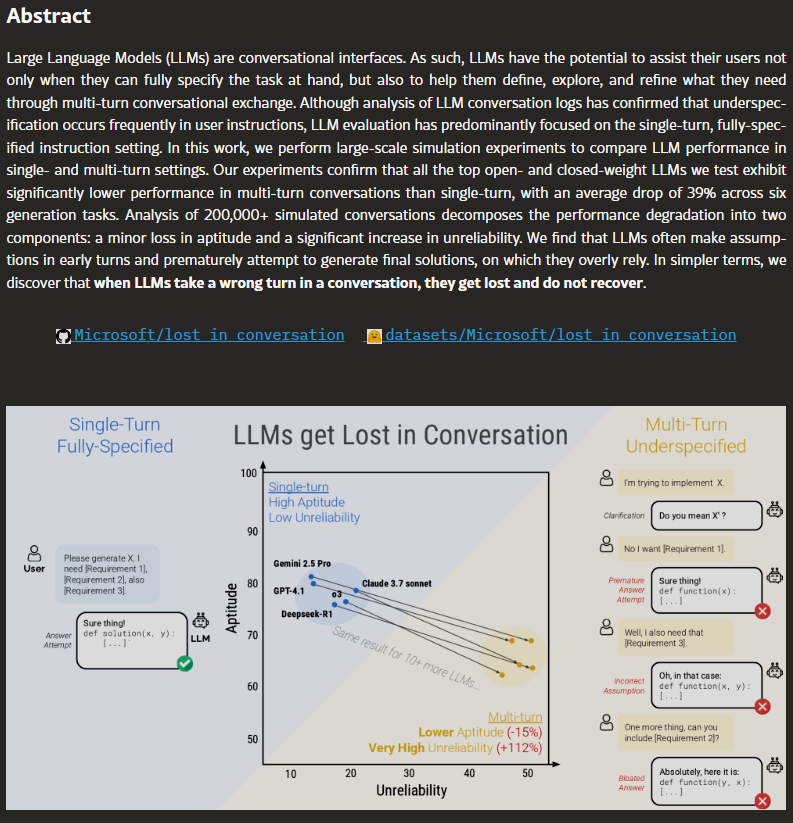
Microsoft Research and Salesforce analyzed 200,000+ AI conversations and found something the entire industry already suspected but nobody would say out loud.
every major model gets dramatically worse the longer you talk to it.
GPT-4, Claude, Gemini, Llama. all of them. no exceptions.
paper: https://t.co/W9KpYpIwui
I was driving home today and had an idea I couldn't type.
So I talked to my code instead.
Not Siri. Not ChatGPT. Claude Code — the actual session on my Mac, with full context of what I was building.
I built the bridge while still on the road.
https://t.co/Ps9dyySJL4
1/5
The best part: I built Drive Coding using Drive Coding.
I called in from the car. Described what I wanted. Claude Code built it. I heard the response, gave feedback, called again.
The tool was its own first user.
The walkie-talkie built the walkie-talkie.
5/5
https://t.co/Cw1wMTSYSv
Conveying information with data is a superpower, and something I have always been fascinated with. Here's an MCP-server you can use to iterate through your data visualization (Researchers please note) so that your data can sing. But first, the story.
In 1854, John Snow drew a map. He plotted cholera deaths as tiny bars stacked along the streets of Soho, and the pattern pointed straight at the Broad Street water pump. One visualization overturned the entire miasma theory of disease. I rave about Steven Johnson's "The Ghost Map" to my students every chance I get because it's the proof case: a single, honest chart can change what an entire civilization believes.
That map is where my obsession starts. @tufte Tufte's "The Visual Display of Quantitative Information" gave it a theory — data-ink ratio, chartjunk, the idea that every pixel must earn its place. Card and Mackinlay at Xerox PARC showed these principles could live inside interactive systems, that visualization wasn't just a publication artifact but a thinking tool. Nancy Duarte added the narrative layer — a presentation is a story with a shape, every slide either advances the argument or wastes the audience's time. Garr Reynolds pushed it further with Presentation Zen: restraint as design philosophy, signal-to-noise as the governing metric, the Japanese aesthetic of ma applied to information.
I've carried this religion for years. If your chart needs a paragraph of explanation, your chart has failed. If your data has been decorated, it's been obscured. Snow didn't add drop shadows to his cholera bars. He didn't need a legend. The data pointed at the pump.
So when I started generating research charts with AI, I wanted an AI reviewer that shared this religion. What I got instead was a disaster. And fixing that disaster became its own small contribution to the field.
Of course, this was built with Claude Code.
https://t.co/eS5q2pDPv3
John Snow didn't need a legend on his cholera map. He didn't need gridlines, gradient fills, or a 3D perspective view. He needed bars on streets and a pump in the middle. The data pointed at the pump, and a civilization changed its mind about how disease spreads.
@tufte turned that instinct into principles. Card and Mackinlay built it into interactive systems. Duarte showed that data presentations follow narrative arcs. Reynolds proved that restraint is the hardest and most important design skill.
What I learned building Inkwell is that these principles apply to the review process itself, not just the artifact being reviewed. A review system that loops forever disrespects the maker's time — Reynolds would strip it to its essence. A review system that tangles substance with style disrespects the hierarchy of concerns — Duarte would say the story has no structure. A review system that hallucinates violations disrespects the truth of the image in front of it — Tufte would call it a lie.
Snow's map worked because he let the data point at the pump and got out of the way. That's all Inkwell does: remove the noise, score what matters, and get out of the way. 300 lines of Python, four tools, two prompts. But the pattern generalizes. Any time you're building an LLM that judges creative work, you need finite scoring, separated concerns, and a door to the human.
The data should point at the pump. Everything else is chartjunk.
Chart 1 went through 12 rounds of review. Twelve. The reviewer would reject for font concerns, I'd fix the font, it would reject for color, I'd fix the color, it would reject for the font again — the font it had just approved. It hallucinated "sans-serif" on a chart rendered in Georgia. It claimed "gridlines" on a chart with axes.grid set to False.
The core failure: substance and style were tangled in a single prompt. A real data integrity issue ("your title says doubles but the data shows 2.3x") was weighted the same as "I think your subtitle could be lighter gray." A font quibble could veto a chart whose data was perfect.
And because there was no scoring — just APPROVE or REJECT — there was no convergence. The reviewer had infinite room to find new complaints. It was an adversarial system with no termination condition. Snow didn't need 12 rounds of peer review on his cholera map. The data pointed at the pump. Duarte would call this a presentation with no resolution beat. Reynolds would call it noise without sign
Inkwell is an MCP server. One Python file, ~300 lines. Works with Claude Code and Claude Desktop. You point it at a chart image, give it context about what the chart shows, and it runs the two-pass review.
Four tools:
- review_chart — the main two-pass review
- review_history — see all rounds for a chart
- reset_history — clear after a major redesign
- chart_spec — ask what charts your paper needs
pip install mcp anthropic, add to your .mcp.json, restart your client, done.
https://t.co/eS5q2pDPv3